Artem Shambalov

  • Dopamine in Apps: From Simple Actions to Deeper Engagement

    Dopamine in Apps: From Simple Actions to Deeper Engagement

    How can dopamine-driven design help apps boost engagement and subscriptions?

    In this article, Artem Shambalov (co-founder of tTravel) shares his hypothesis of “dopamine baby steps” — a product psychology approach where simple actions lead to deeper engagement.

    Here’s what you’ll learn:

    ✔️ Big actions like purchasing or publishing itineraries required too much commitment in the old app;

    ✔️ How the new dopamine baby steps model works with stickers, scratch maps, and Easter Eggs;

    ✔️ Early subscription offerings failed (with up to 99% drop-off) — and how the team changed the flow;

    ✔️ How Me, the app’s mascot, avoids making subscriptions annoying;

    ✔️ How dopamine nudges prepare users for advanced features like the Itinerary Constructor.

    If you prefer video formats, there you go:

    Retrospective

    In the previous version of tTravel, the key users’ actions were either purchasing itineraries or publishing them for sale. Both are complex actions that required a significant level of commitment. Publishing an itinerary for sale, in particular, was positioned too far down the user funnel, making it less likely to occur.

    With the new tTravel, we’ve shifted our focus. The primary action is now subscribing—an action placed at the early stages of the funnel and stimulated through easy achievements and dopamine influxes. With this change we hope to engage users quickly and encourage them to explore the app’s full potential.
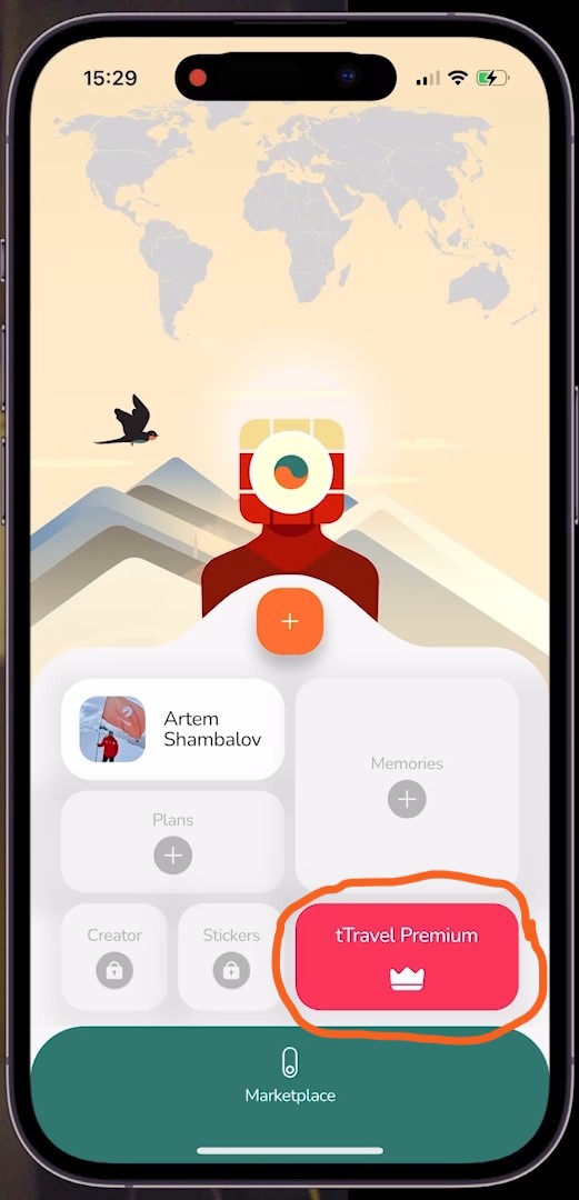
    Subscription as new primary action

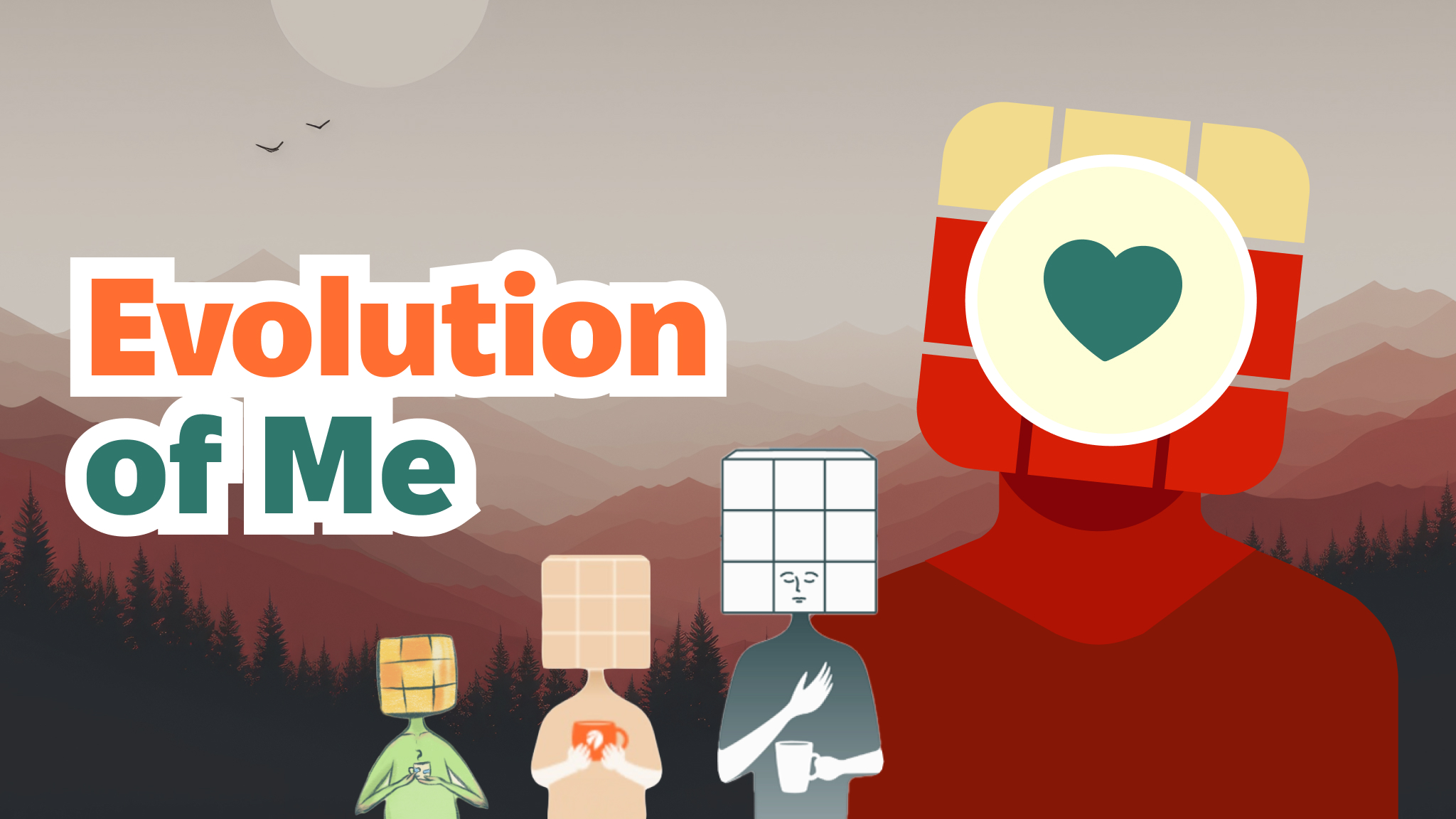
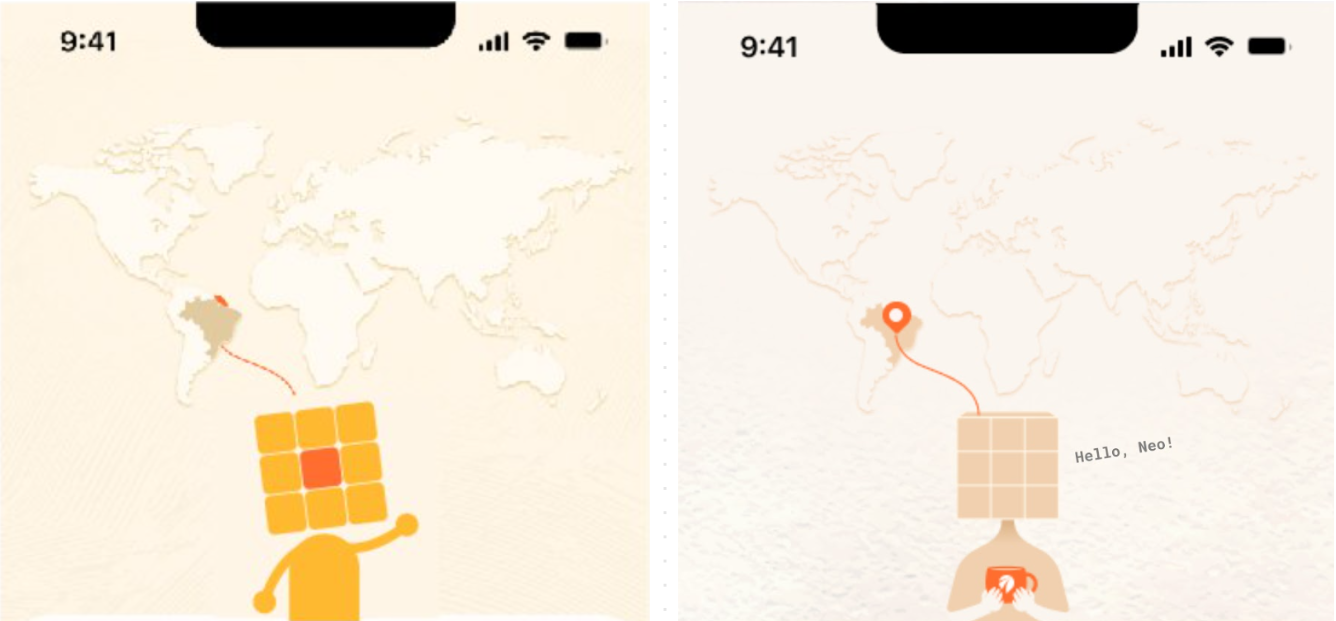
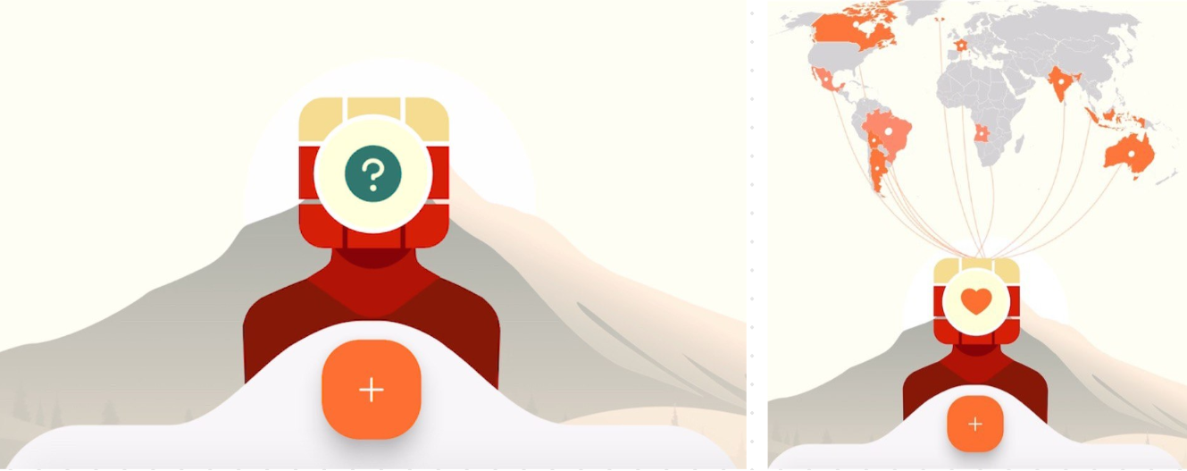
    To encourage subscriptions, we’ve introduced a series of dopamine-driven micro-rewards— I call them “dopamine baby steps.” These are small, easily achievable actions that provide users with a sense of progress and excitement. So now, when users complete simple actions, they unlock a two-layered scratch map with interactive threads and receive stickers with lots of Easter Eggs, which adds an element of playfulness and personalization.

    Each such achievement delivers a burst of dopamine. Thus, we aim to enhance the user’s connection with the app and create a positive feedback loop.
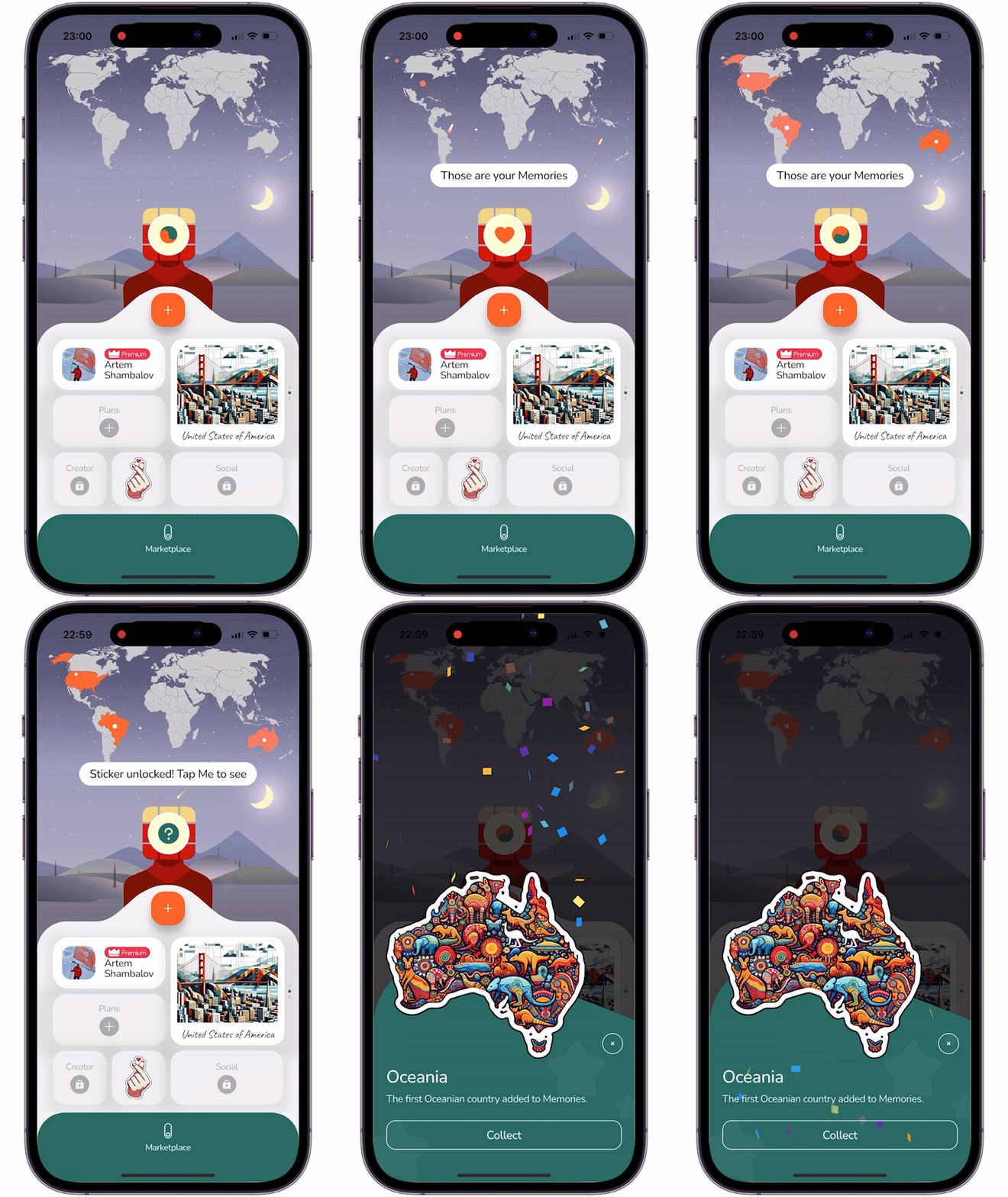
    Dopamine-driven micro-rewards
    Dopamine-driven micro-rewards

    Subscription-Driving Dopamine

    The map and stickers widget are partially available for free, but their full potential unlocks after the subscription is purchased. At first we tried a subscription offering right off the bat, at the moment users first interact with any premium feature, but this approach was a total disaster. Up to 99% of users didn’t subscribe and many were confused by the flow.

    To make the transition to subscription seamless, we stopped showing the subscription offering screen without the user’s consent to see it. Instead, we use Me, our mascot, to explain the limitations when the user runs out of free functionality. If the user wants to lift those limitations, they can tap Me and proceed to the subscription screen. If not, Me’s dialogue disappears in a few seconds, so the user won’t even have to make extra taps to proceed with the app.

    So now, users can check out the benefits of all premium features without immediate commitment and annoying subscription offerings. But the dopamine-driven elements serve as a consistent nudge toward upgrading.
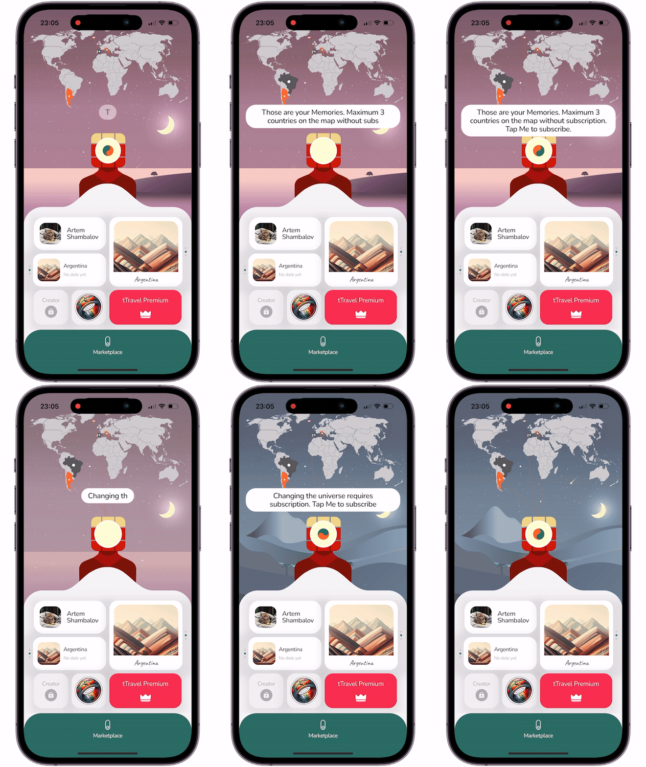
    Me's explanations on subscription
    Me’s explanations on subscription

    Building Toward Complex Actions

    Our hypothesis is that the small doses of dopamine not only drive subscriptions but also prepare users for the app’s more advanced features, like the Itinerary Constructor, which is also a partially free premium feature and basically the core one.

    By creating a sense of progression and accomplishment through simple actions, we are trying to make users more inclined to explore and understand the more complex and valuable aspects of the app. Hence, this is another change that hopefully will indirectly increase the % of users checking out the constructor.

    tTravel isn’t just a trip planner app — it’s also a space where product design and psychology come together to create a more engaging user journey.

    I hope this article was useful to you. Download tTravel on iOS or Android if you haven’t done so yet. And stay tuned for the next articles. Until next time.

    By: Artem Shambalov

  • Dynamic Wallpapers in tTravel | A Home Screen That Changes with Time

    Dynamic Wallpapers in tTravel | A Home Screen That Changes with Time

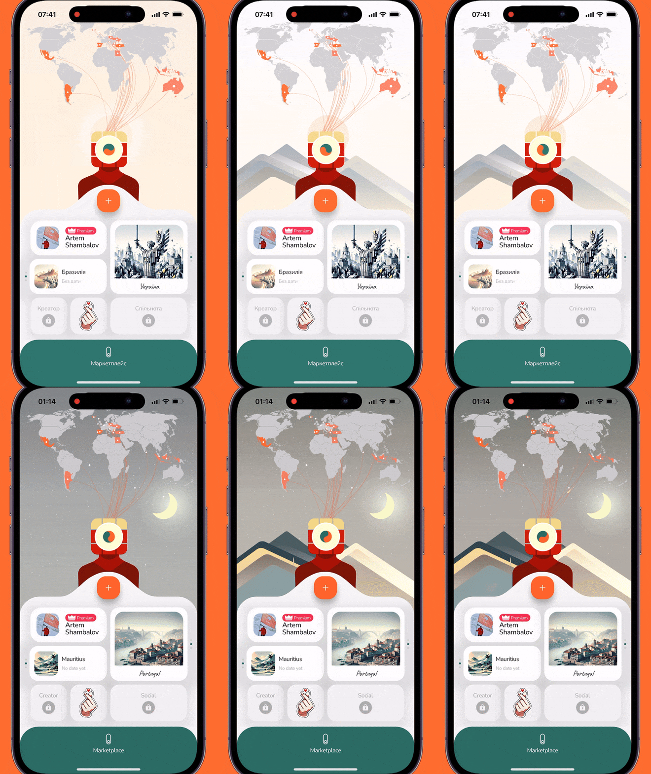
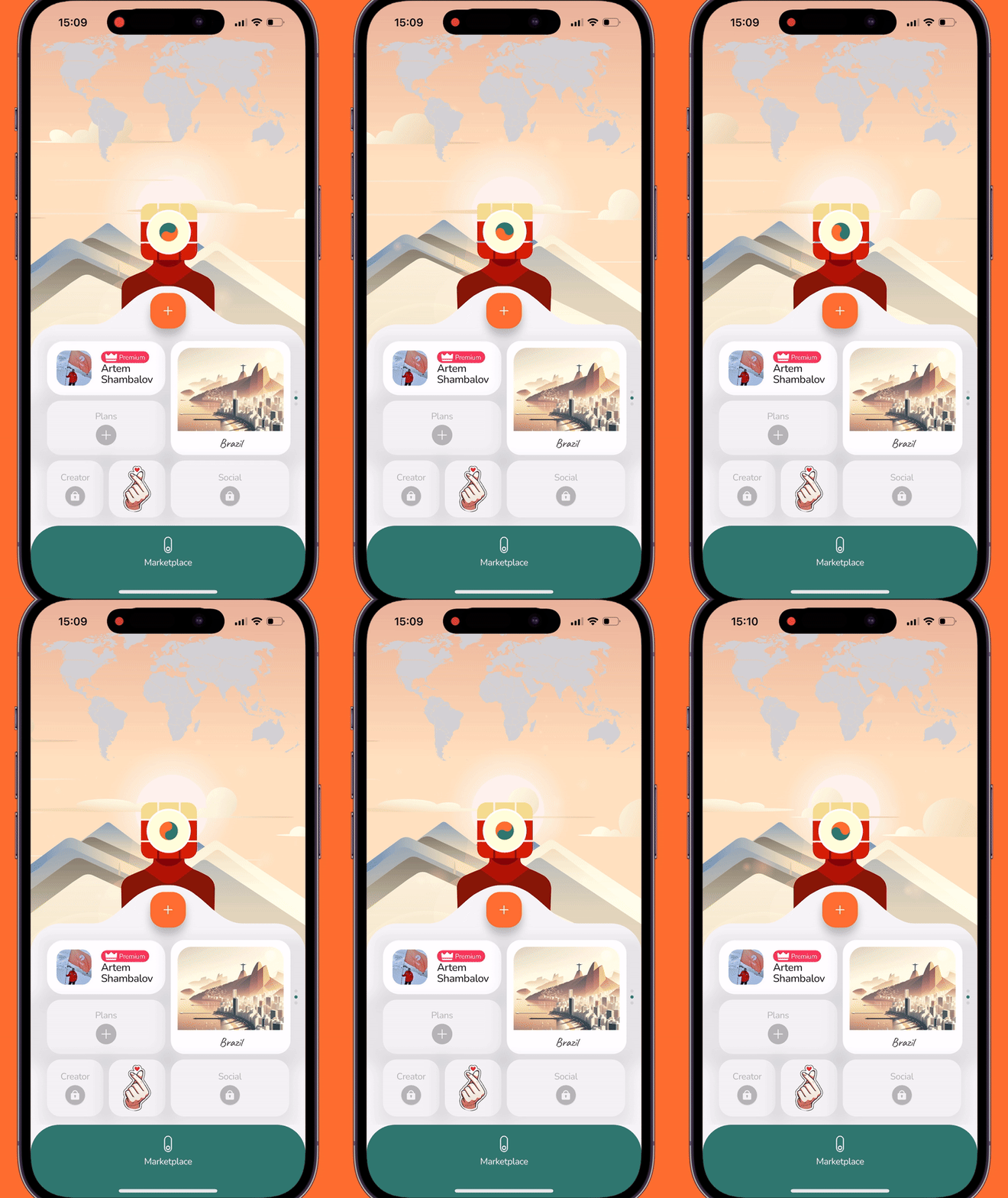
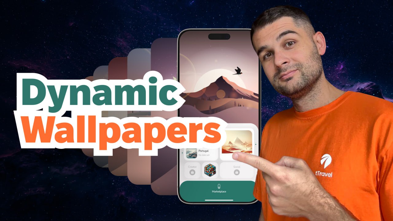
    We’ve turned our app’s home screen into a living universe that changes throughout the day. This became one of the most artistic features in our app and in this article, we’re going to reveal the peculiarities of its implementation.

    If you prefer video format, there you go:

    Over the past year, only 6% of tTravel users changed their wallpapers – most didn’t even know the feature existed as it wasn’t explicitly shown. So we thought: how can we give users a little nudge without spoiling the Easter-egg feel?

    To fulfill this task, we teamed up with Liuba Syrotiuk, a talented Rive animation artist we met at Lisbon Web Summit.

    Liuba Syrotiuk
    Liuba Syrotiuk

    While brainstorming, we had two ideas for the hint in mind:

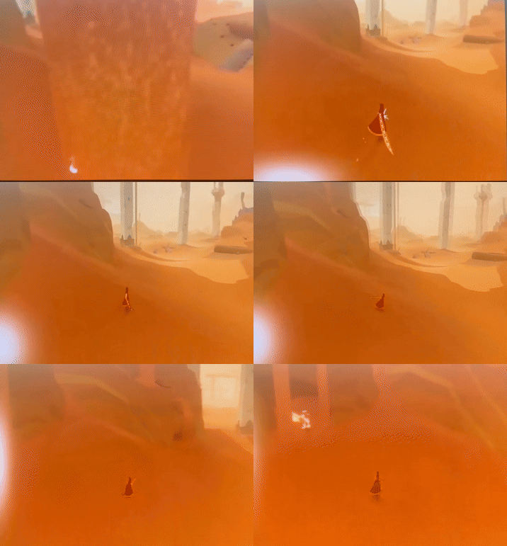
    1. Glowing wallpaper edges. Inspired by the halo effect in Journey.

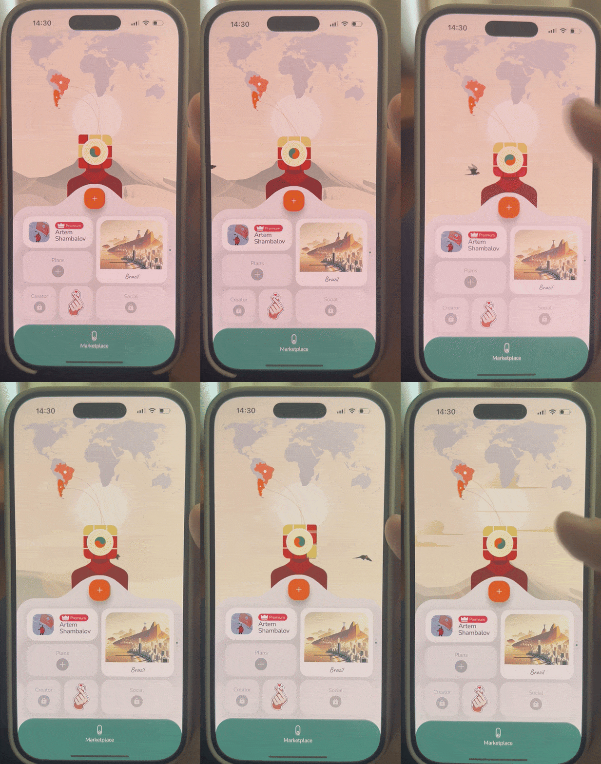
    2. A bird flying across the app’s home screen – something that sparks interest and makes you want to “catch” it, tapping the screen. And when you tap, the wallpaper changes.

    We chose the bird and decided to turn static wallpapers we had into universes with life, motion, and time.

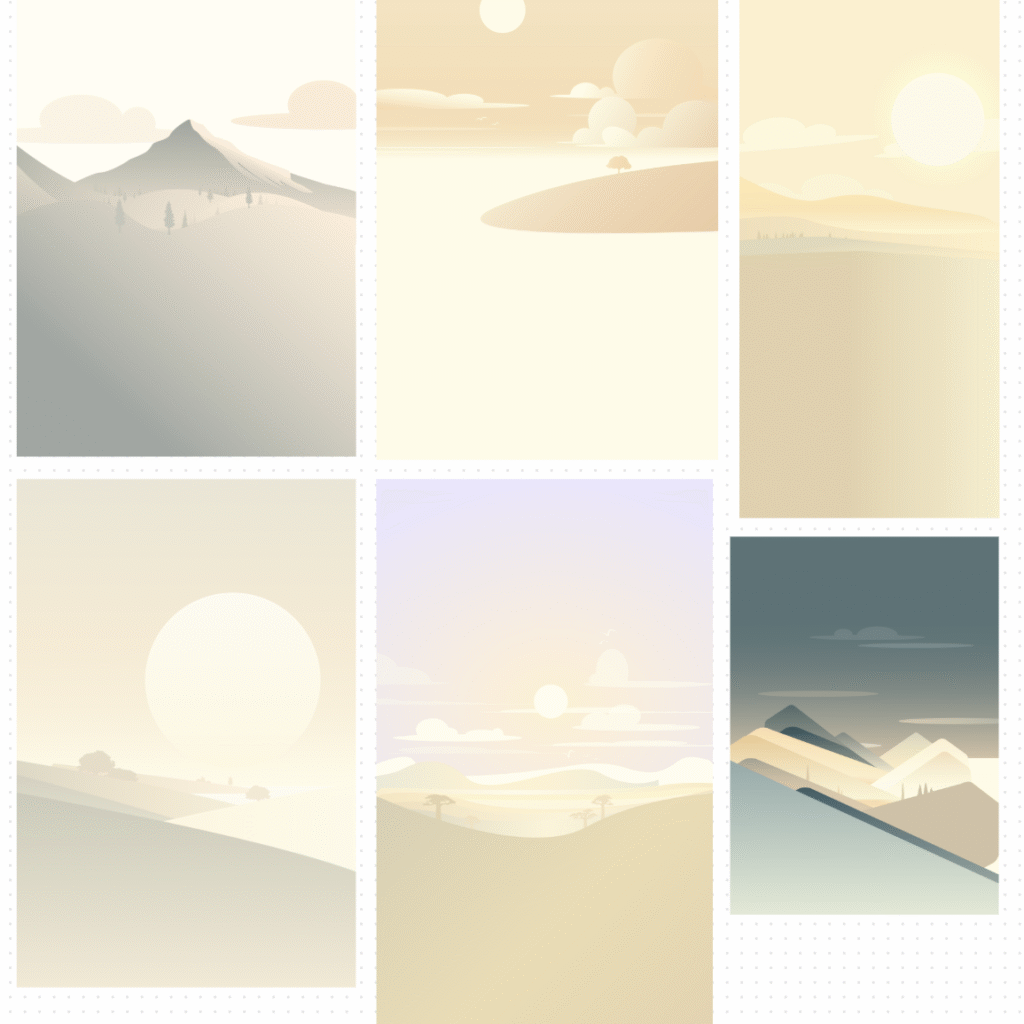
    First, Liuba expanded the designs of our old wallpapers

    Old wallpapers

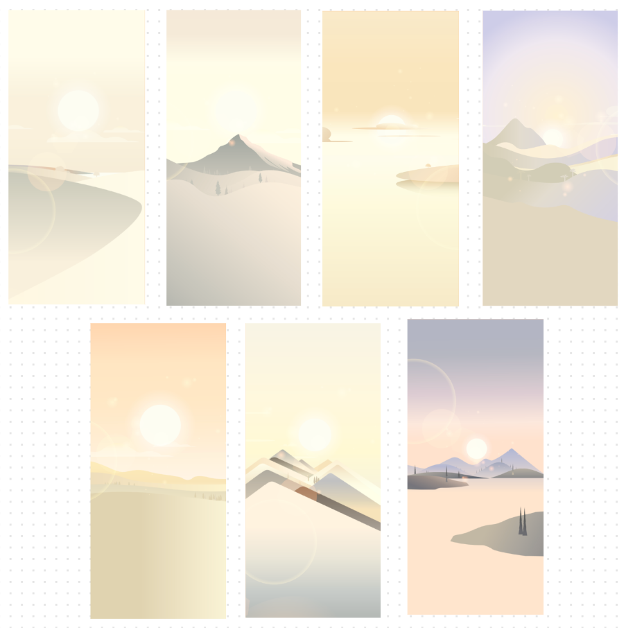
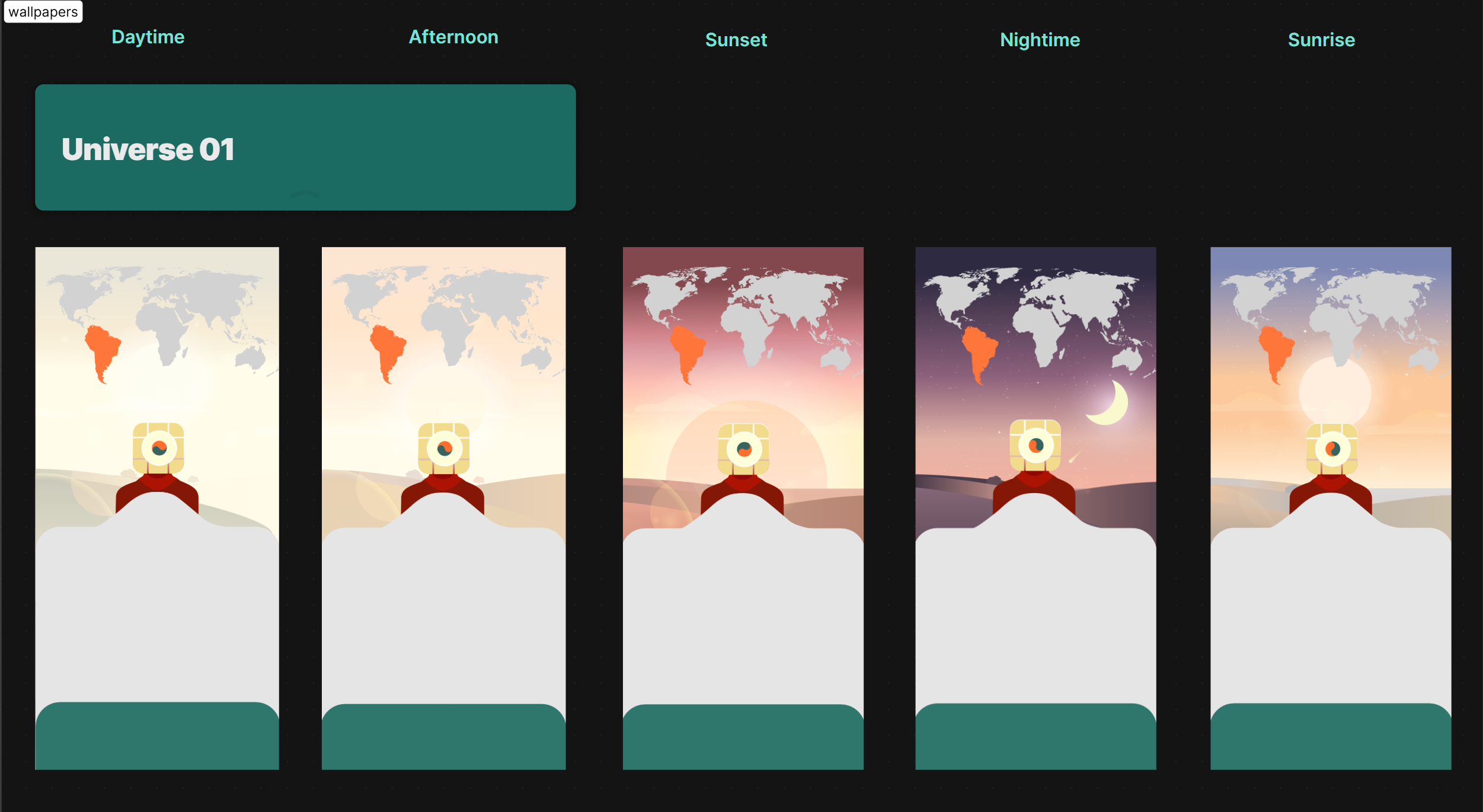
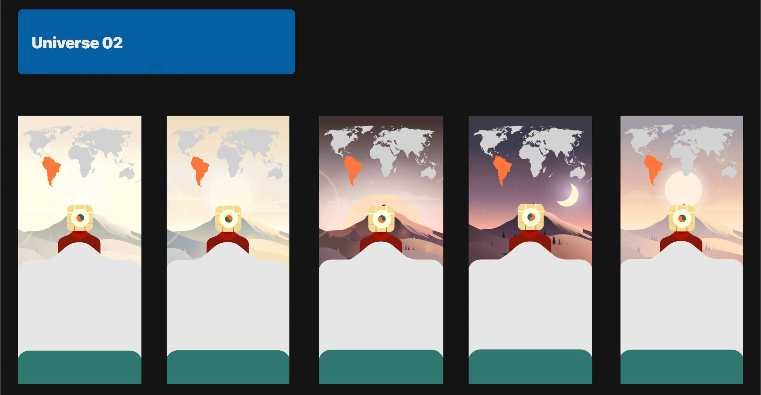
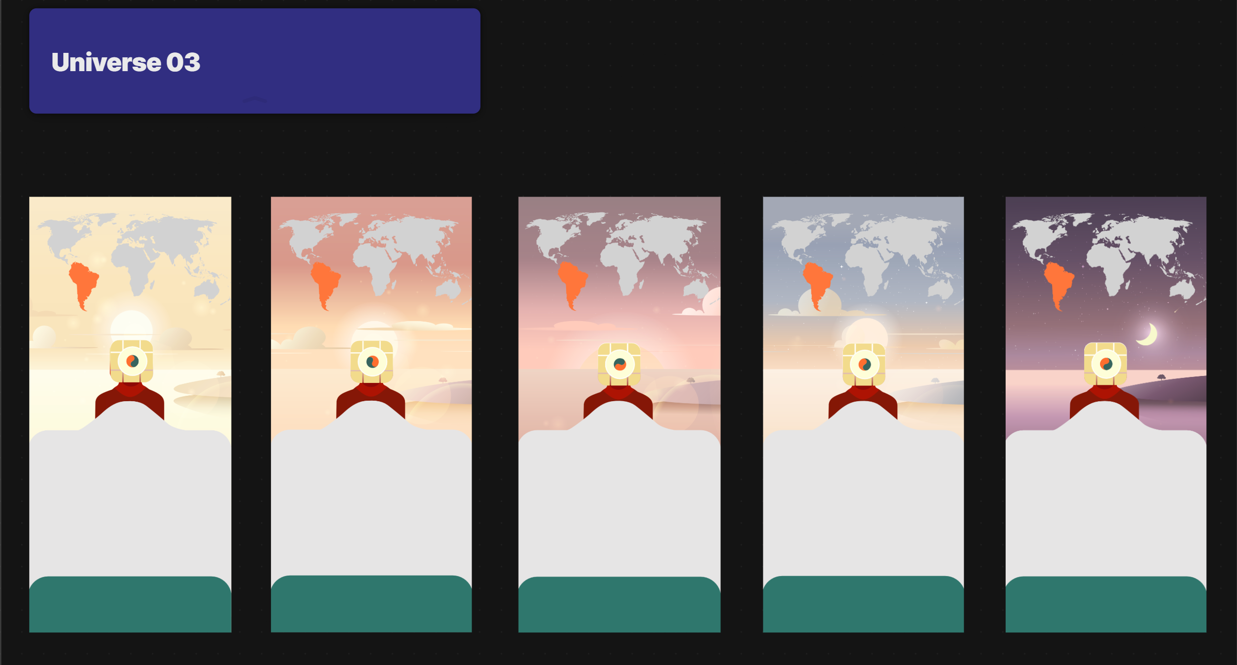
    into seven new universes and applied color correction to align them with our app’s palette.

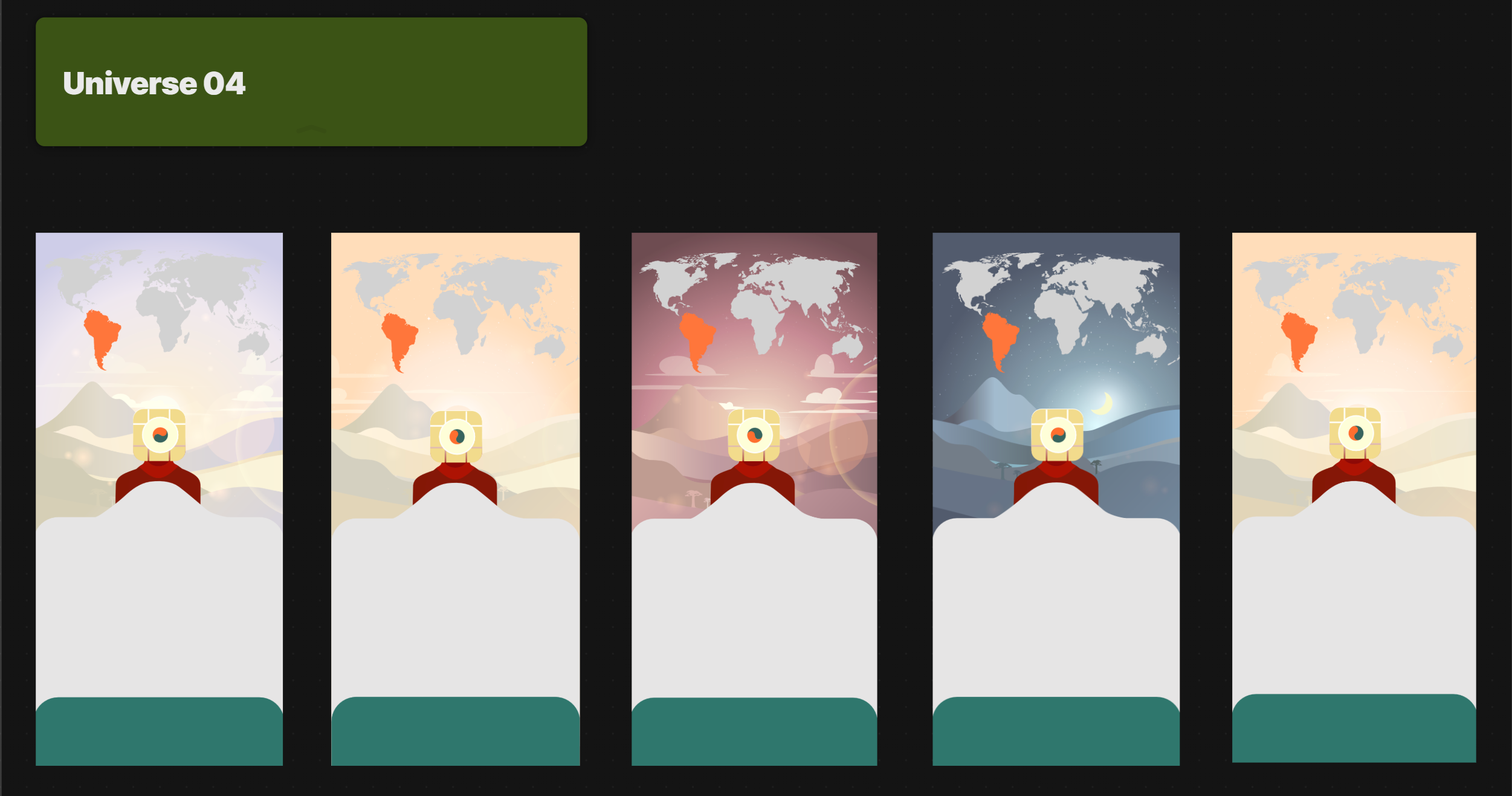
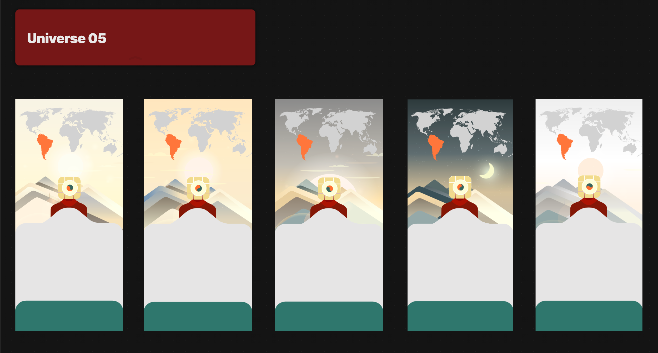
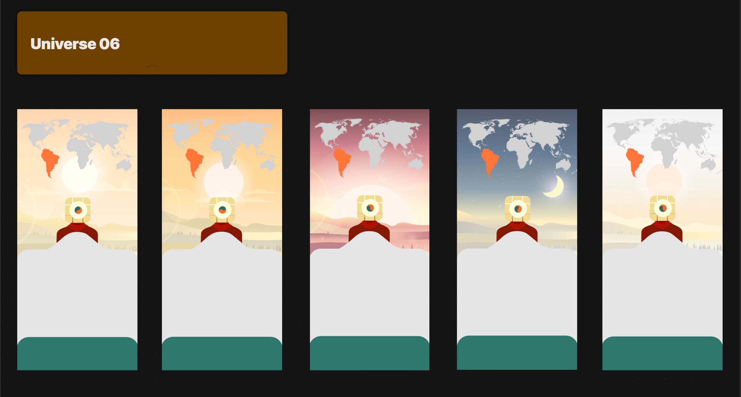
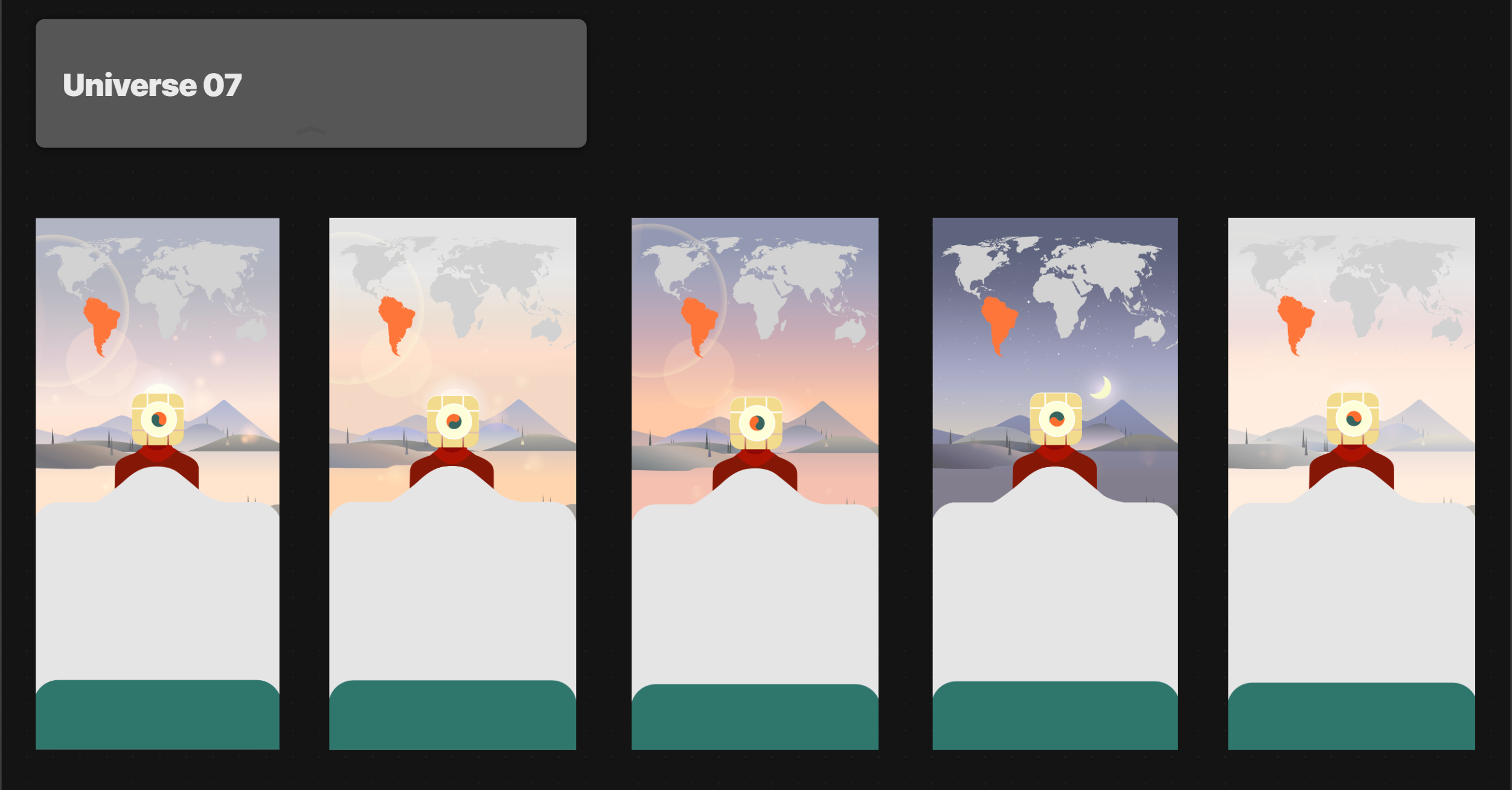
    New wallpapers

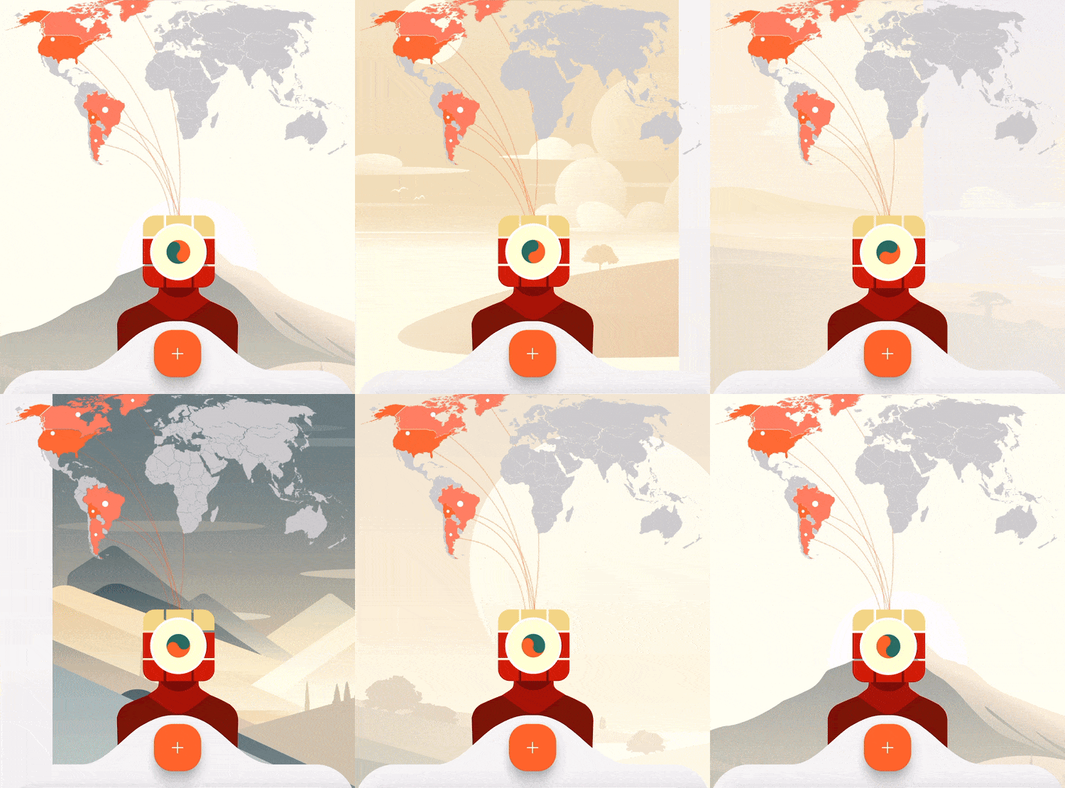
    Then, in the Illustrator file, she developed time-based variations for each universe to create a full day–night cycle. Open the app in the morning and you’ll see a sunny landscape. Then get back in the evening and you’ll see a glowing sunset or a starry night.

    Day-night transition
    Day-night transition

    On top of that, Liuba implemented a parallax effect that responds to phone tilting, and added moving elements, like clouds or meteors, to draw the user’s attention.

    Parallax & moving objects
    Parallax & moving objects

    Finally, we aimed for layered transitions – instead of static image swaps from the first iteration, now elements will smoothly fade and pan.

    Old wallpapers change
    Old wallpapers change

    Designing smooth transitions

    Here are Liuba’s notes about her working process and the difficulties she had while making our home screen alive:

    One of the main design and animation challenges I faced wasn’t creating the parallax effect itself, but figuring out how to organize smooth transitions between two parameters for each universe: the time of day and the universe changes.

    Our goal was to achieve a layered transition pan effect in which one element seamlessly replaces another. The first step in Rive was transferring everything from Illustrator, making sure the colors worked, fixing gradients, and setting up a simple pan effect.

    Once everything was exported into Rive, I configured the parallax and fine-tuned the colors before shifting my focus to transitions.

    At first, to test it, I built both transitions as separate layers, with any state changing through a simple trigger. We planned to build transitions with two numeric triggers: the first numeric trigger changes the universe, and the second numeric trigger controls the time of day (which should automatically change over 24 hours on its own). After testing the first Rive file, we realized we need triggers for each universe and each time of day so that developers can control it better.

    I tested different state machines, and to fix the universe transition I tried adding another layer with in/out animations for each universe, where the layers would move in and out. This approach worked when triggering either a universe change or a time-of-day change. At this stage, the transition looked better and felt smoother, but it still wasn’t perfect:

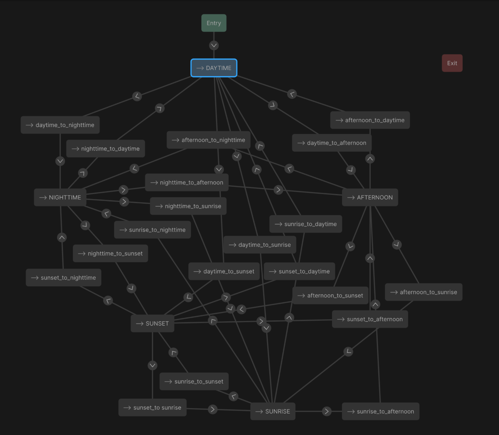
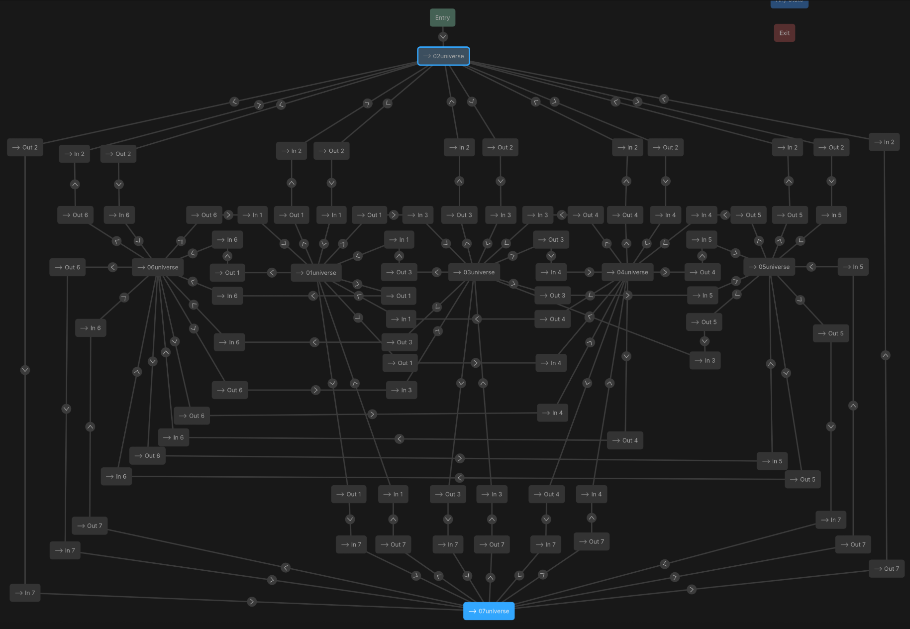
    After a few rounds of testing, I realized the transitions looked best when in/out animations were added to each transition layer. So I built a complex matrix for both time-of-day and universe transitions, with dedicated in/out states:

    Time-of-day matrix
    Time-of-day matrix
    Universe matrix
    Universe matrix

    Finally, it worked just as I had imagined. I fine-tuned the timing by slowing down certain parts and adding pauses between animations. The result was a smooth, gradual parallax effect. In Rive, it looked very polished:

    When I saw the animation running in the real app, it looked even better than I expected. It felt like the app’s home screen was a small, interactive world that responds to you and the time of day.

    We went through several rounds of color correction to ensure everything felt harmonious, and I took the opportunity to split the layers into individual elements – like the sun, clouds, sky gradient and smaller details – giving the animation more depth and flexibility.

    And here’s the final result:

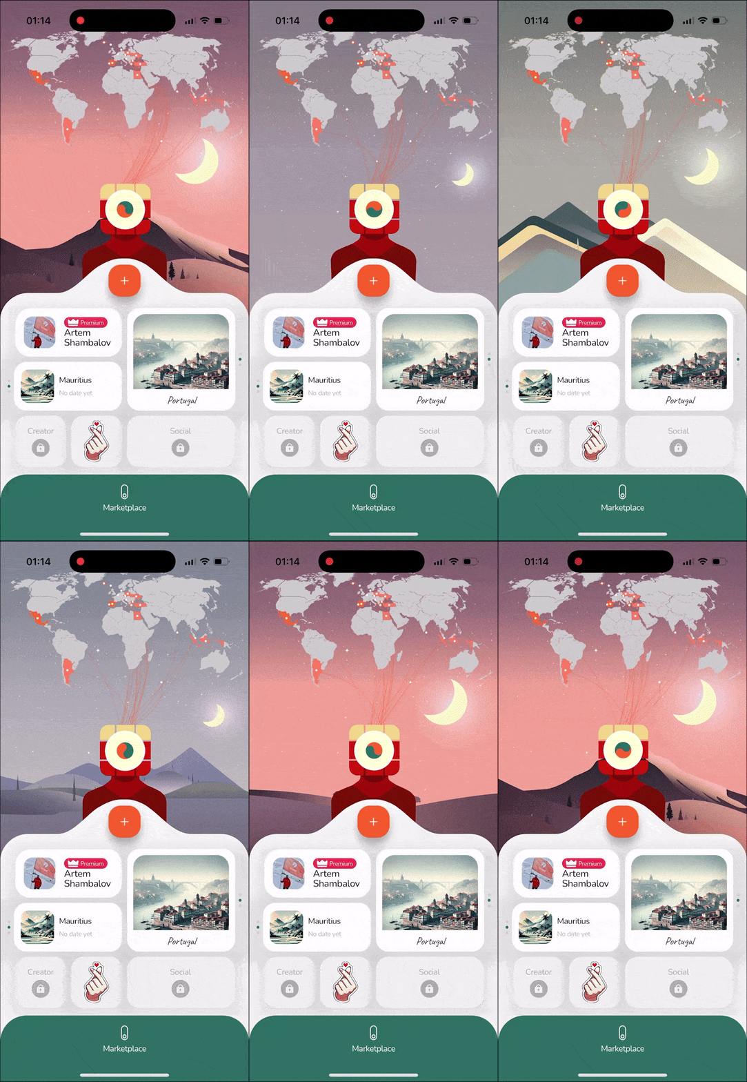
    New wallpapers change
    New wallpapers change

    Of course, we don’t expect this feature to skyrocket metrics, but we want our app to look immersive, creative and simply beautiful. And with this wallpaper Easter Egg, we aim to reward those users who are invested in the app enough to discover all its features and secrets. Ultimately, it’s not always about metrics, sometimes it’s just about our love for tTravel. For us, every screen in our app should feel like a small piece of art.

    We hope this article was useful to you. Download tTravel on iOS or Android if you haven’t done so yet. And stay tuned for the next articles. Until next time.

    By: Artem Shambalov & Liuba Syrotiuk
  • How to Create Travel Plans & Memories in tTravel

    How to Create Travel Plans & Memories in tTravel

    Learn how to create travel plans and memories in the tTravel app, your all-in-one trip planner and travel diary. In this tutorial, we’ll show you step by step how to use the trip constructor to plan your journeys and save your travel memories.

    Download tTravel now and start planning your next adventure:


    iOS

    Android

  • tTravel Easter Eggs

    tTravel Easter Eggs

    With tTravel 2.0, we wanted to honor artistic works that greatly influenced us as personalities and creators. The new tTravel app features a lot of cinematic, musical and gaming Easter Eggs.

    We’re not going to tell you what exactly they are, but we’ll give you 3 hints: contemplate over the home screen, unlock the stickers and give love 🙂 Also, here’s the list of inspiration sources our tTravel Easter Eggs pay tribute to:

    Cinematography

    • LOST
    • Matrix
    • Terminator
    • Lord of the Rings
    • Tom Cruise
    • Interstate 60

    Games

    • The Last of Us
    • Journey

    Music

    • Depeche Mode
    • Queen
    • RHCP
    • Frank Sinatra
    • Matthew Bellamy

    Ukraine

    Of course, we couldn’t create tTravel 2.0 without paying tribute to our homeland, Ukraine, its bravery and resilience.

    Love

    There’s also an ultra-hidden Easter Egg that gives a unique reward if found 🙂

    How Many Have You Found?

    The Easter Eggs are scattered across the app, waiting to be discovered. Whether it’s through exploring the design, unlocking stickers, or delving deeper into the app’s features, each Easter Egg connects you to the artistic influences that have fueled tTravel’s creation.

    How many tTravel Easter Eggs have you found and unlocked so far? Dive into tTravel 2.0 and let the hunt begin!

    Download tTravel on iOS or Android if you haven’t done so yet. And stay tuned for the next articles. Until next time.

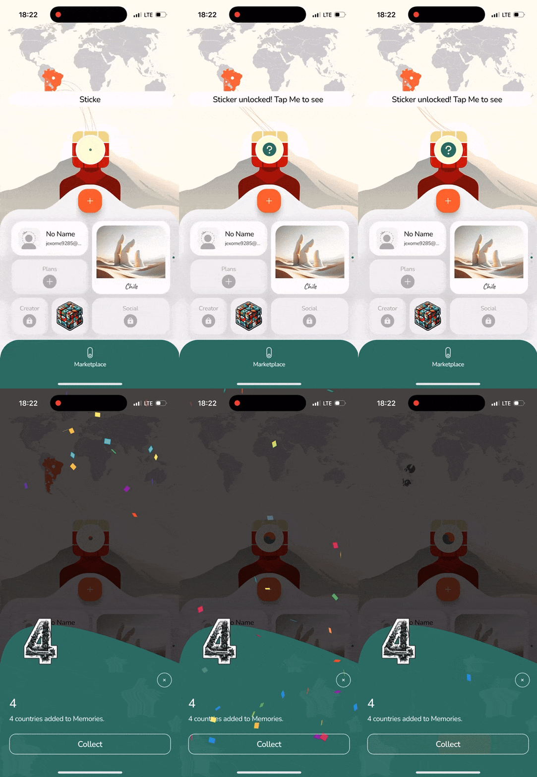
    Sticker unlocked animation in tTravel
    Sticker unlocked animation in tTravel

    By: Artem Shambalov

  • Personalized travel app experience in tTravel

    Personalized travel app experience in tTravel

    For years, we’ve been struggling with providing a personalized travel app experience for tTravel users. In today’s digital world, personalization has become more than a trend—it’s an expectation. Users want products that adapt to their needs, preferences, and lifestyles, offering experiences that feel uniquely tailored to them.

    In the first version of tTravel app, personalization wasn’t part of the experience. Every user started on a standard marketplace page, where they could browse or purchase itineraries. While functional, it lacked the personal touch that makes travel planning exciting and meaningful.

    Now, with the new tTravel, we’ve completely transformed the approach and introduced a deeply personalized travel app experience.

    If you prefer video format, here’s the video chapter of this story:

    Home Screen as Your Journey Reflection

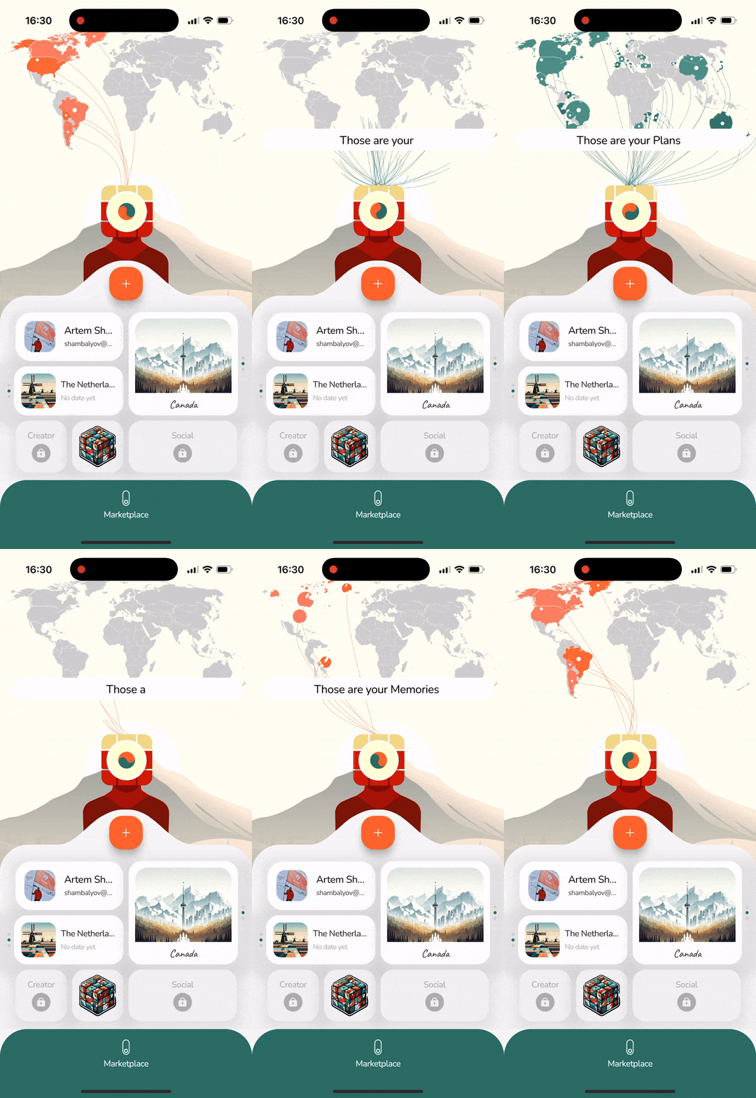
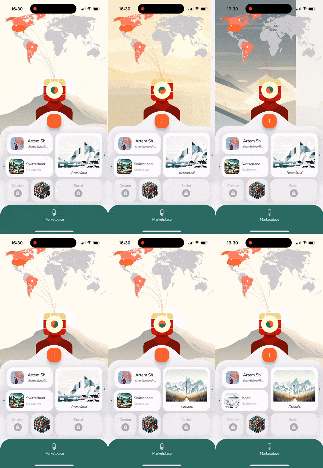
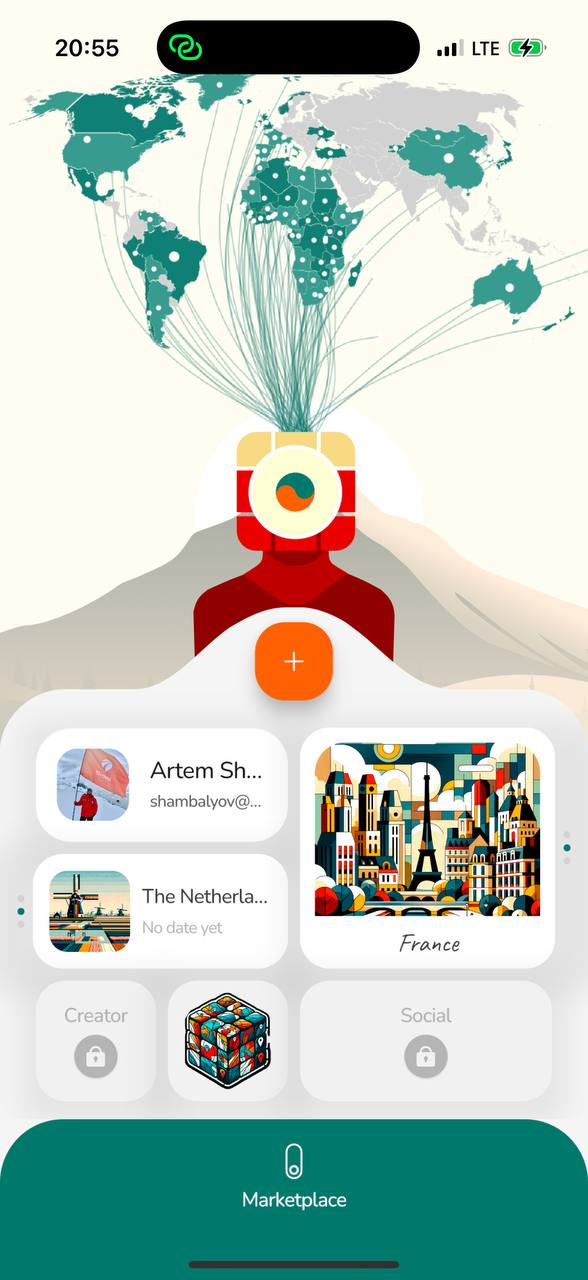
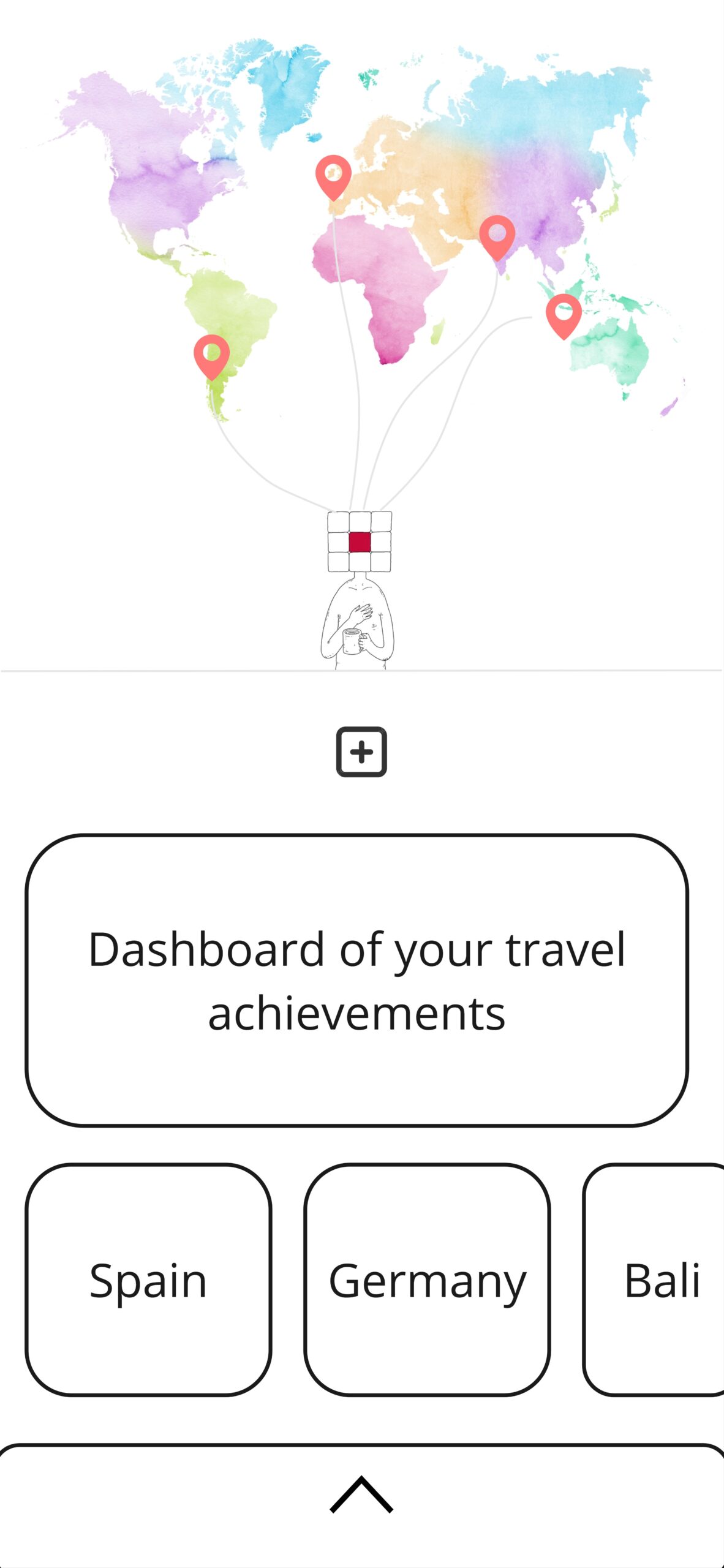
    The home screen is no longer a one-size-fits-all interface—it’s personalized to you. Your dashboard and scratch map showcase your travel plans, memories, and achievements. You can even customize the home screen wallpaper by selecting the universe that resonates with you the most.

    Personalized scratch map in tTravel
    Personalized scratch map in tTravel
    Wallpapers and widget covers customization in tTravel
    Wallpapers and widget covers customization in tTravel

    This shift to personalization isn’t just about aesthetics; it’s about creating an app that feels like an extension of your travel story. With tTravel, your adventure begins the moment you open the app.

    Smart Recommendations for Smarter Travel

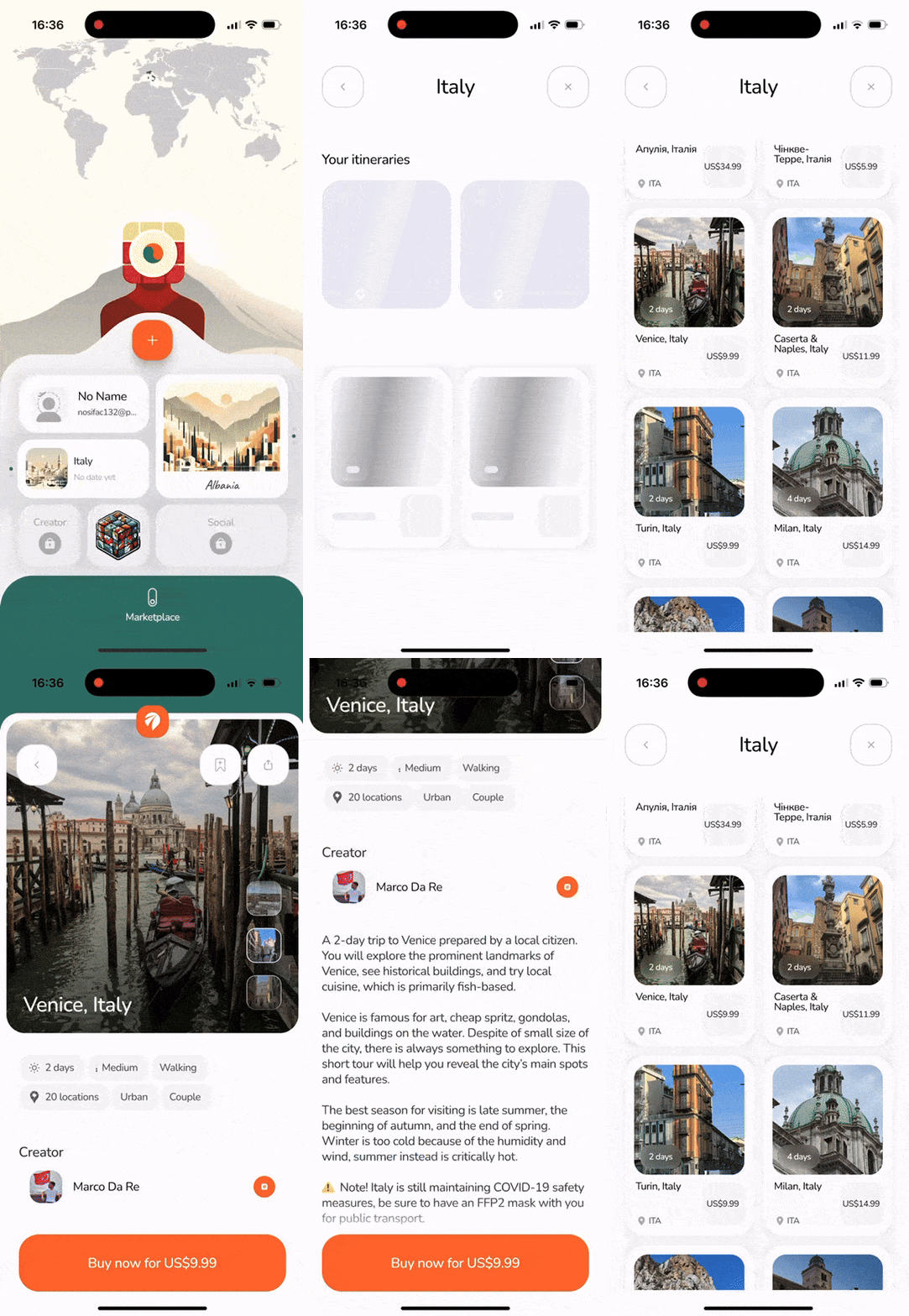
    We’ve also enhanced the Plans widget to make planning seamless and intuitive. Recommended itineraries are now tailored to the countries you’ve added to your Plans. Whether you’re dreaming of a trip to Japan or exploring the best of Italy, our smart suggestions help you discover itineraries that align with your goals.

    Smart itinerary recommendations in tTravel
    Smart itinerary recommendations in tTravel

    What’s Next?

    Personalized travel app experience doesn’t stop here. We’re working on exciting new features to make tTravel even more tailored to your needs:

    • Recommended for You: In the near future, our marketplace will offer personalized itinerary suggestions based on your saved plans and preferences. This feature will make it easier than ever to find trips that match your style of travel.
    • Customizable Me Appearance: Soon, you’ll be able to select the look and personality of Me—your travel companion, making your interactions even more engaging and personal.

    Why Personalization Matters

    Travel is deeply personal. The destinations we choose, the experiences we seek, and the memories we create are all reflections of who we are. By putting personalized travel app expreience at the heart of tTravel, we’re not just helping you plan trips—we’re helping you craft experiences that resonate with your unique story.

    Join us on this journey as we continue to innovate, bringing you closer to the adventures you dream of. With tTravel, your journey starts here—and it’s entirely your own.

    Download tTravel on iOS or Android if you haven’t done so yet. And stay tuned for the next articles. Until next time.

    By: Artem Shambalov
  • App Soundtrack: How tTravel’s Meditative OST Was Born

    App Soundtrack: How tTravel’s Meditative OST Was Born

    If you opened the new app at least once you must have heard the meditative soundtrack in the background. We added it to set the proper tone and immerse users in a contemplative atmosphere helping them reminisce about their past journeys or plan future ones.

    If you prefer video format, here’s the video about our app soundtrack:

    As I’ve mentioned in the Concept of Me article, we wanted tTravel to be not only a tool, but also an artistic expression.

    The Birth of an App Soundtrack Idea

    The idea of an app soundtrack was first planted during my research on competitor apps. While exploring the Louis Vuitton City Guide app, I noticed their use of music and sound effects, which sparked a thought: could music elevate tTravel? At the time, I saw it as a nice-to-have, not a necessity—until I discovered Gris.

    Gris is more than a video game; it’s a work of art. Its stunning visuals influenced tTravel’s design and the look of our mascot, Me. But the real magic lies in its soundtrack, composed by Berlinist. The music was transcendent, perfectly complementing the game’s artistic atmosphere. I even used tracks from Gris as the background music for my internal video pitch of the new app concept to our team:

    As I developed the concept for tTravel, I often worked with Gris’s soundtrack playing in the background. It wasn’t just inspiration—it was a catalyst. This experience made it clear: tTravel needed its own music to evoke the same emotional depth.

    DIY: A Humbling Attempt

    At first, I tried composing the music myself. By the time we approached this task, DIY approach has worked pretty well for us: I’ve generated countries thumbnails, home screen wallpapers, stickers and Me sketches using DALL-E, while Sasha Buratynskyi drew the final version of Me in vector graphics. So why not compose an app soundtrack ourselves as well? 🙂

    With my limited playing and recording skills, this is what I came up with:

    While it was a fun experiment, it became clear that not everything can be done ourselves… 🙂 We wanted the music to be truly to the point, not just music for the sake of music. We wanted it to feel like ocean waves, drawing you into a meditative state. For that, we needed more than amateur skills.

    Turning to the Professionals

    Determined to find the right sound, I reached out to Berlinist, hoping they could compose a track for us. Unfortunately, I didn’t receive a response.

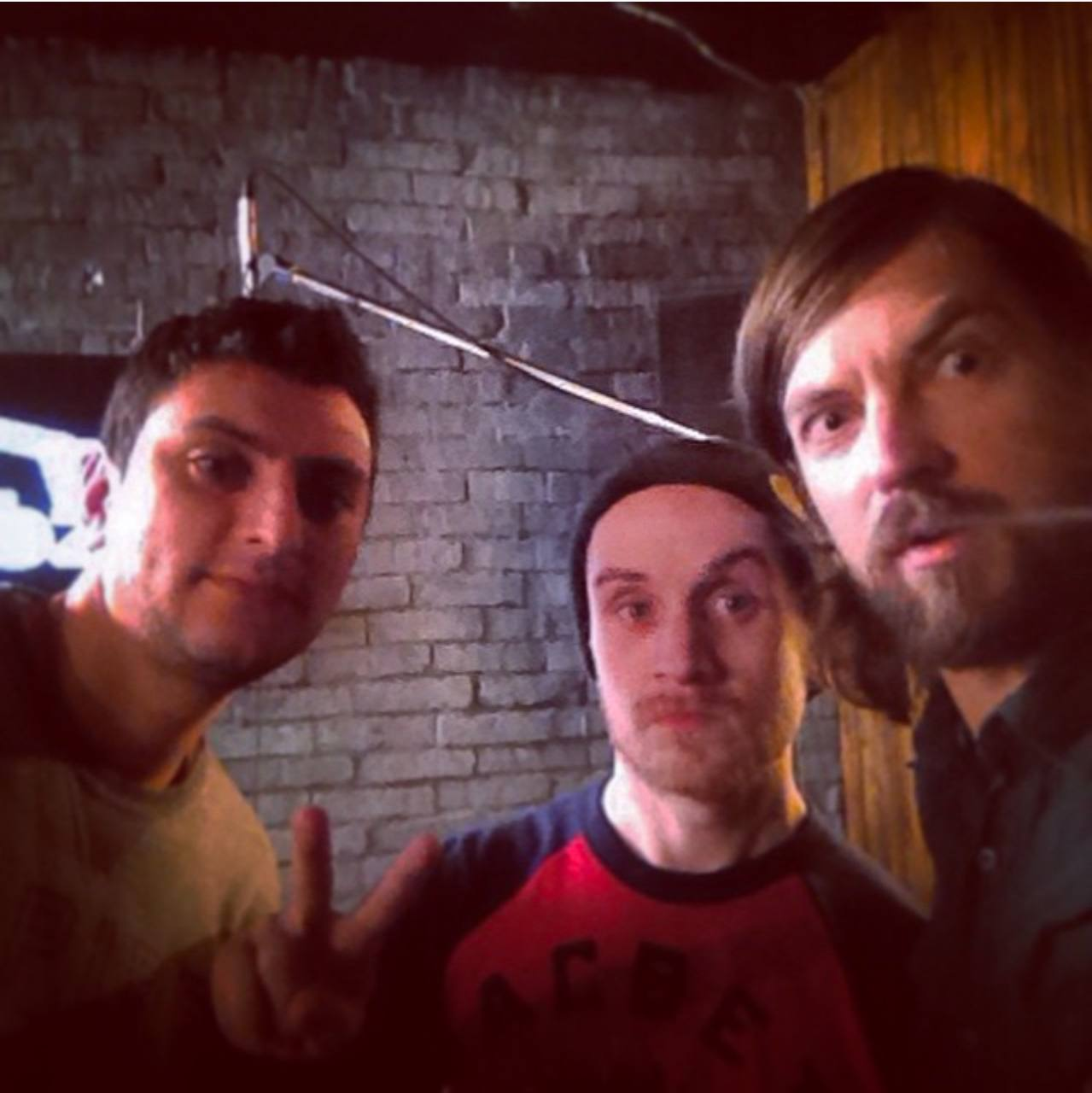
    That’s when Sasha Buratynskyi stepped in. In previous life, Sasha had a strong connection to the music world. He played in a band called In Diana, worked as a sound engineer, and even created video interviews with drummers. One such interview featured Oleksandr Solokha, a talented drummer known for his work with O.Torvald, Lika Bugaeva, and DJ Tapolsky:

    Sasha reached out to Oleksandr, who had since started composing his own music. To our delight, Oleksandr agreed to help—and he nailed it on the first try. His track perfectly captured the meditative, relaxing, and emotional vibe we were aiming for. It’s amazing how old connections can lead to such serendipitous outcomes years later!

    Photo of Sasha Buratynskyi and Oleksandr Solokha made in 2015
    Photo of Sasha Buratynskyi and Oleksandr Solokha made in 2015

    Conclusions

    Now that the app has been live for several months, we can confidently say the app soundtrack has achieved its goal. While notions like “meditation” or “emotional connection” can’t be directly measured, their impact is evident in one key metric: session length. Users are spending significantly more time in the app, proving that the music creates a more engaging experience.

    Another important insight is that only 8% of users turn off the music in Settings. And personally, I sometimes just turn on tTravel to listen to it 🙂

    Download tTravel on iOS or Android if you haven’t done so yet. And stay tuned for more stories about the creative journey behind tTravel!

    By: Artem Shambalov

  • App design with AI – the Story of tTravel

    App design with AI – the Story of tTravel

    In the era of artificial intelligence, the new tTravel app stands as a synthesis of human and AI creativity. From conceptual design to detailed visuals, AI played a pivotal role in shaping the app’s aesthetic and functionality. In this article, I’ll delve into the development of tTravel app design with AI, focusing on the creation of country thumbnails, wallpapers, stickers and our mascot, Me.

    If you prefer video format, here’s a video about developing our app design with AI:

    Country Thumbnails: A Unified Aesthetic

    In the new app’s concept we completely restructured the itineraries database. This required a dedicated folder for every country of the world. Naturally, each folder needed a thumbnail, but finding the right approach wasn’t easy.

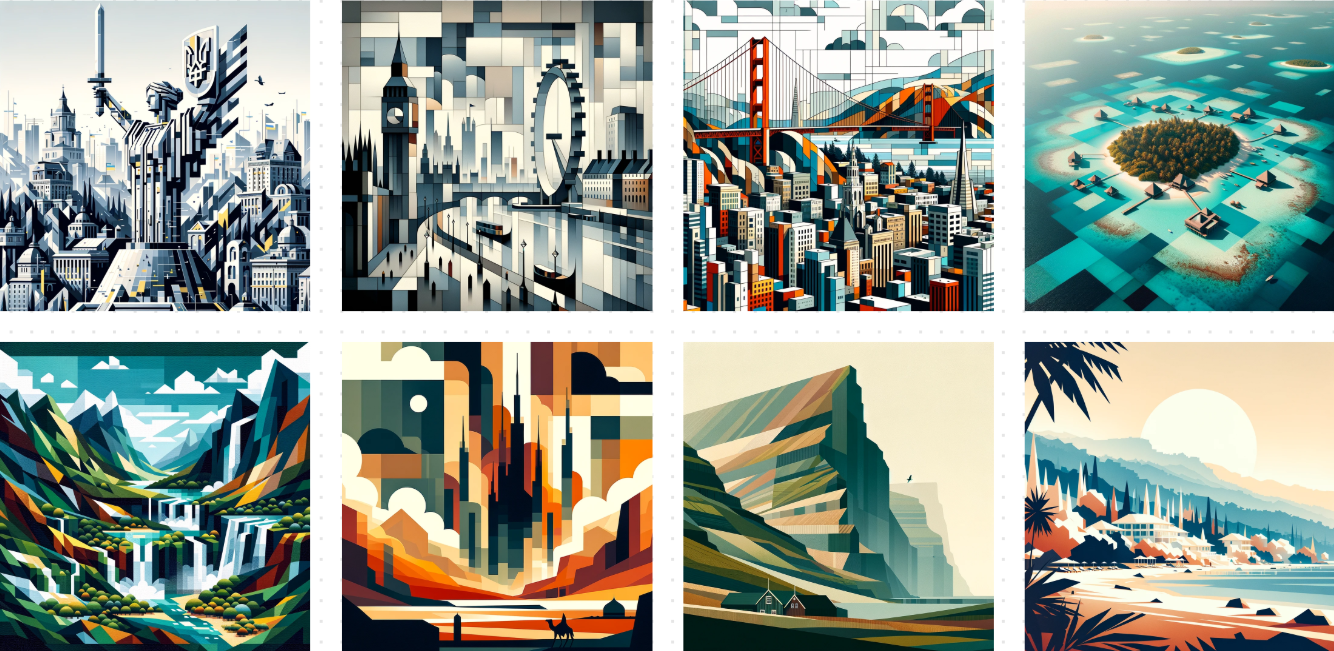
    Using the tTravel logo for every thumbnail felt monotonous, while stock photos appeared too inconsistent and cluttered. This led to the idea of creating unique thumbnails in a consistent style—a blend of cubism and minimalism. This style not only complemented the geometric theme of our mascot, Me, but also offered a clean, modern aesthetic for the app.

    One of the famous painters who worked in the cubism style was Picasso. When I started generating images for the app, I didn’t expect to match Picasso’s level, of course… just not ending up with Picasshole art would be fine 🙂

    To generate images, I used DALL-E. And I was greatly impressed by the results carefully crafted prompts could yield. Of course, it required a bit of a tweaking, but in general I should say that DALL-E understood the task pretty quickly and generated incredibly beautiful images, some of them I may even call masterpieces!

    AI-generated country thumbnails in tTravel
    AI-generated country thumbnails in tTravel

    Overall, it took me about 2 weeks to generate thumbnails for about 200 destinations but it was definitely worth it. We achieved a cohesive and visually appealing interface for the Plans and Memories widgets. The feedback from users was overwhelmingly positive. Many shared that they spent up to 10 minutes just admiring the country thumbnails and flipping through their widget pages on the dashboard. A truly brilliant AI contribution to the app design.

    Wallpapers: Building Universes

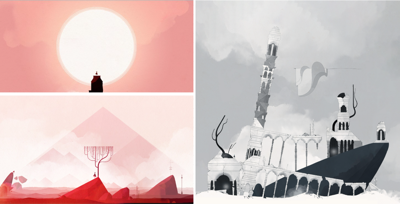
    Initially we planned the wallpapers to be drawn by professional illustrators. I was greatly inspired by the level design in Gris video game and wanted something similar for our wallpapers, aligning with the minimalist cubist aesthetic.

    Level designs in Gris
    Level designs in Gris

    Unfortunately, none of the illustrators we found came close to the idea we were aiming for.

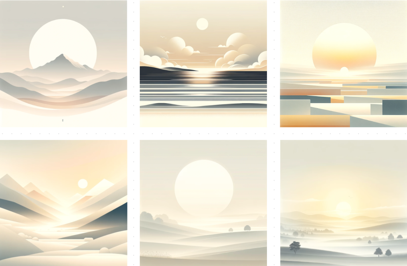
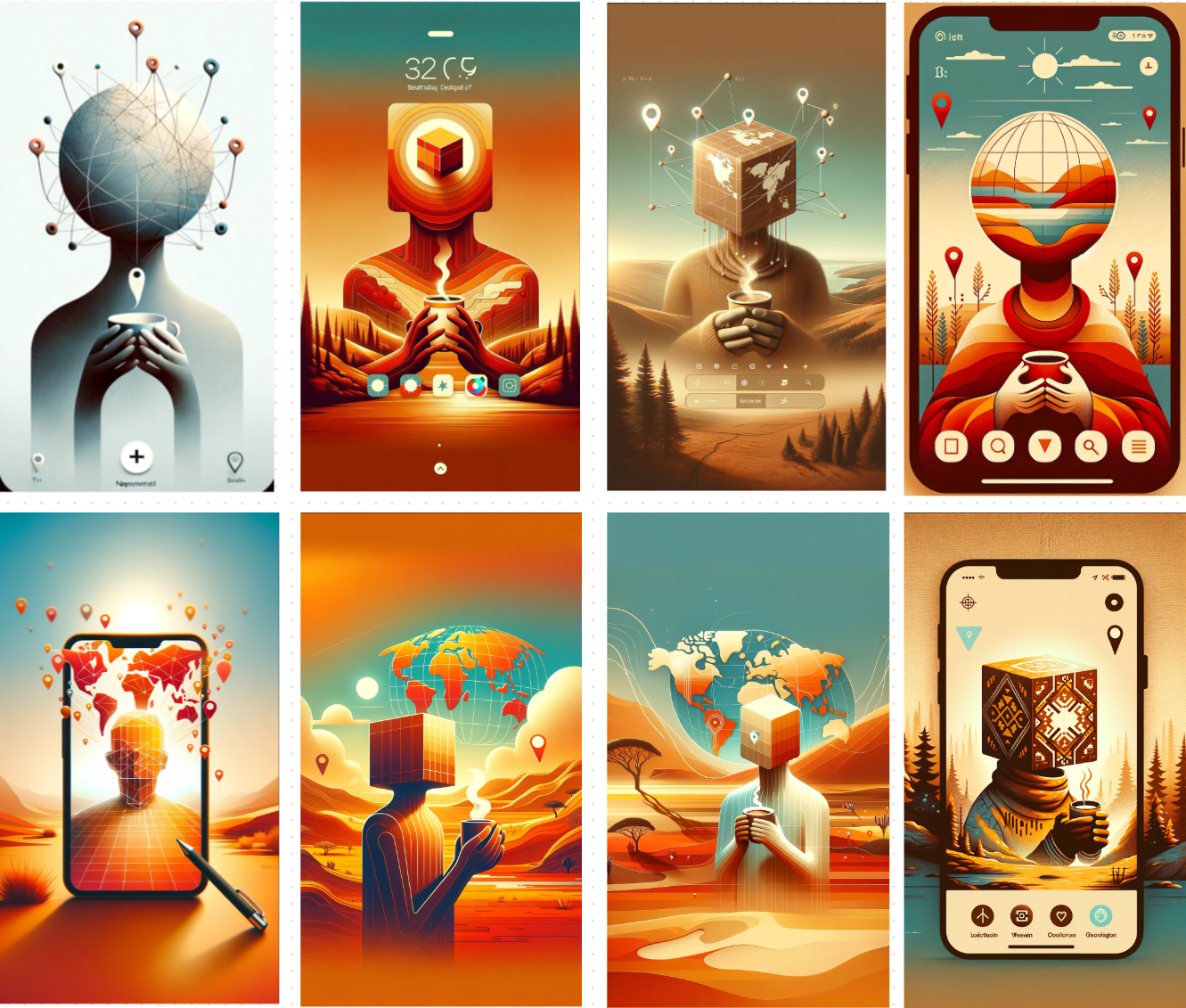
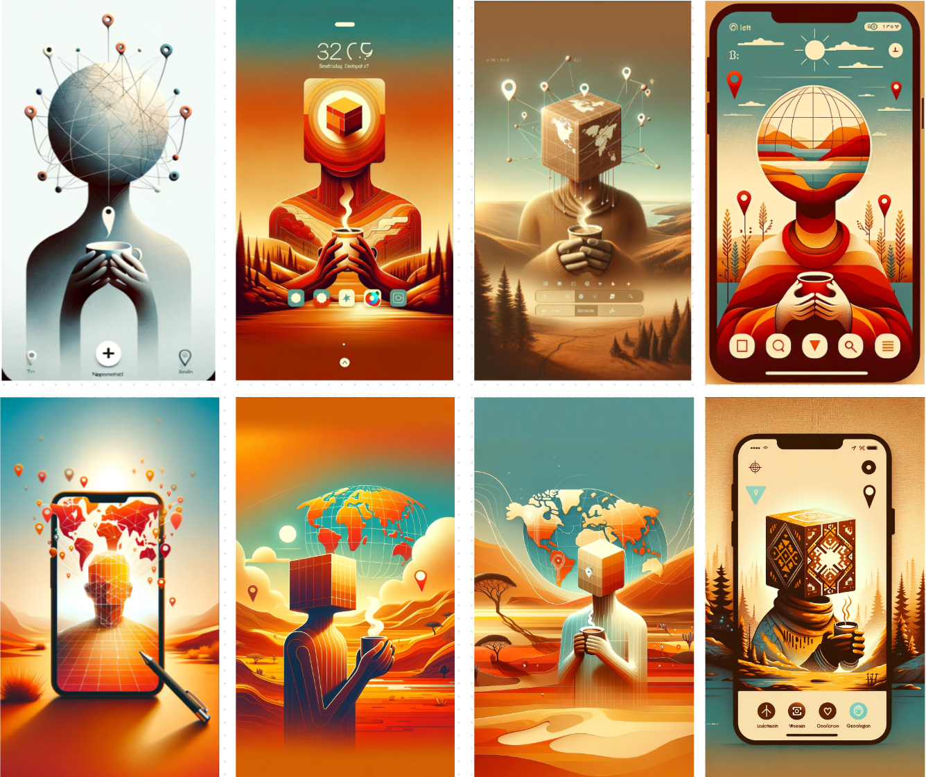
    That’s why I decided to experiment with DALL-E once again—and it didn’t disappoint. Within a short time, I generated a dozen mesmerizing wallpaper concepts, all reflecting the style we envisioned.

    AI-generated wallpaper concepts in tTravel
    AI-generated wallpaper concepts in tTravel

    The only drawback was DALL-E’s inability to produce vector graphics, which are essential for implementing future parallax effects we have in mind.

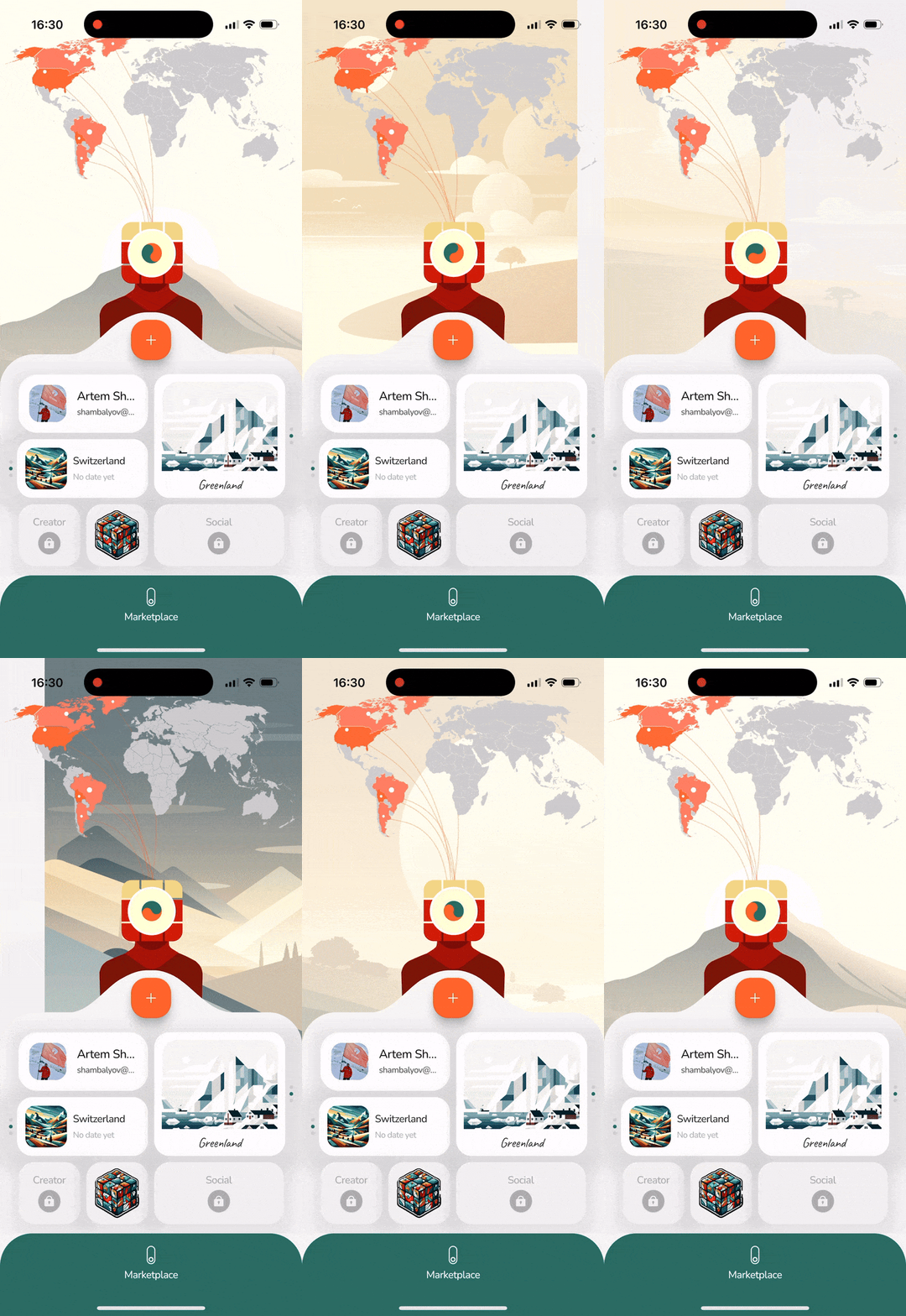
    To address this, we selected the best AI-generated designs as references and handed them to an illustrator—an acquaintance of Sasha Buratynskyi—who recreated them in vector form. The result was a stunning collection of wallpapers that brought the app’s artistic vision to life.

    Wallpapers customization in tTravel
    Wallpapers customization in tTravel

    Check out our tutorial article about wallpapers customization in tTravel.

    Stickers

    Many apps reward users with badges, often generic in design and logic of unlocking. I decided to approach the concept of rewards from a different angle. First of all, I thought traveling is associated with stickers rather than badges. Think about it:

    • Many travelers have stickers on their passports, suitcases, laptops and smartphones. 
    • Some leave stickers abroad as a memento, hoping to find them years later. It’s like leaving a part of yourself in some place abroad that’s become dear to you.
    • After all, if the stickers receive positive feedback we might even consider printing and selling them as tTravel merch.

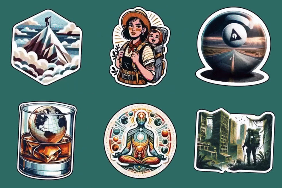
    Our stickers were also made with DALL-E. But it was a challenging process.

    Stickers in tTravel
    Stickers in tTravel

    Step 1: Ideas and Prompts

    First, I created a list of sticker ideas, names and the actions users could take to unlock them. Each sticker needed to stand out, often incorporating Easter Eggs paying tribute to iconic movies, series, musicians, or video games.

    Step 2: Visualizing Stickers with AI

    Then, I wrote prompts to visualize each sticker separately. It was harder than with countries’ covers or wallpapers, because the ideas of the stickers were often pretty complicated for AI to understand and visualize in the right way. I even had to abandon some ideas and choose simpler ones. 

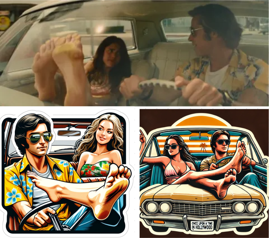
    For example, a sticker for the car traveling itineraries was initially meant to be a tribute to the scene with Brad Pitt and Margaret Qualley from Quentin Tarantino’s Once Upon a Time in Hollywood, nodding to Tarantino’s fondness for including foot shots in his movies. With this one, DALL-E constantly messed up with the legs, number of fingers and the car composition.

    Attempted sticker tribute to Tarantino
    Attempted sticker tribute to Tarantino

    Despite the challenges, I believe we’ve created a solid first iteration of stickers. They’re unique, meaningful, and aligned with tTravel’s vision of making every user interaction personal and enjoyable.

    But this is just the beginning. If you have ideas for new stickers or suggestions to improve the existing ones, we’re all ears! Collaborating with our community is essential to making tTravel even better. Who knows? Your idea could be the next standout sticker in the app—or even on someone’s suitcase.

    Me sketches

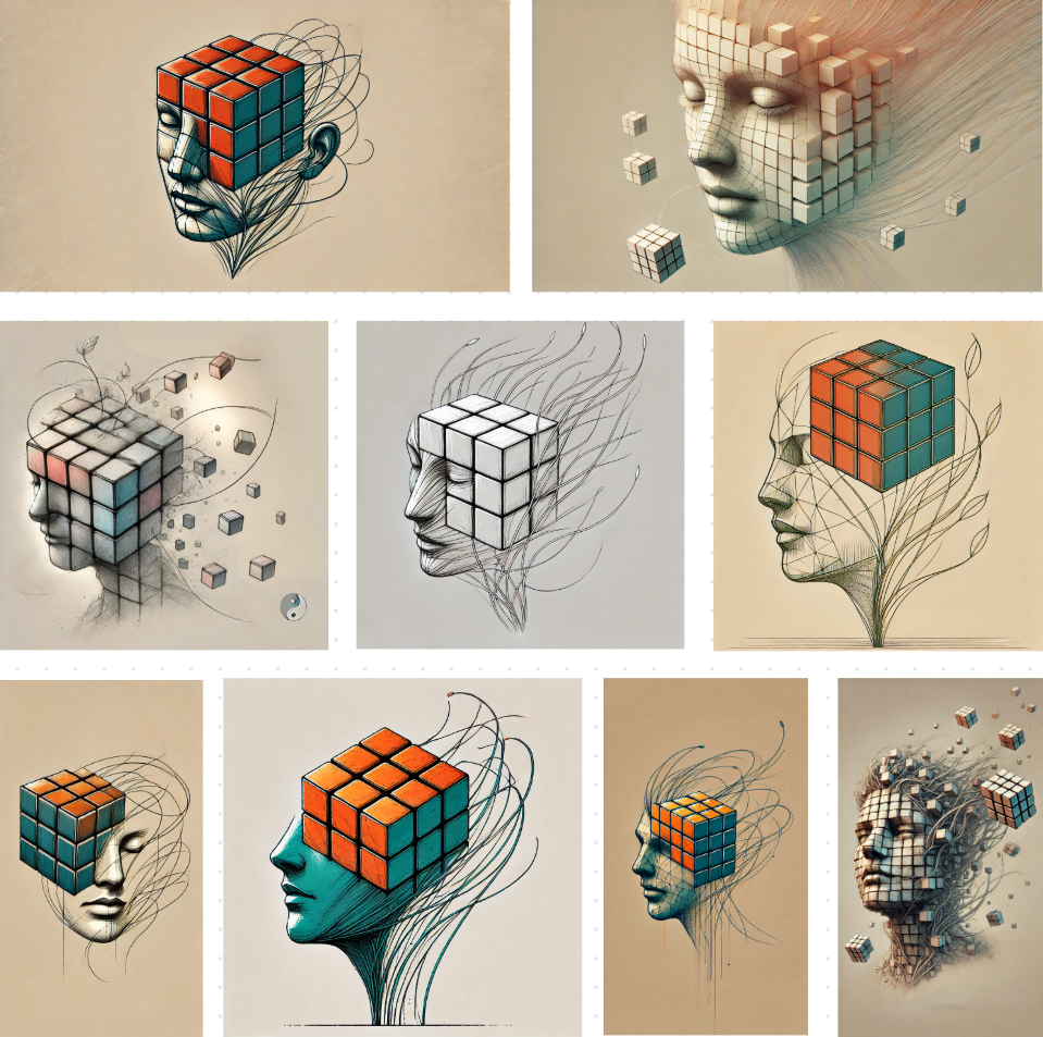
    The development of Me, our mascot, was another area where AI had a significant impact. From early sketches to the final design, DALL-E played a key role in refining Me’s appearance. For the full story on how AI influenced Me’s development, check out this article.

    AI-generated mascot sketches for tTravel
    AI-generated mascot sketches for tTravel

    The Artistic Impact of AI

    Incorporating AI into the development of tTravel app design allowed us to merge human creativity with cutting-edge technology. AI didn’t just save time; it elevated the app’s design by providing unique, cohesive visuals that resonate with our users.

    As we continue to innovate, AI will remain a vital tool in shaping tTravel. Stay tuned for more updates on how we’re blending art, technology, and travel into a seamless, personalized experience.

    Download tTravel on iOS or Android if you haven’t done so yet. Until next time.

    By: Artem Shambalov

  • We Reinvented the Scratch Map – Here’s How

    We Reinvented the Scratch Map – Here’s How

    One of the biggest novelties in tTravel 2.0 is the Scratch Map. Of course, it’s not a big innovation. Most of our competitors already have a similar feature implemented. But remember what I said in our article about building a travel app in wartime? Competitors enjoy numerous advantages. To stand out, we needed to push boundaries and approach familiar features with bold creativity.

    The mission was clear: create a map so distinctive and unexpected that users wouldn’t mistake tTravel for anything else on the market.

    If you prefer video format, here’s a video about our scratch map creation:

    Threads

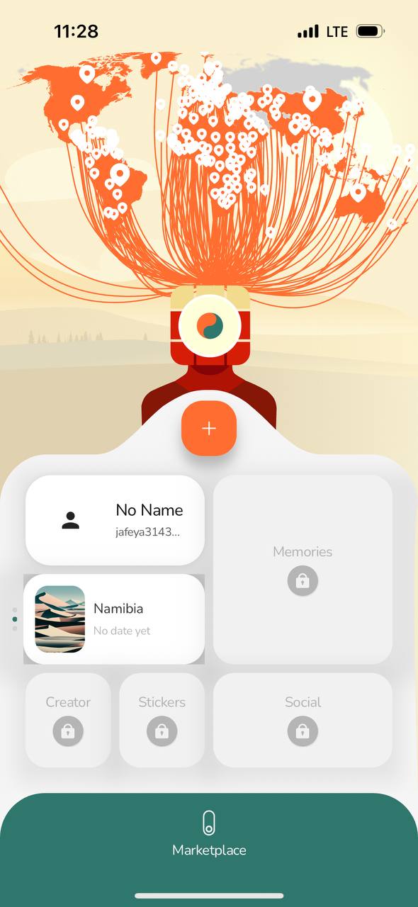
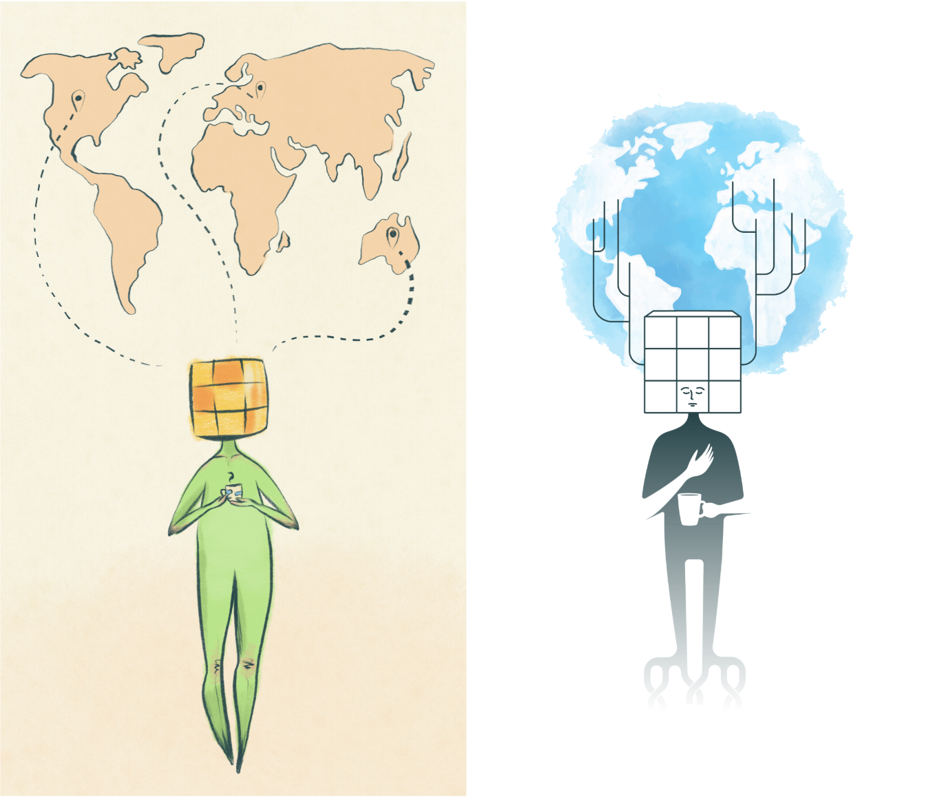
    I came up with that idea to merge the Scratch Map with Me, our mascot, in a gamified way. This involved threads growing from Me’s head and extending to the map, coloring countries that users added to their Plans or Memories. The concept sounded fun and innovative, but execution proved challenging.

    At first, we projected the threads on top of the map, ending in geo pins at their tips. It worked for a few countries, but once entire continents were colored, the map became a chaotic tangle of lines that almost made us abandon the whole threads concept. Just look at this mess:

    Chaotic tangle of threads in early iterations
    Chaotic tangle of threads in early iterations

    We were really having a hard time finding the solution. However, a collective brainstorming effort saved the day:

    • Thinner Threads & Lower Opacity: Making the threads less intrusive visually.
    • Switching Layers: Moving the threads to the back layer, hiding them under the map.
    • Replacing Geo Pins with Dots: Simplifying the endpoints for a cleaner look.

    Through these adjustments, the concept evolved into a polished and functional feature.

    Improved threads look after refinement
    Improved threads look after refinement

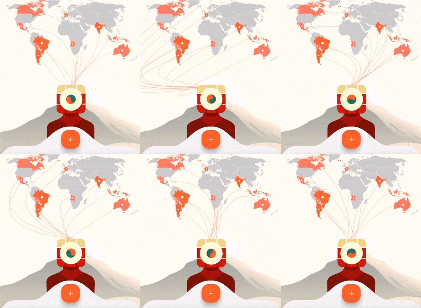
    However, the best part of the threads feature, to my mind, is that they are actually alive! This was another great idea by Kedri. By integrating the smartphone’s accelerometer, he made the threads “alive,” swinging side to side as users tilted their phones. This hypnotic motion added a playful, dynamic element to the app, significantly increasing session lengths.

    By the way, if you’re interested in the hidden senses behind the threads, read this article about the concept of our mascot.

    Threads swaying animation
    Threads swaying animation

    Color-Coded Layers: Plans and Memories

    At first, we considered an option of having a single layer of the map with different colors. But having one country in both Plans and Memories really turned that version into a confusing mess:

    One-layered map version
    One-layered map version

    That’s when we came up with the idea of switching the map layer by swiping the cube (Me’s head) in any direction – literally making a turn of the cube shifting the perspective.

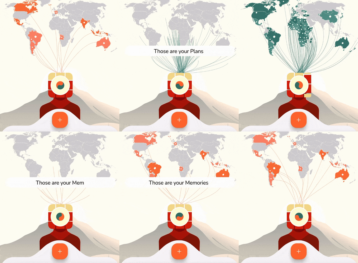
    As for the colors choice, we decided to color the Plans layer green, as it represents freshness and new beginnings. The Memories layer is colored orange, evoking warmth, vividness, and cherished experiences.

    Shades

    If you look close enough, you can see that our map layers are not uniform. They have different shades of green and orange. Right now the shades are placed randomly, but in the future it will have an awesome deeper meaning! Future updates will tie shades to time:

    • Brighter shades for recent additions: Reflecting vivid, fresh experiences.
    • Fading shades for older entries: Mirroring the nostalgic fading of old photographs.

    Inspired by polaroid photography, this feature adds a temporal dimension to the map, making it a living archive of your travels.

    This was another awesome idea proposed by Kedri. Indeed, all co-founders put their share of creativity into the concept!

    Future Plans

    We’re just scratching the surface of the map’s potential. Here’s what’s coming next:

    • Shaded Logic: Implementing the temporal shading system for a deeper storytelling experience.
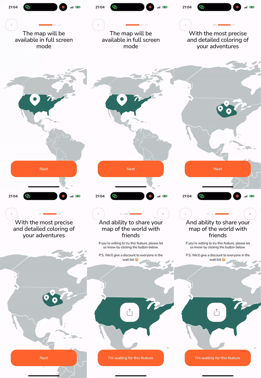
    • Full-Screen Mode: A feature that will take the Scratch Map to a new level. Unlike competitors, this mode will allow users to mark only the specific areas of a country they’ve visited, not just the entire territory. While details are under wraps, we promise a feature that will set tTravel apart even further.
    Future full screen map
    Future full screen map

    The Scratch Map in tTravel 2.0 is more than a feature—it’s a creative statement. From its interactive threads to its meaningful colors and dynamic layers, every detail reflects the collective creativity of our team.

    With more exciting updates on the horizon, we’re committed to ensuring tTravel continues to stand out as a unique and immersive travel companion. Stay tuned as we keep redefining the journey!

    And download tTravel on iOS or Android if you haven’t done so yet.

    By: Artem Shambalov

  • AI vs. Human Designers: How We Created tTravel Mascot Design

    AI vs. Human Designers: How We Created tTravel Mascot Design

    Developing the design of our mascot, Me, was a long and challenging journey that spanned 2-3 months. From struggling to convey our vision to illustrators to leveraging AI and animation technology, the process became a creative adventure of its own.

    If you prefer video format of storytelling, check out the video:

    Struggling with Illustrators

    Our initial approach was to work with professional illustrators to bring the concept to life. We reached out to about seven illustrators, providing them with detailed explanations and a wireframe reference to guide their designs:

    1st wireframe
    1st wireframe

    However, the results were far from what we envisioned. The mascot design either leaned too heavily into cartoonish and childish styles:

    cartoonish versions of Me
    cartoonish versions of Me

    Or presented overly literal interpretations of the concepts behind Me—such as the tree concept:

    tree versions of Me
    tree versions of Me

    Among the options, the simplest versions came the closest. They managed to partially capture the contemplative and transcendent vibe we were striving for:

    simplistic versions of Me
    simplistic versions of Me

    And we even considered stopping at one of them. Especially since it could be drawn in vector graphics making it much easier to animate. But we were cautious the overall home screen would look too dull with nothing catching the eye. And then there was our idea with wallpaper customization, for which we needed a mascot that stood out, serving as the centerpiece of any wallpaper universe.

    Turning to AI: The Game-Changer

    Frustrated by the lack of alignment with illustrators, I decided to experiment with AI tools like DALL-E. And it turns out AI understands me much better than people 🙂

    DALL-E generated numerous incredible versions of the mascot design and the wallpapers, giving me a burst of inspiration and creativity.

    At the same time it was incredibly difficult to choose the best version. What I can say for sure is that AI definitely complemented the concept. Just check out some of the coolest designs it came up with:

    AI generated versions of Me
    AI generated versions of Me

    However, there was one major drawback with the imagery DALL-E created: they couldn’t be directly transformed into vector graphics, which are essential for animation. This is when Sasha Buratynskyi stepped in, recalling his artistic skills to recreate the chosen mascot design in vector form.

    By simplifying the AI-generated image, Sasha made it possible to animate Me while retaining its essence.

    Rive Animation

    For animation, we chose Rive technology. With the help of Dmytro Ruban our Me was brought to life (it is literally breathing if you take a closer look!), but only in 2D for now – to animate in 3D it needs to be redrawn. So, if any of you reading this article is inspired by tTravel and would like to make a 3D version of Me, contact us by sending email to info@ttravel.me

    Me breathing animation
    Me breathing animation

    Interaction with Me. Hints.

    From the very beginning, we knew we wanted our Me to interact with users, to be their travel companion, guide and assistant. The question was how exactly it should communicate. Should we give it hands or face? Should it have any emotions depending on users’ actions?

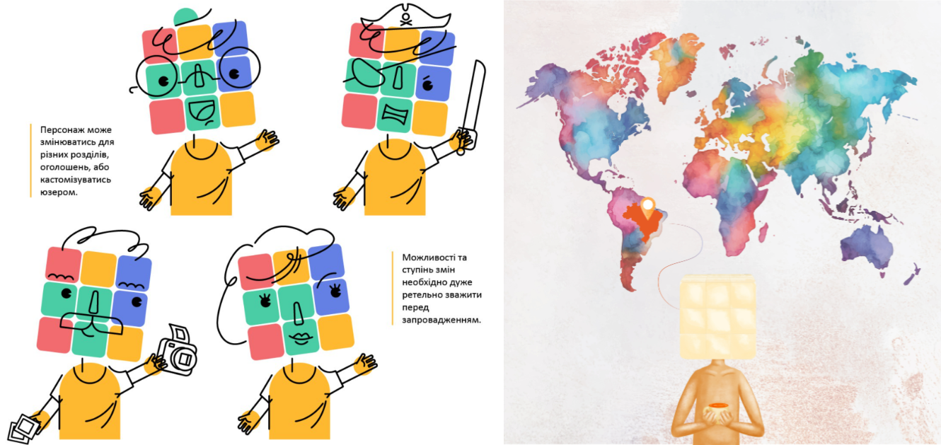
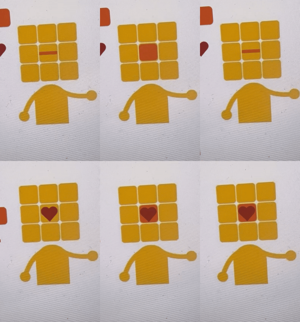
    At some point I came up with the idea of central cube animation – turning into different emojis or icons:

    Me's central cube animation
    Me’s central cube animation

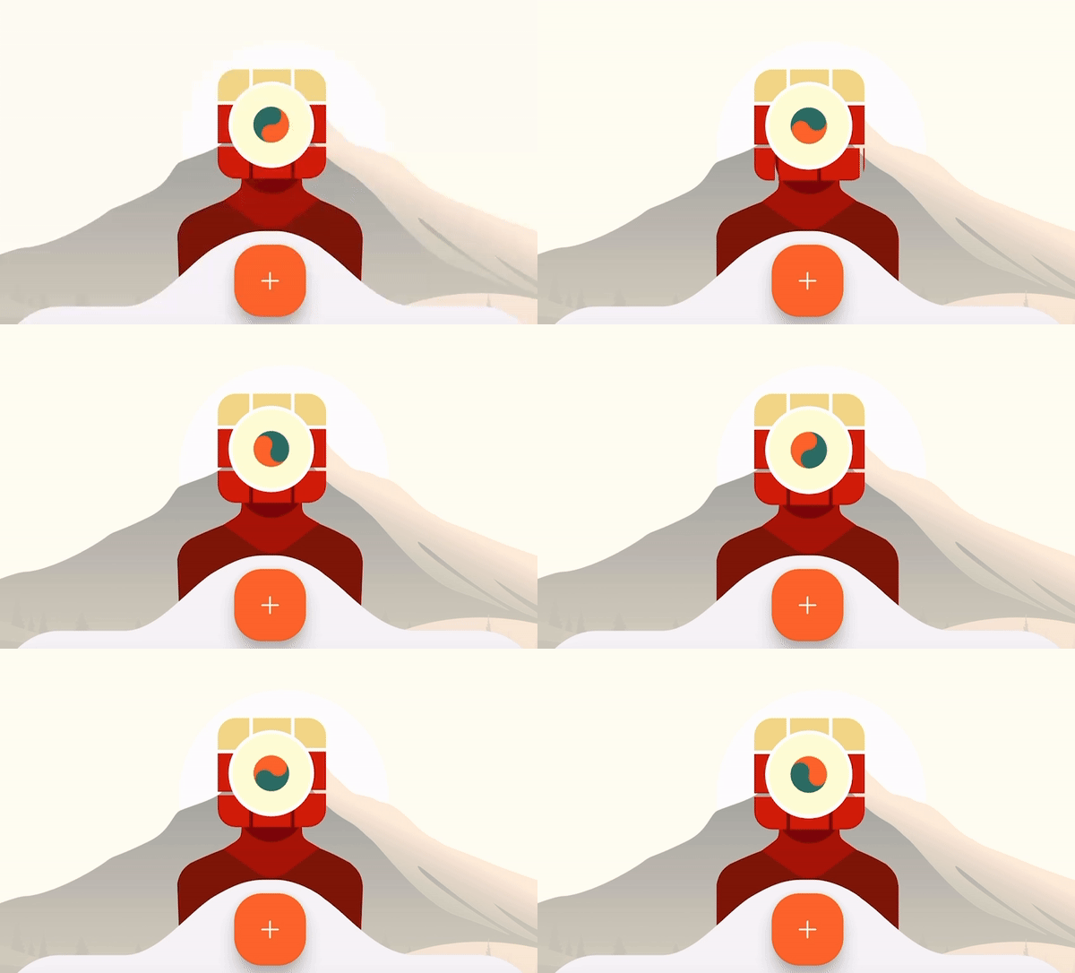
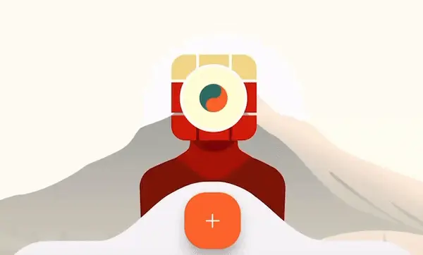
    Ultimately we came up with a circle monitor and Yin and yang sign (check the article about Me’s concept and hidden senses) replaced by other icons from time to time, giving Me a more technological vibe, but still there’s part of me that has warm feelings about that versions with central cube’s animations 🙂

    Me's version with circle monitor
    Me’s version with circle monitor

    Plans for the Future:

    Me’s evolution is far from over. Here’s what we’re working on next:

    • AI-Powered Features: Me will act as your personal travel assistant, like a travel-focused Siri or Chat GPT. We’re planning significant expansions of Me’s interaction with users, of course backed by AI. It will search for travel information like weather conditions, hotels, car rental, flight info etc. Also, it will provide inspirational tips and help with itinerary building.
    • 3D Animation: A fully animated 3D version of Me is in our sights, and we’re eager to collaborate with talented artists to make it happen.
    • Customizable Skins: We’re planning to introduce multiple skins for Me, allowing premium users to choose their mascot’s look.
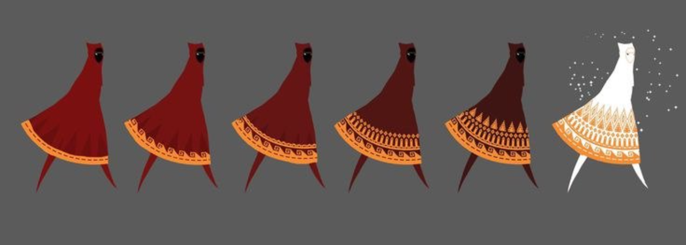
    • Gamified Progression: Inspired by Journey, we aim to incorporate gamification, where Me’s appearance evolves based on users’ achievements in the app.
    Wayfarer in Journey changes its look with every new game completion
    Wayfarer in Journey changes its look with every new game completion

    Download tTravel on iOS or Android if you haven’t done so yet. And stay tuned for the next articles. Until next time.

    By: Artem Shambalov
  • Concept of Me – The Hidden Meaning Behind tTravel’s Mascot

    Concept of Me – The Hidden Meaning Behind tTravel’s Mascot

    Our mascot Me is the soul of tTravel app. Its bizarre look might evoke a lot of questions. In this article, I will share all the answers and reveal hidden senses behind Me.

    tTravel mascot ‘Me’ – a minimalist, cube-headed character in idle state.

    If you’re more up to video content, here’s the video story based on this article:

    Why Me?

    In the initial concepts, we called our mascot “Istotka” (“creature” in Ukrainian)—a name I used when presenting the app concept to other co-founders.

    However, in the final stages of development, we decided to change the name, and here are some of the most interesting versions we considered:

    • Puzzle— rejected because of the letter “z.” ruzzian aggression against our country has tainted even a Latin letter, giving it negative associations.
    • Riddle— commonly used in computer games, where it refers to a puzzle the player must solve to proceed. Rejected due to the narrow audience and complex meaning.
    • t— an extra “t” in “tTravel” resulted from a typo by one of the co-founders, Oleksandr Buratynskyi, when he created the first group chat for co-founders. Naming our mascot “t” would be an additional justification for the name “tTravel”, but it still didn’t feel like the best option.
    • Me— the name we came up with when recalling our website domain ‘ttravel.me’. We considered it the best option, as we wanted our mascot to be a mirror of the user, but metaphorically—not as an explicit reflection. Some might see it as an assistant. Others might consider it a kind of Tamagotchi. And some might view it as their avatar. Plus, this name works well with the hints Me gives to users.

    Why Does Me’s Head Resemble a Rubik’s Cube?

    Constructor

    Think about a Rubik’s Cube: it’s a mix of colorful pieces that, at first glance, might seem chaotic. But each turn brings you closer to a perfect, seamless picture. Travel, too, starts with a beautiful mess: ideas, dreams, and destinations waiting to be pieced together. And that’s what Me symbolizes — the challenge and joy of solving a puzzle of a perfect journey by means of our itinerary constructor.

    Sketches of Me symbolizing travel planning

    Self-discovery

    Travel shapes us, expands our worldview, and reveals new sides of ourselves—just like solving a Rubik’s Cube reveals an unexpected, colorful harmony. Me’s head serves as a metaphor of self-discovery through traveling.

    Sketches of Me symbolizing self-discovery

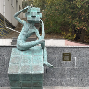
    A striking reinforcement of our concept is the sculpture “In Search of Your True Self” by Ukrainian sculptor Bohdan Kazachenko. I came up with the concept of Me before seeing this sculpture, but it was a real pleasure coming across it, as it really shored up the idea behind Me’s concept.

    “In Search of Your True Self" sculpture by Ukrainian sculptor Bohdan Kazachenko
    “In Search of Your True Self” sculpture by Ukrainian sculptor Bohdan Kazachenko

    The Meaning Behind Threads

    Threads connecting Me with the map of the world is another hugely important feature of our mascot and Home screen in general.

    When I came up with this idea, I couldn’t imagine our co-founder Kerdi Plok would implement it with such a cool mechanic — threads are reacting to you tilting the smartphone!

    Let’s break down the symbolism behind them.

    tTravel mascot ‘Me’ – a minimalist, cube-headed character with threads connecting to a world map, symbolizing self-discovery, travel connections, and the journey of exploration.

    Mental Ties

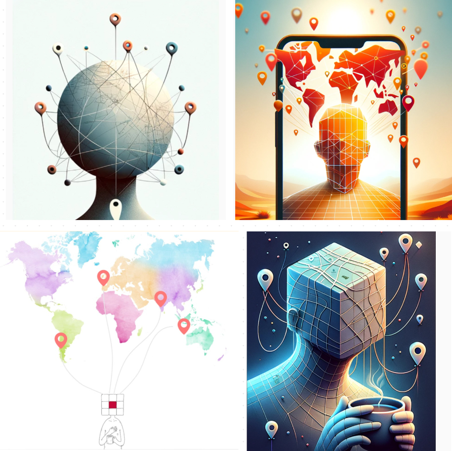
    Travel memories are among the most cherished and vivid ones. By means of threads I tried to depict special bonds we make while traveling, tying together places, people, and experiences. I call these bonds ‘mental ties’ with the world.

    When Me grows mental ties with the map, it becomes a ‘Tree’ symbol — a symbol of life and growth. Thus, I aimed to give users a subconscious feeling of self-growth and fresh air in the app.

    Sketches of Me's mental ties with the map of the world

    Tree

    When Me grows mental ties with the map, it becomes a ‘Tree’ symbol — a symbol of life and growth. Thus, I aimed to give users a subconscious feeling of self-growth and fresh air in the app.

    Matrix

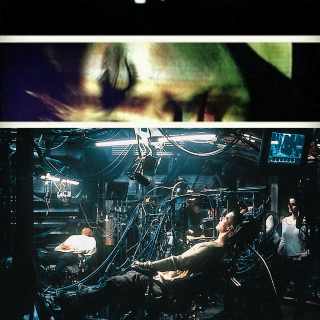
    Another source of inspiration for us was the concept of Matrix, where people plunge into the Matrix through cables connected to the back of the head. This way we also aimed to show that users can relive their travel memories in tTravel.

    Conceiving

    Finally, I metaphorically aimed to symbolize the process of conceiving a travel plan — I guess, no explanations needed after looking at the pictures 🙂

    Images of sperm cells resembling geopins

    Yinyang, Colors and Drawing Style

    When developing the concept of new tTravel, I was also greatly inspired by two indie games: Journey and Gris.

    Journey

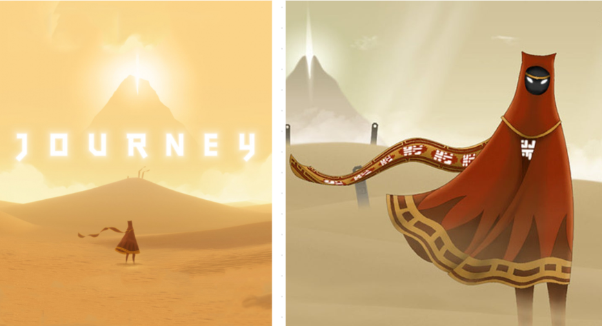
    In Journey you play as an abstract wayfarer heading to the ‘Mountain’. Along the way, you meet companions that look very similar to you and ultimately you understand that it’s not about the final destination, but about the journey itself, which in fact is a never-ending one, and the companions you share it with. This idea had a huge impact on our concept.

    The colors of Me are similar to the colors of a wayfarer you’re playing for in Journey, and the mountain behind Me’s back on the main wallpaper is in fact an Easter egg of the “mountain’ from Journey. Hence, the concept of Me metaphorically depicts both user and user’s travel companion.

    The Yinyang symbol on Me’s screen is also a reference to Journey, as in the end of the game you realize that you were heading to the ‘mountain’ just to start your journey over and over again. This inspired me to come up with a never-ending cycle of travel content in the app: at first you plan your journey using the travel experience of other people, then this experience becomes yours and your updated knowledge serves as a guidance for the next travelers forming a never-ending cycle of travel content creation and updating.

    Wayfarer and mountain from Journey

    Gris

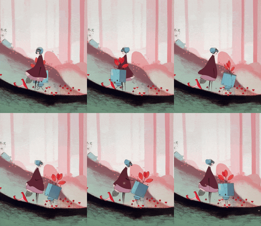
    Character and level design in Gris served as a huge inspiration for me as well. In terms of our mascot, its look was strongly influenced by a square-headed companion you meet along the way in Gris.

    In terms of wallpapers I really wanted tTravel to have the same visual vibe. We achieved it by combining AI and human creativity.

    But the main source of inspiration from Gris for me was its OST. Composed by Berlinist, it guided me through months of work over the new tTravel concept. The first concept video I pitched to my co-founders was accompanied by Gris OST. I dreamed of having a similar soundtrack in the app and it’s such a pleasure that we’ve achieved that. Soon, we will release an article about soundtrack creation as well, so stay tuned!

    Square-headed companion from Gris indie game

    Conclusions

    tTravel has been deeply inspired by the world of art in all its forms—cinematography, music, sculpture, video games, and even AI-generated art. These influences have shaped the app’s design, features, and overall experience, blending creativity with functionality to create a platform that isn’t simply a tool, but an artistic expression. From visual aesthetics to interactive elements, every detail reflects our passion for art and travel.

    Follow tTravel for more stories and insights into the creative journey behind the app. Download tTravel on iOS or Android if you haven’t done so yet. And stay inspired to explore the world with us!

    By: Artem Shambalov