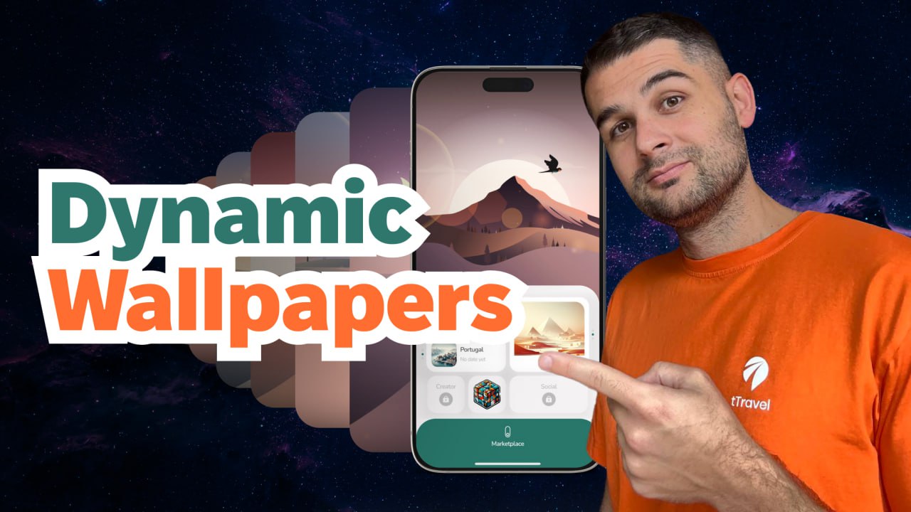
We’ve turned our app’s home screen into a living universe that changes throughout the day. This became one of the most artistic features in our app and in this article, we’re going to reveal the peculiarities of its implementation.
If you prefer video format, there you go:
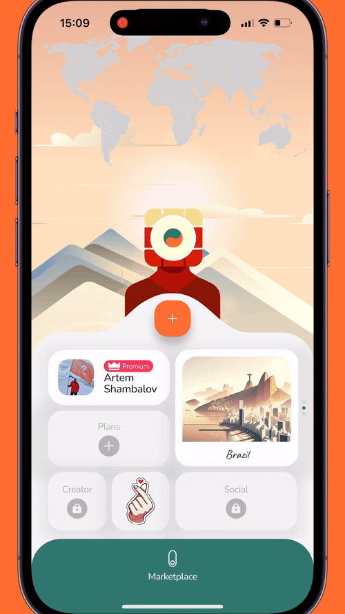
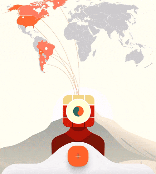
Over the past year, only 6% of tTravel users changed their wallpapers – most didn’t even know the feature existed as it wasn’t explicitly shown. So we thought: how can we give users a little nudge without spoiling the Easter-egg feel?
To fulfill this task, we teamed up with Liuba Syrotiuk, a talented Rive animation artist we met at Lisbon Web Summit.
While brainstorming, we had two ideas for the hint in mind:
- Glowing wallpaper edges. Inspired by the halo effect in Journey.
2. A bird flying across the app’s home screen – something that sparks interest and makes you want to “catch” it, tapping the screen. And when you tap, the wallpaper changes.
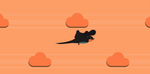
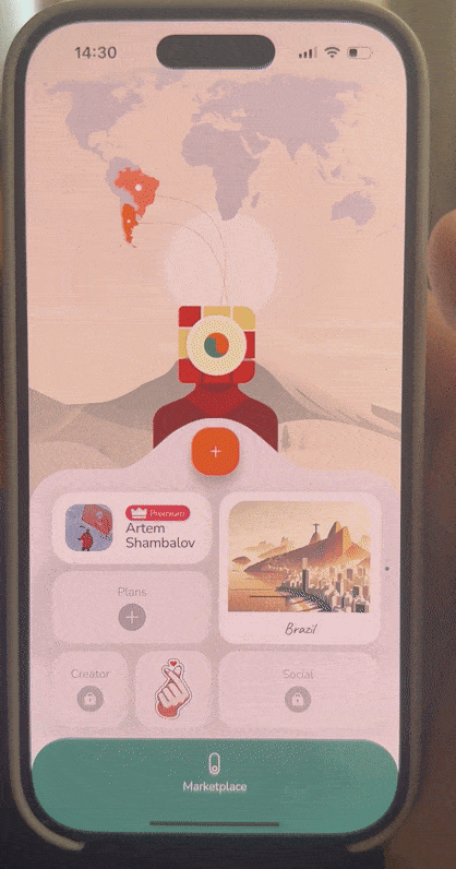
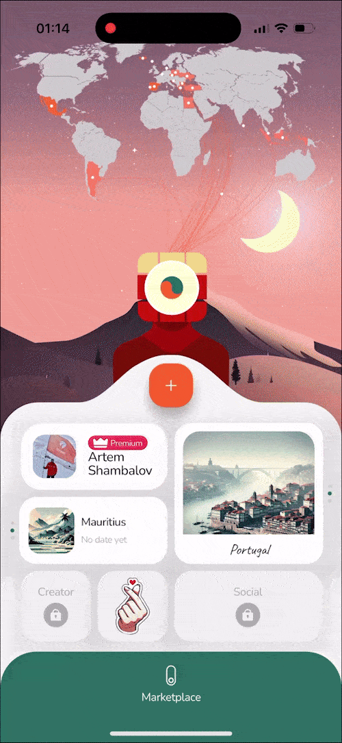
We chose the bird and decided to turn static wallpapers we had into universes with life, motion, and time.
First, Liuba expanded the designs of our old wallpapers
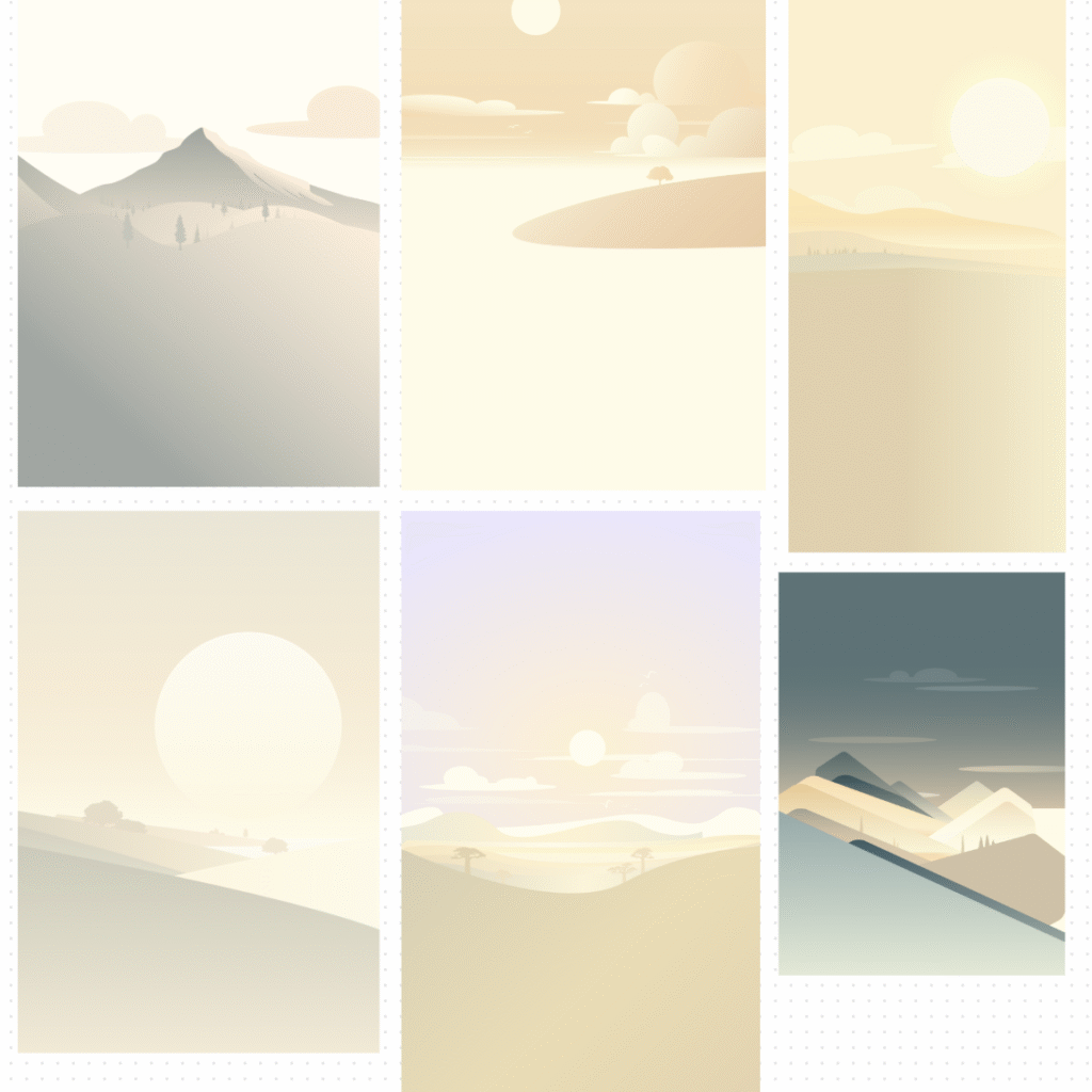
into seven new universes and applied color correction to align them with our app’s palette.
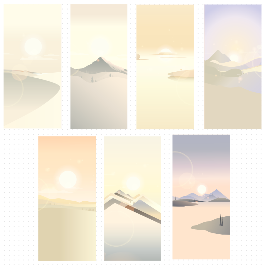
Then, in the Illustrator file, she developed time-based variations for each universe to create a full day–night cycle. Open the app in the morning and you’ll see a sunny landscape. Then get back in the evening and you’ll see a glowing sunset or a starry night.
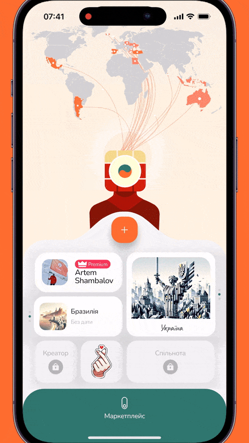
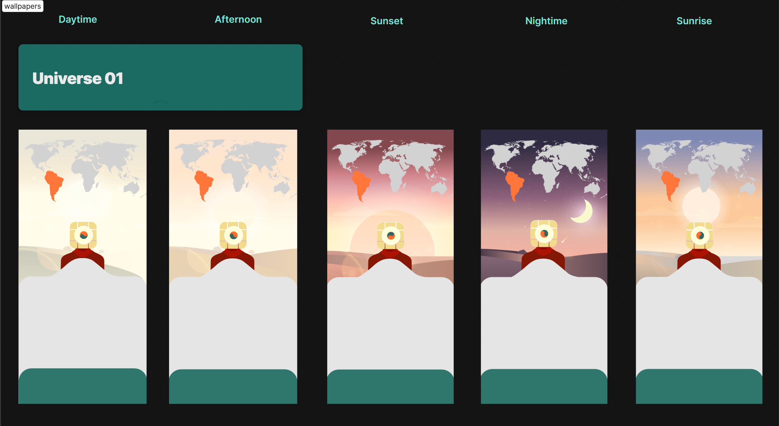
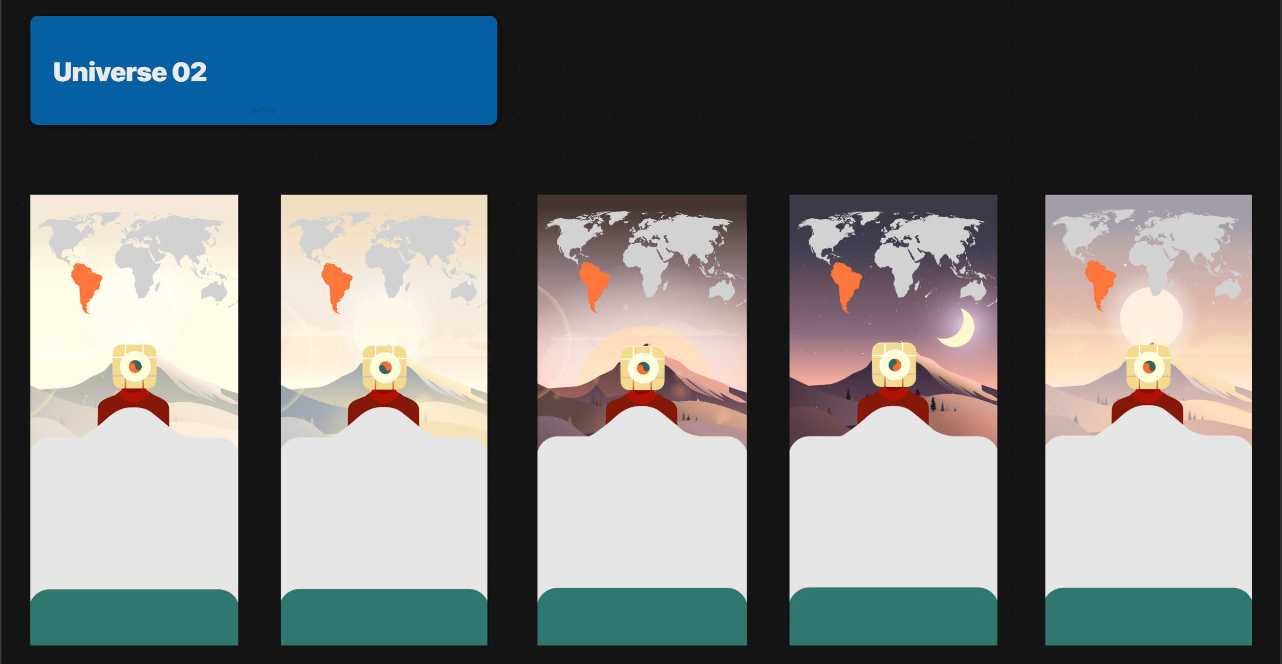
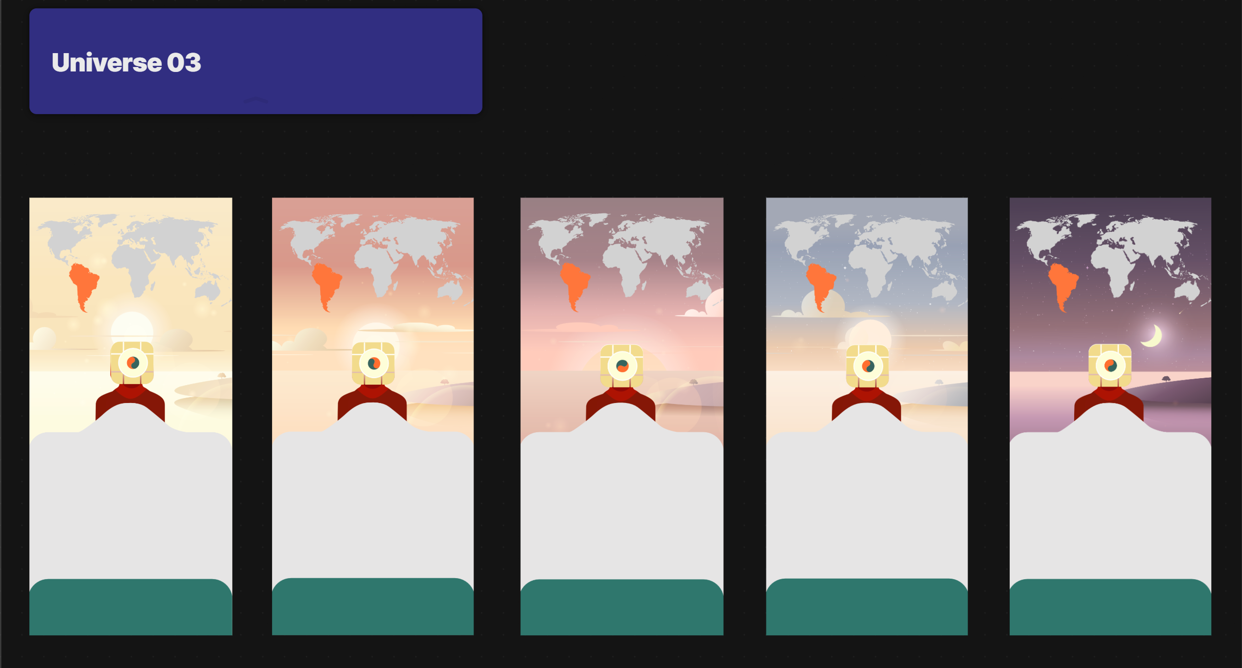
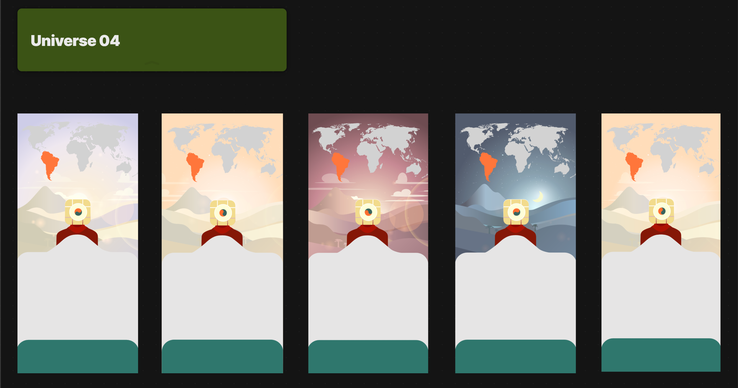
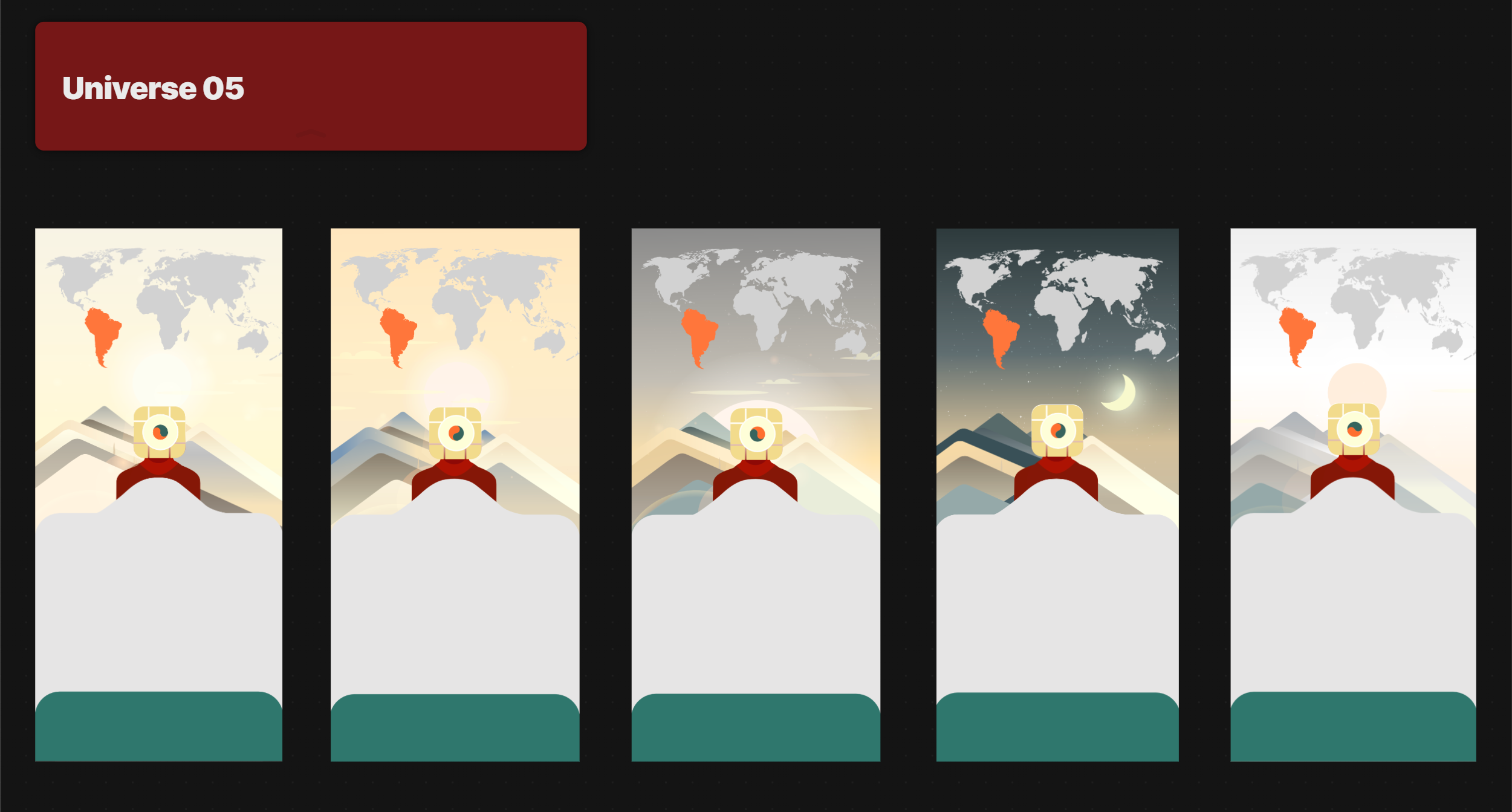
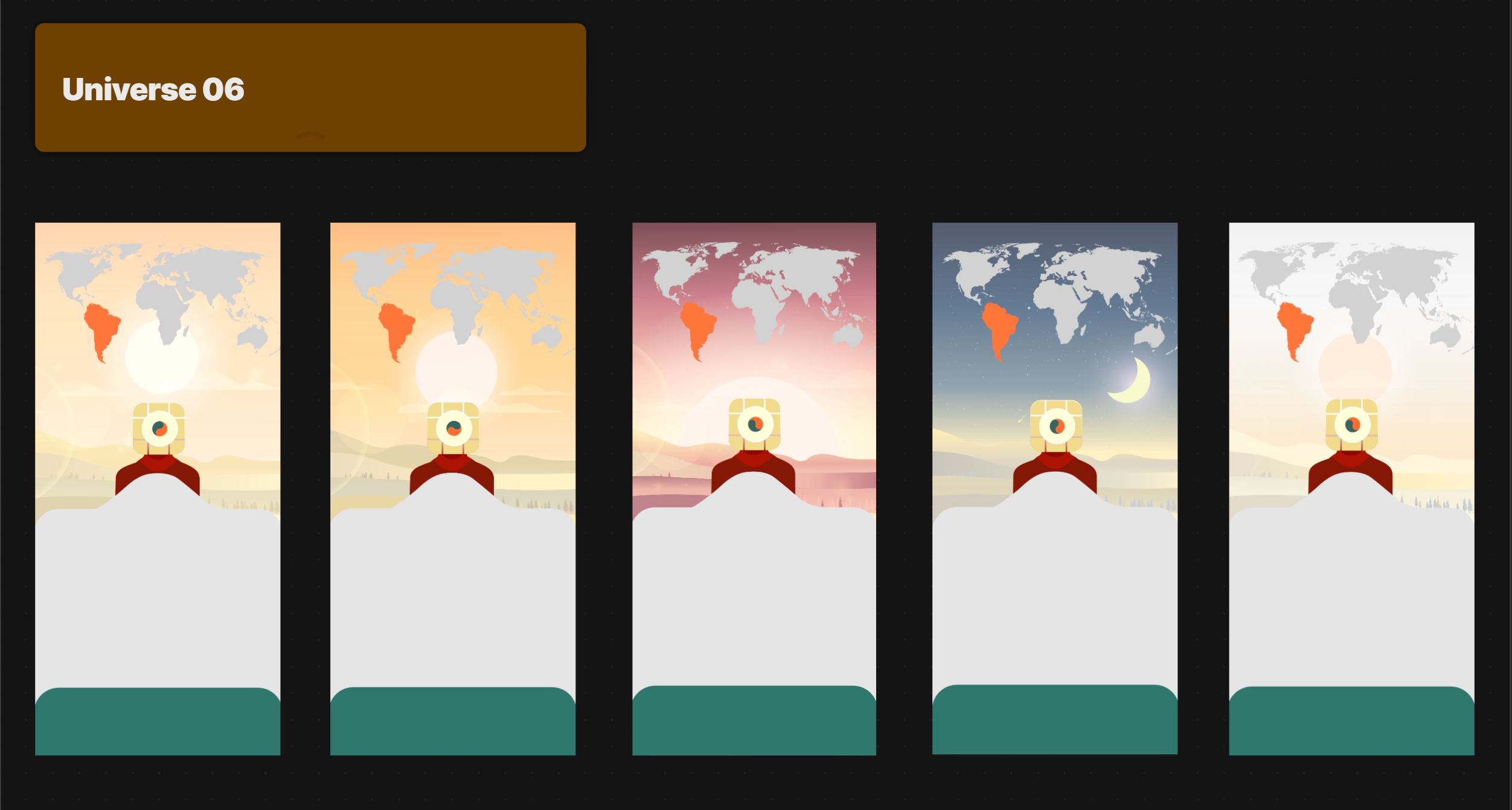
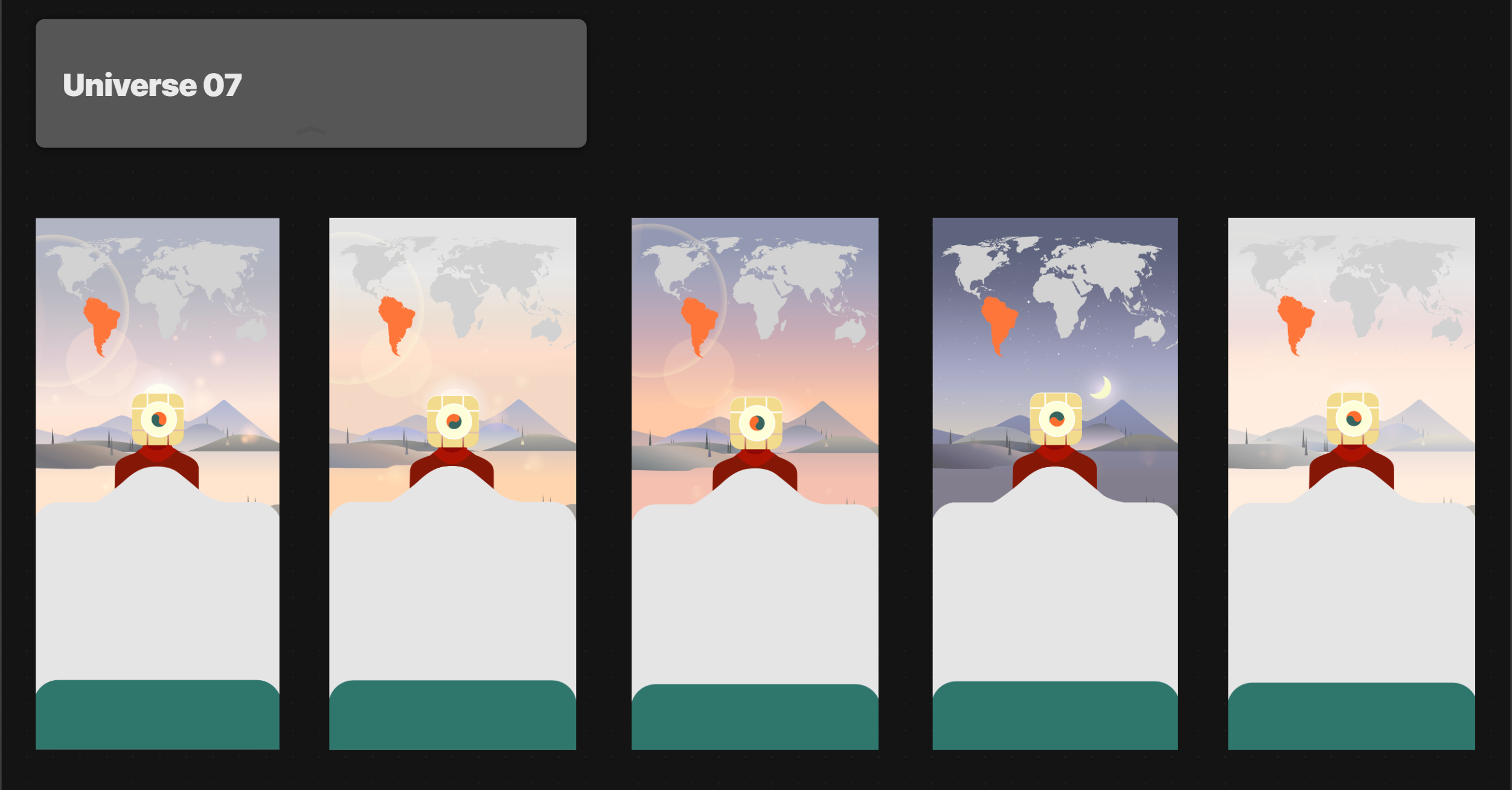
On top of that, Liuba implemented a parallax effect that responds to phone tilting, and added moving elements, like clouds or meteors, to draw the user’s attention.
Finally, we aimed for layered transitions – instead of static image swaps from the first iteration, now elements will smoothly fade and pan.
Designing smooth transitions
Here are Liuba’s notes about her working process and the difficulties she had while making our home screen alive:
One of the main design and animation challenges I faced wasn’t creating the parallax effect itself, but figuring out how to organize smooth transitions between two parameters for each universe: the time of day and the universe changes.
Our goal was to achieve a layered transition pan effect in which one element seamlessly replaces another. The first step in Rive was transferring everything from Illustrator, making sure the colors worked, fixing gradients, and setting up a simple pan effect.
Once everything was exported into Rive, I configured the parallax and fine-tuned the colors before shifting my focus to transitions.
At first, to test it, I built both transitions as separate layers, with any state changing through a simple trigger. We planned to build transitions with two numeric triggers: the first numeric trigger changes the universe, and the second numeric trigger controls the time of day (which should automatically change over 24 hours on its own). After testing the first Rive file, we realized we need triggers for each universe and each time of day so that developers can control it better.
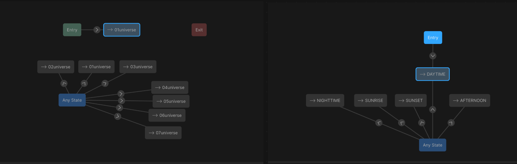
I tested different state machines, and to fix the universe transition I tried adding another layer with in/out animations for each universe, where the layers would move in and out. This approach worked when triggering either a universe change or a time-of-day change. At this stage, the transition looked better and felt smoother, but it still wasn’t perfect:
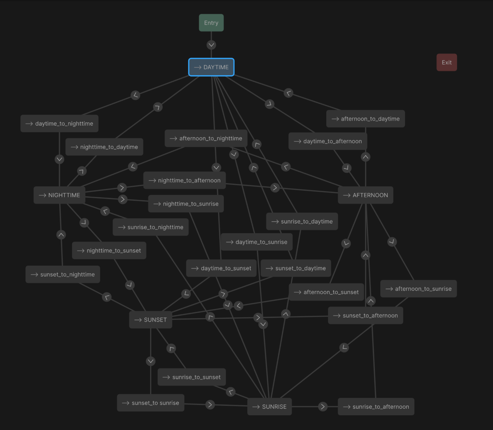
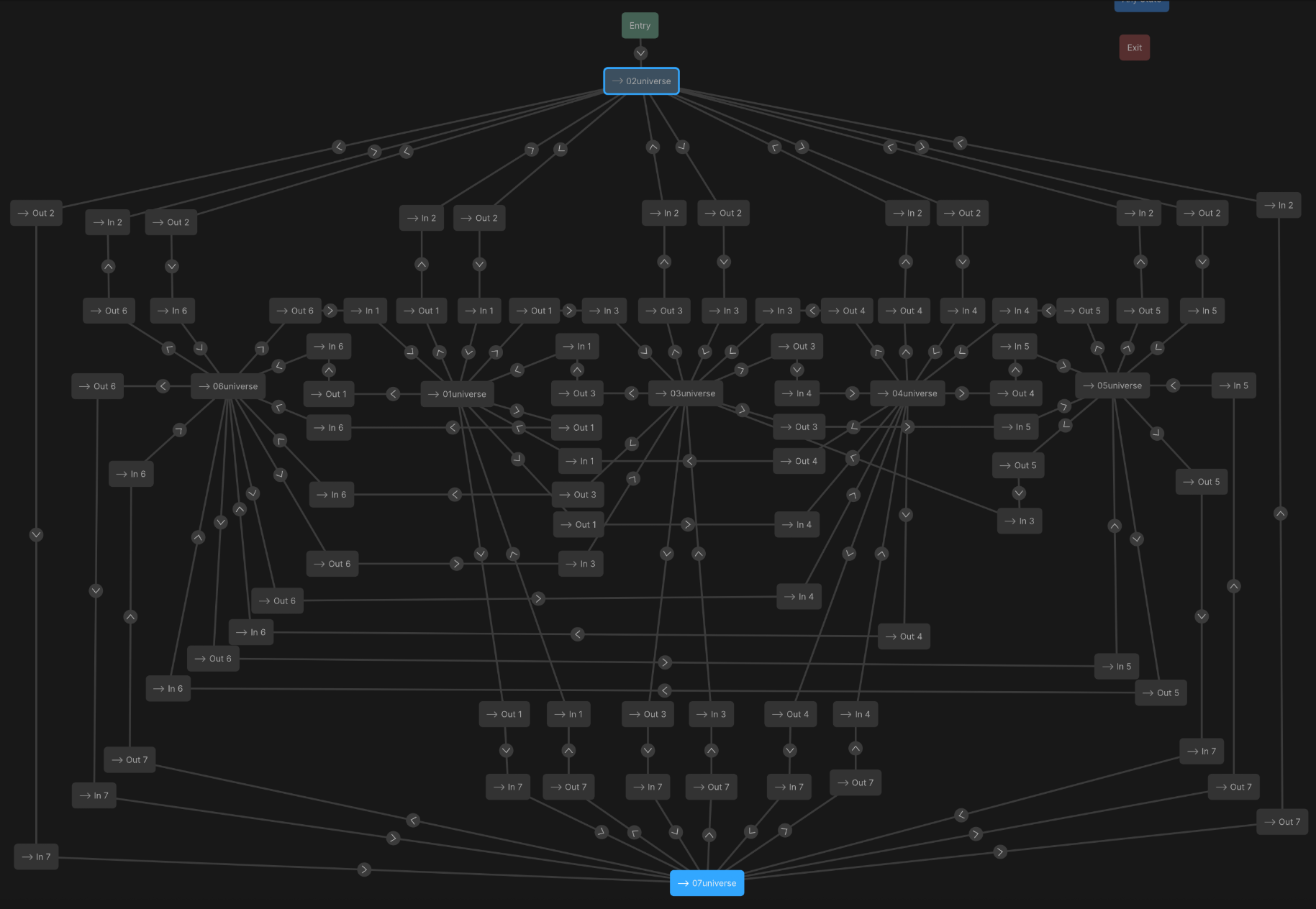
After a few rounds of testing, I realized the transitions looked best when in/out animations were added to each transition layer. So I built a complex matrix for both time-of-day and universe transitions, with dedicated in/out states:
Finally, it worked just as I had imagined. I fine-tuned the timing by slowing down certain parts and adding pauses between animations. The result was a smooth, gradual parallax effect. In Rive, it looked very polished:
When I saw the animation running in the real app, it looked even better than I expected. It felt like the app’s home screen was a small, interactive world that responds to you and the time of day.
We went through several rounds of color correction to ensure everything felt harmonious, and I took the opportunity to split the layers into individual elements – like the sun, clouds, sky gradient and smaller details – giving the animation more depth and flexibility.
And here’s the final result:
Of course, we don’t expect this feature to skyrocket metrics, but we want our app to look immersive, creative and simply beautiful. And with this wallpaper Easter Egg, we aim to reward those users who are invested in the app enough to discover all its features and secrets. Ultimately, it’s not always about metrics, sometimes it’s just about our love for tTravel. For us, every screen in our app should feel like a small piece of art.
We hope this article was useful to you. Download tTravel on iOS or Android if you haven’t done so yet. And stay tuned for the next articles. Until next time.
Leave a Reply