How can dopamine-driven design help apps boost engagement and subscriptions?
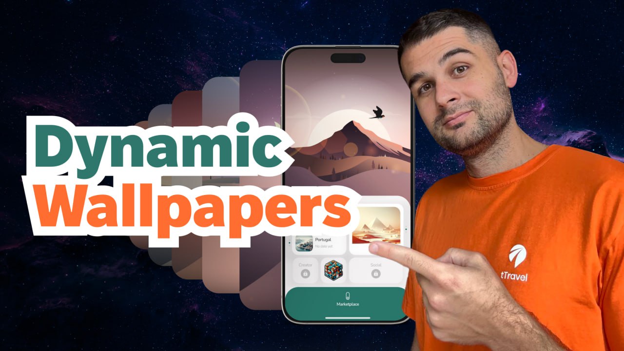
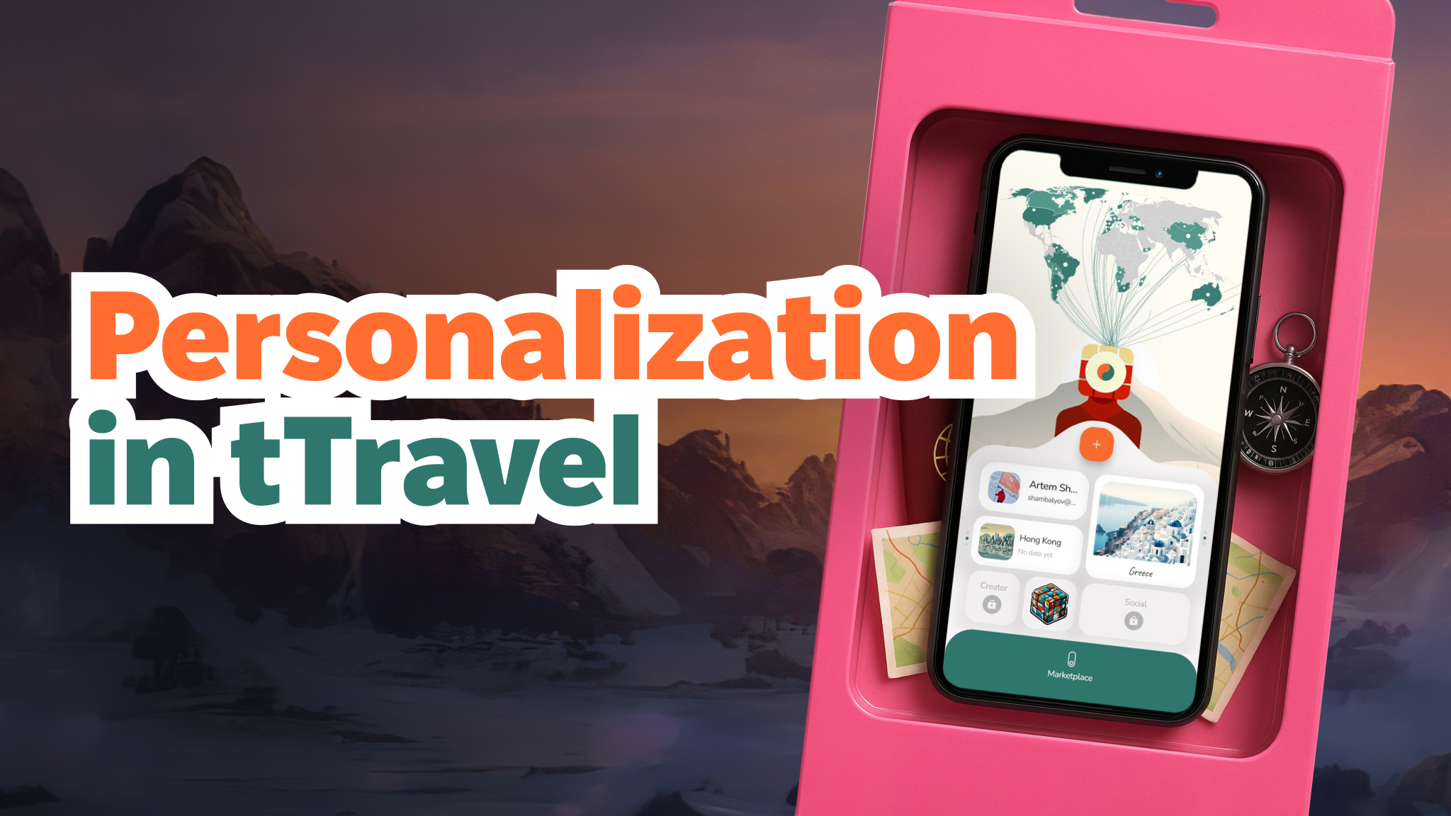
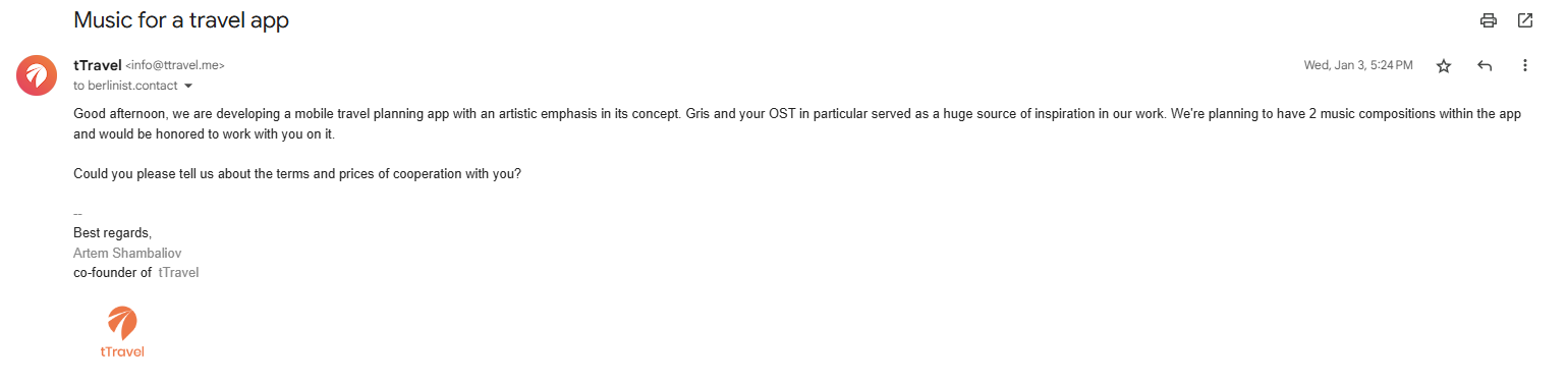
In this article, Artem Shambalov (co-founder of tTravel) shares his hypothesis of “dopamine baby steps” — a product psychology approach where simple actions lead to deeper engagement.
Here’s what you’ll learn:
✔️ Big actions like purchasing or publishing itineraries required too much commitment in the old app;
✔️ How the new dopamine baby steps model works with stickers, scratch maps, and Easter Eggs;
✔️ Early subscription offerings failed (with up to 99% drop-off) — and how the team changed the flow;
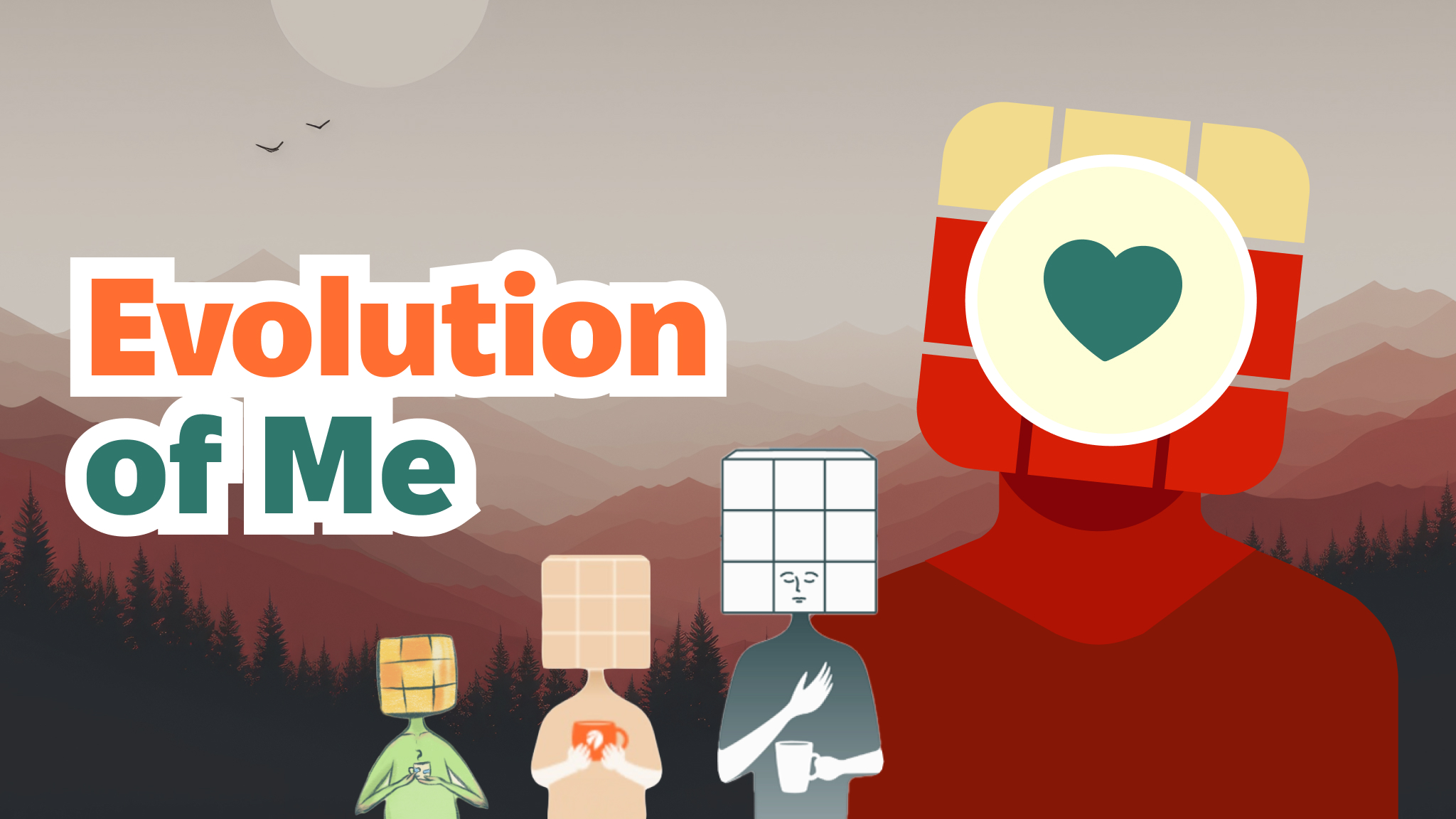
✔️ How Me, the app’s mascot, avoids making subscriptions annoying;
✔️ How dopamine nudges prepare users for advanced features like the Itinerary Constructor.
If you prefer video formats, there you go:
Retrospective
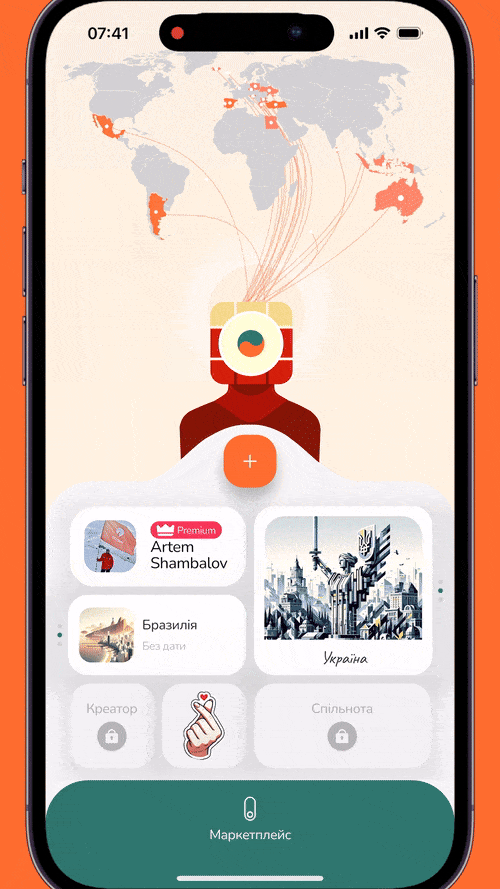
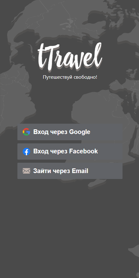
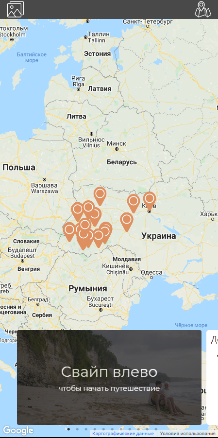
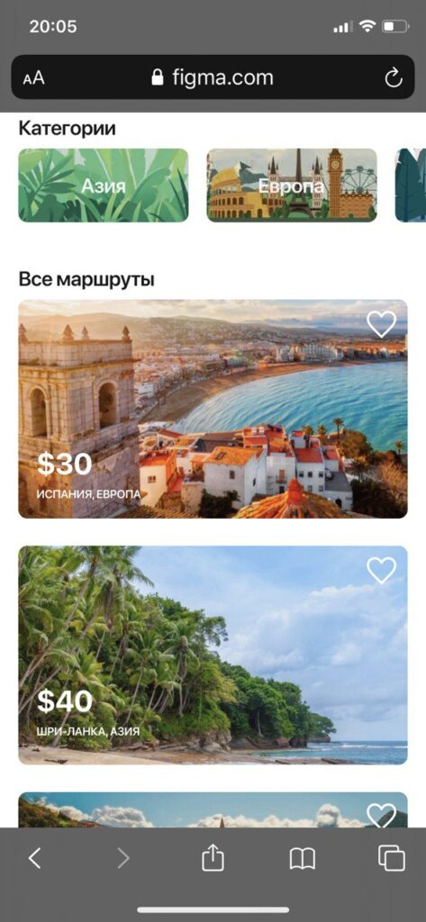
In the previous version of tTravel, the key users’ actions were either purchasing itineraries or publishing them for sale. Both are complex actions that required a significant level of commitment. Publishing an itinerary for sale, in particular, was positioned too far down the user funnel, making it less likely to occur.
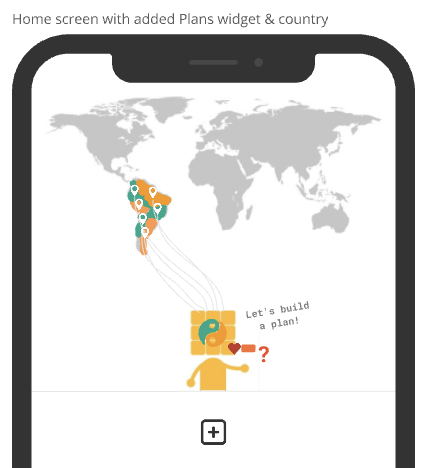
With the new tTravel, we’ve shifted our focus. The primary action is now subscribing—an action placed at the early stages of the funnel and stimulated through easy achievements and dopamine influxes. With this change we hope to engage users quickly and encourage them to explore the app’s full potential.
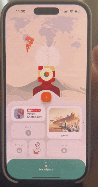
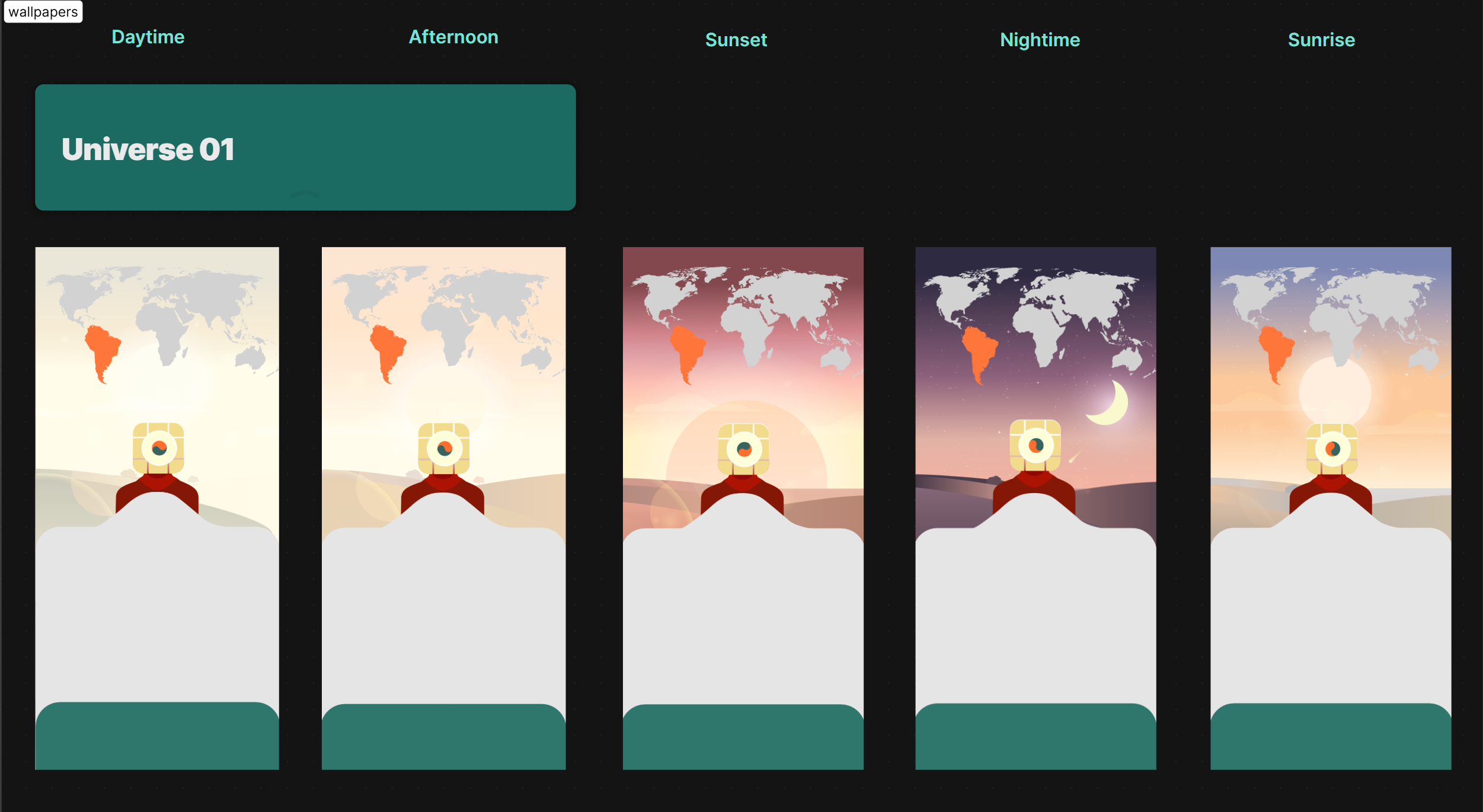
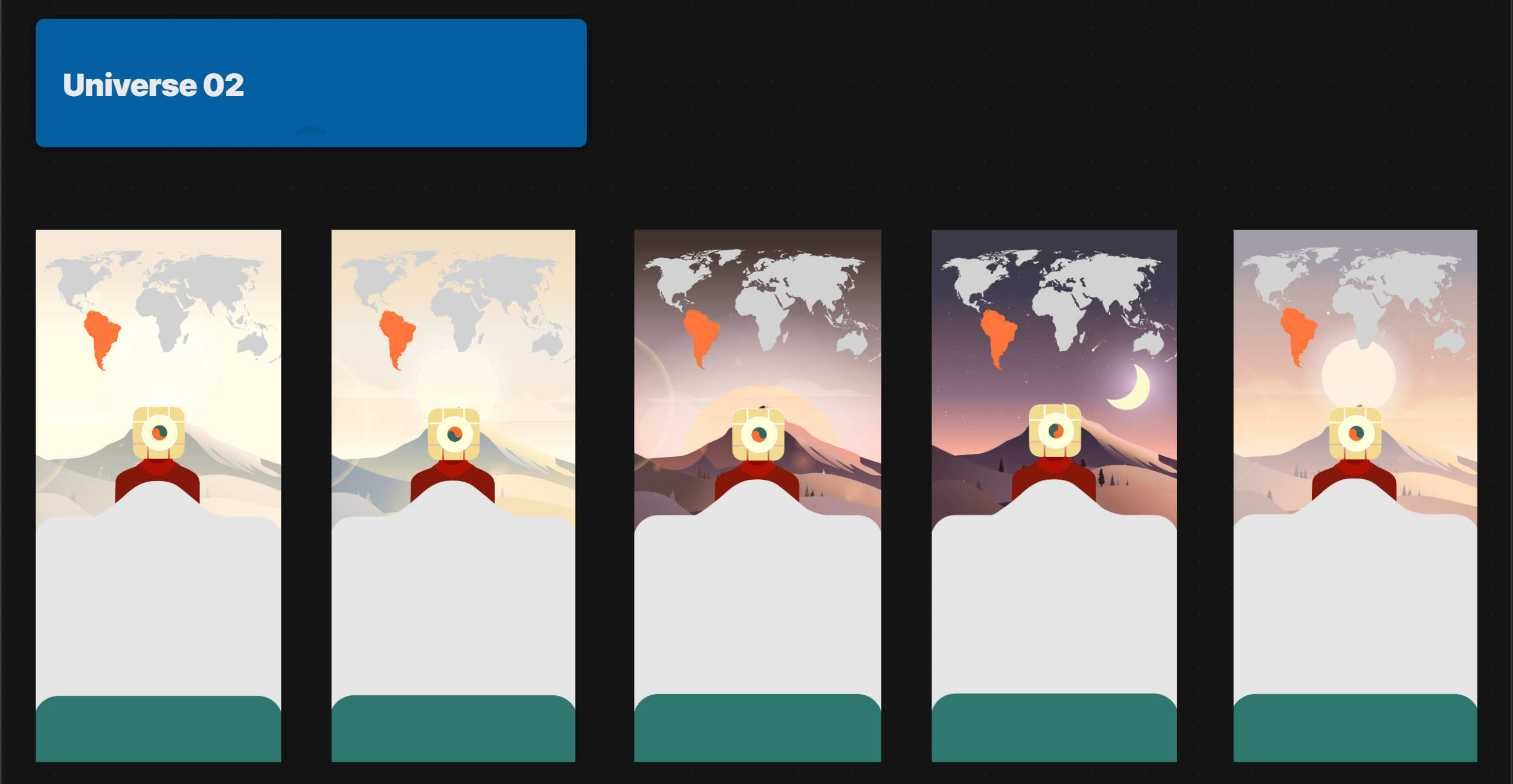
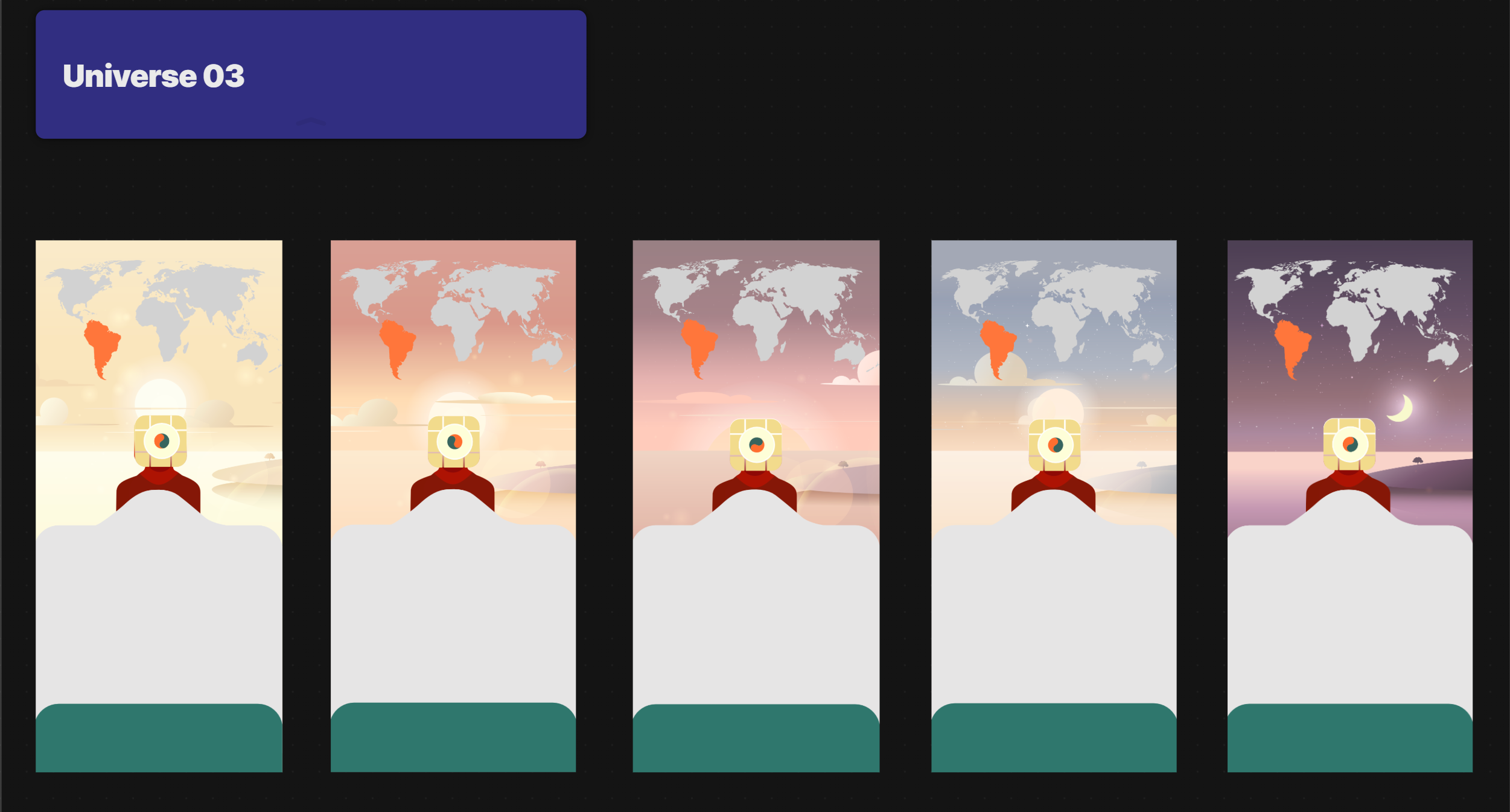
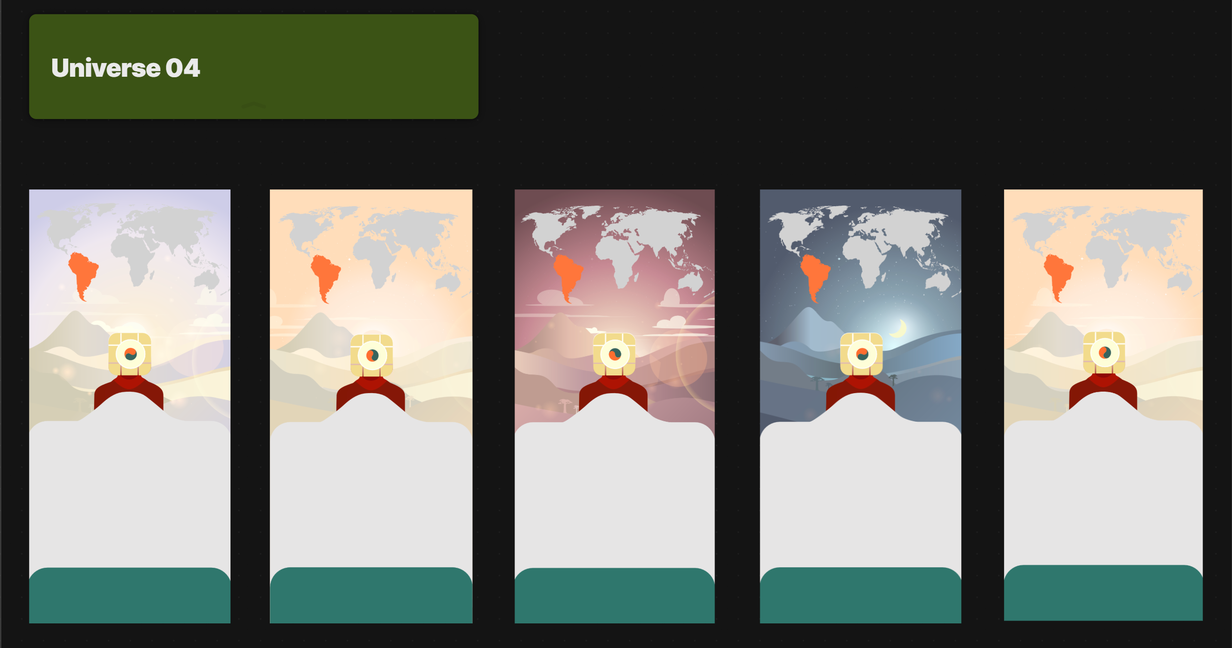
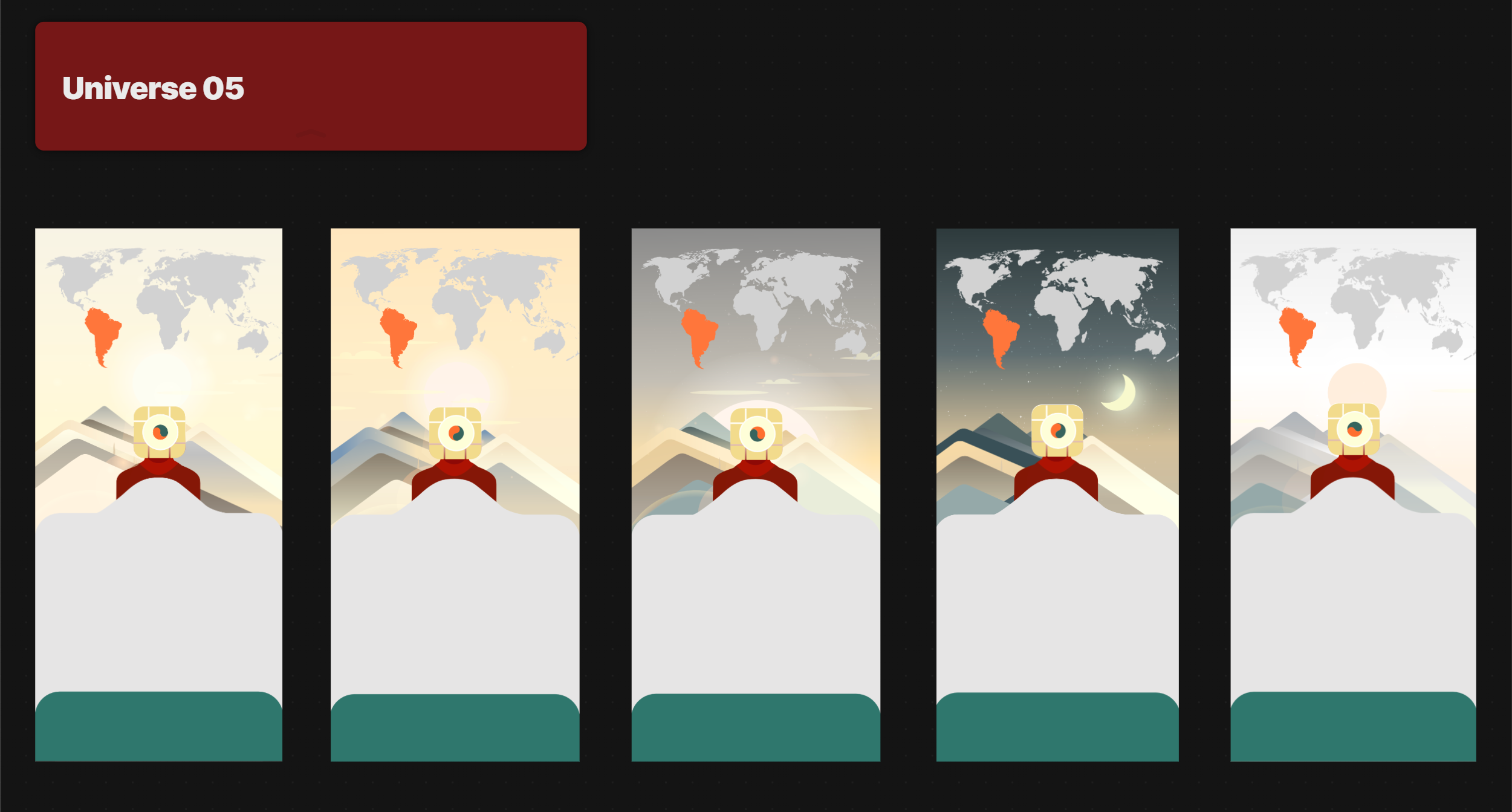
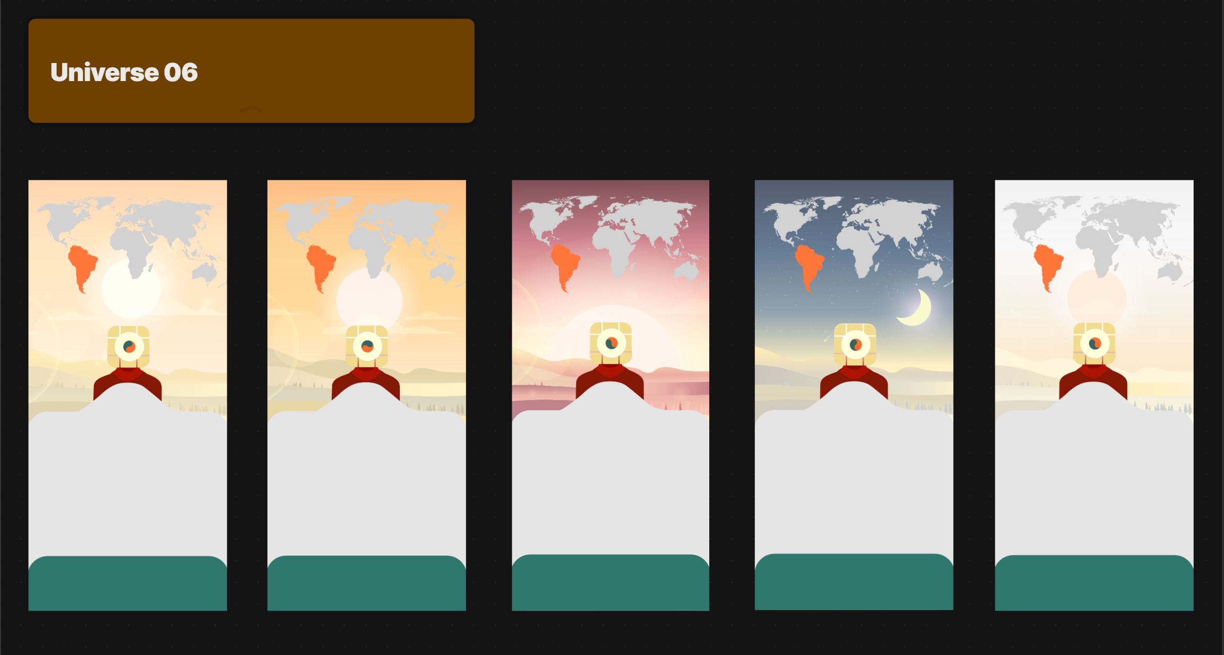
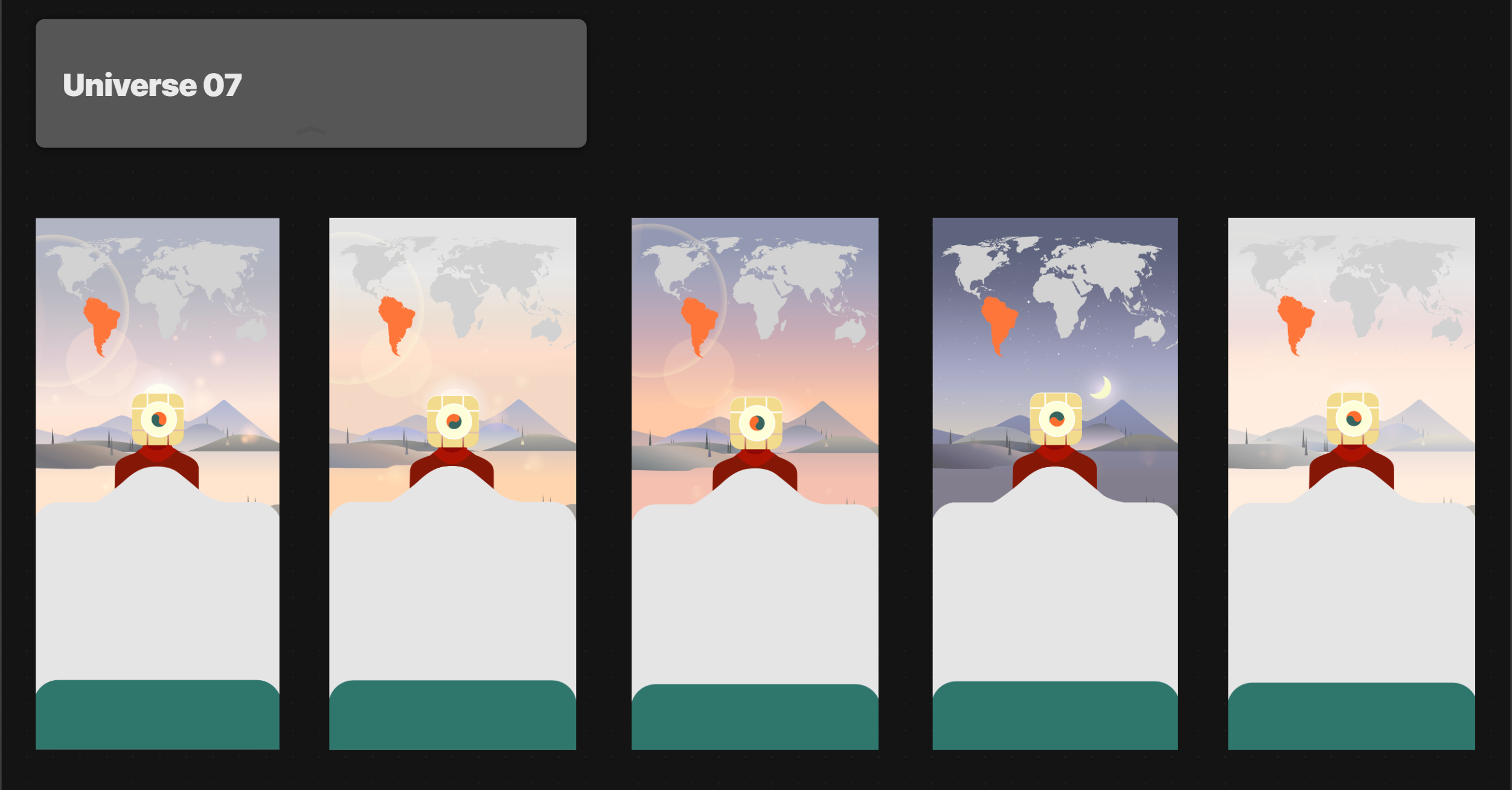
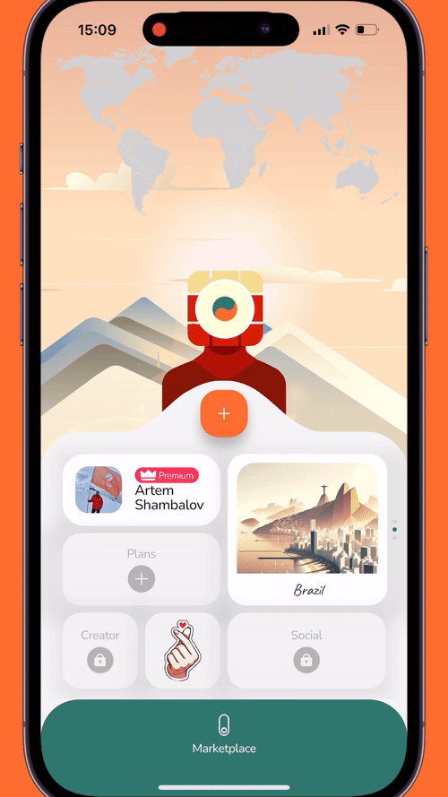
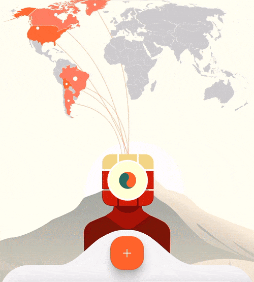
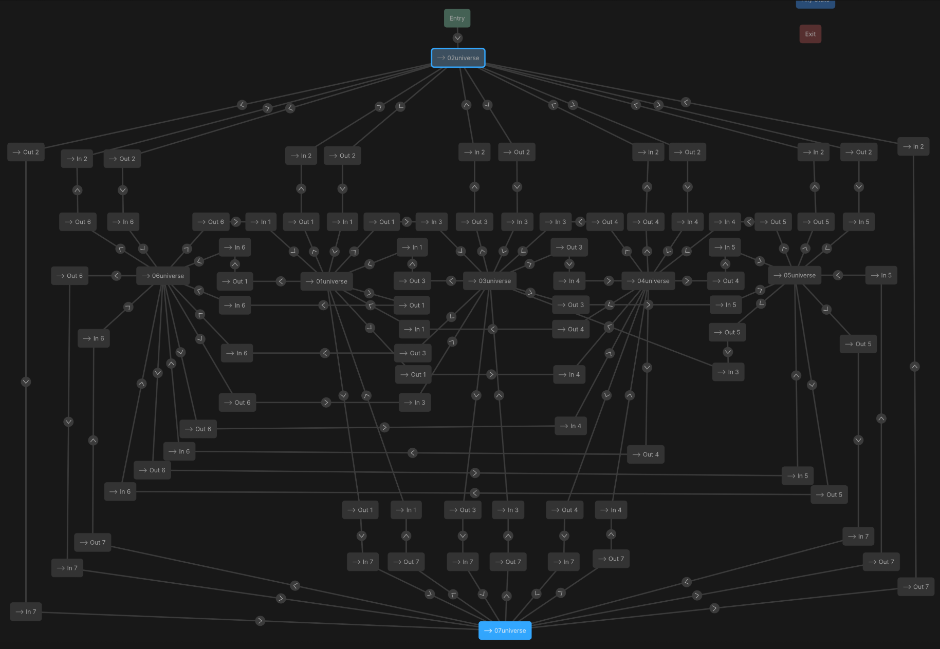
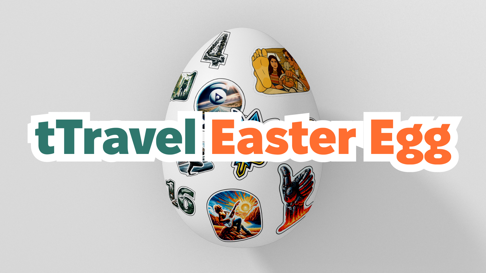
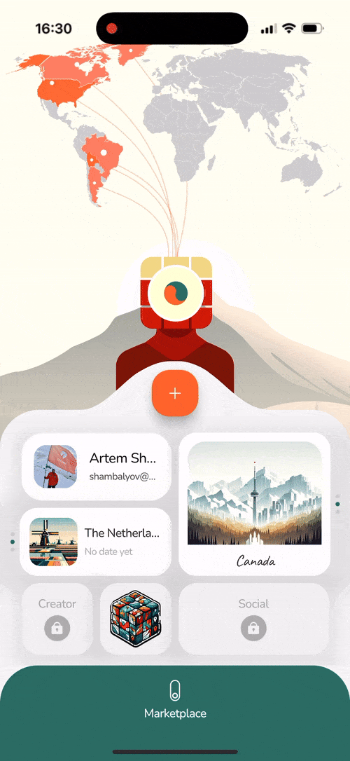
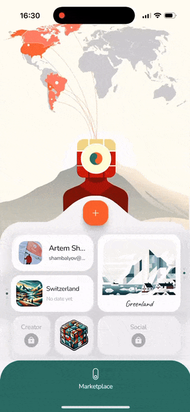
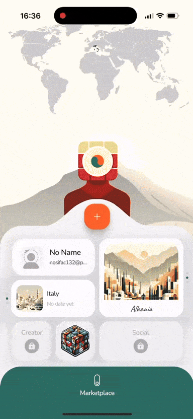
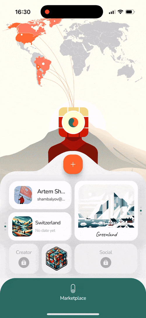
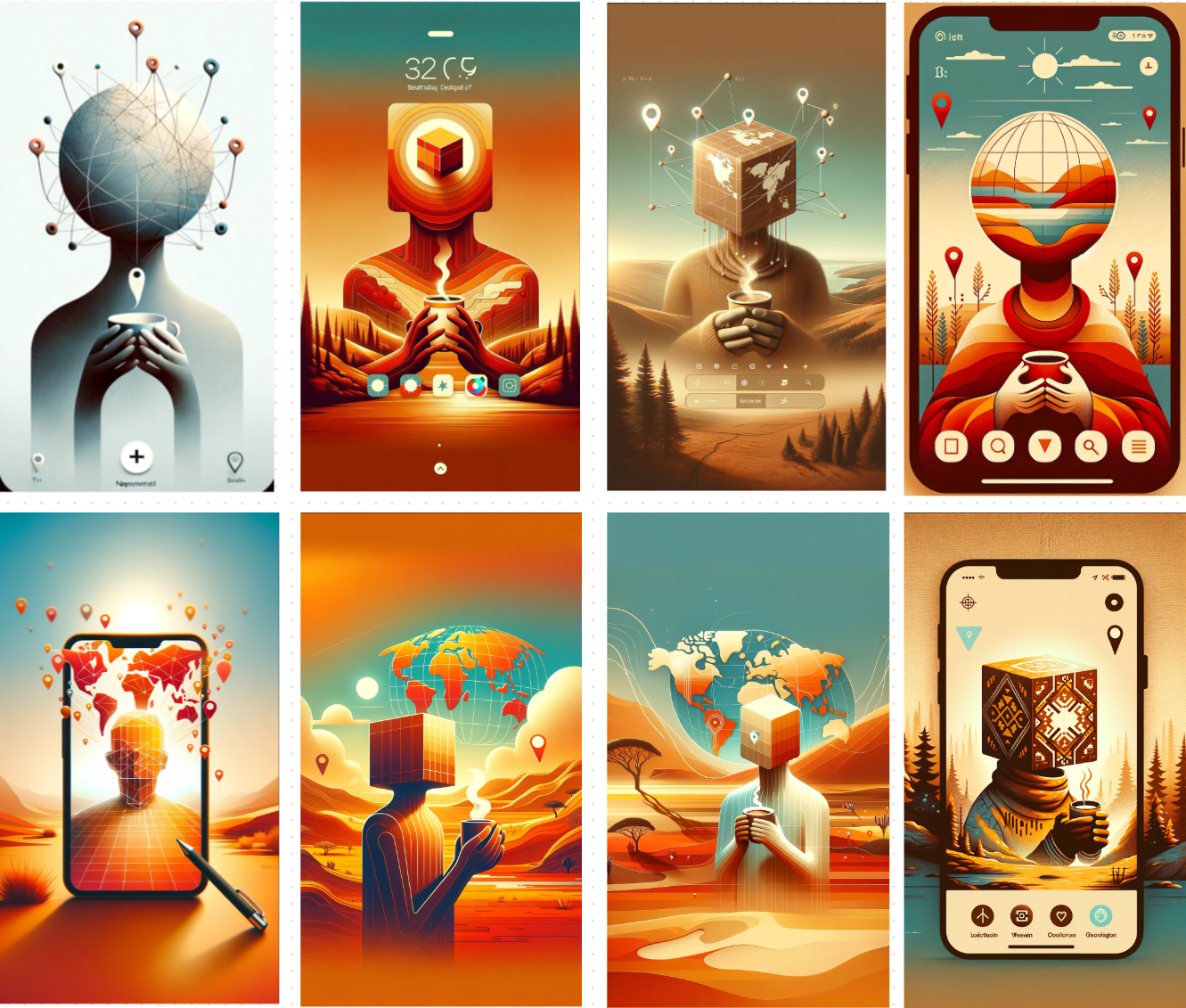
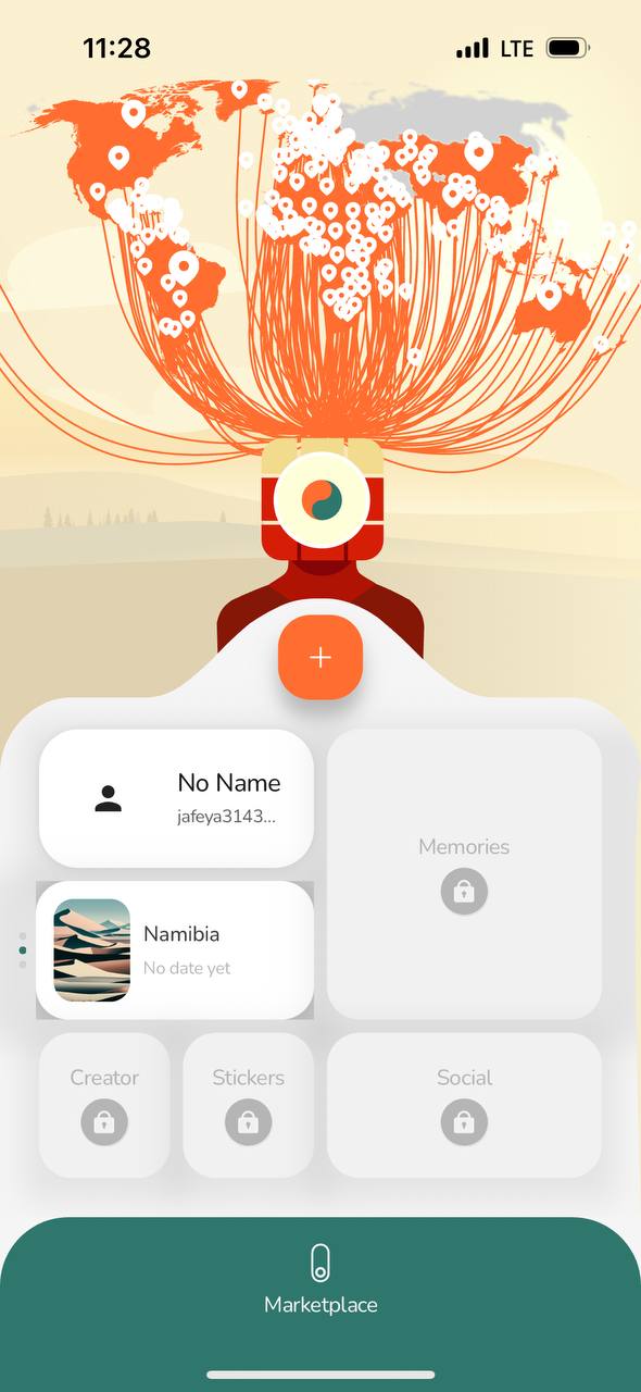
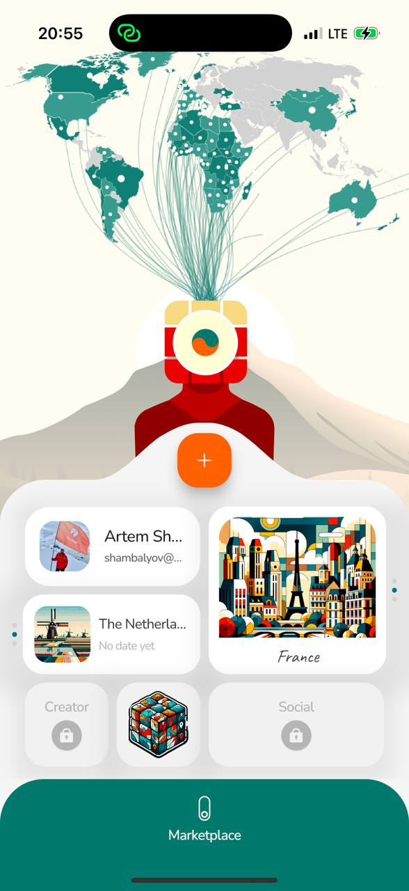
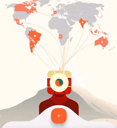
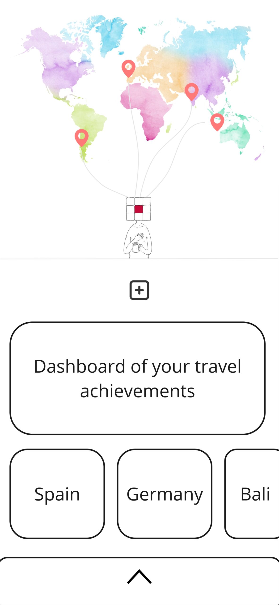
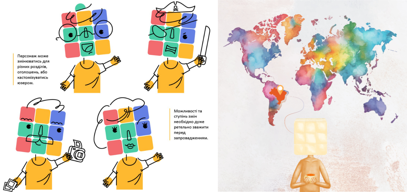
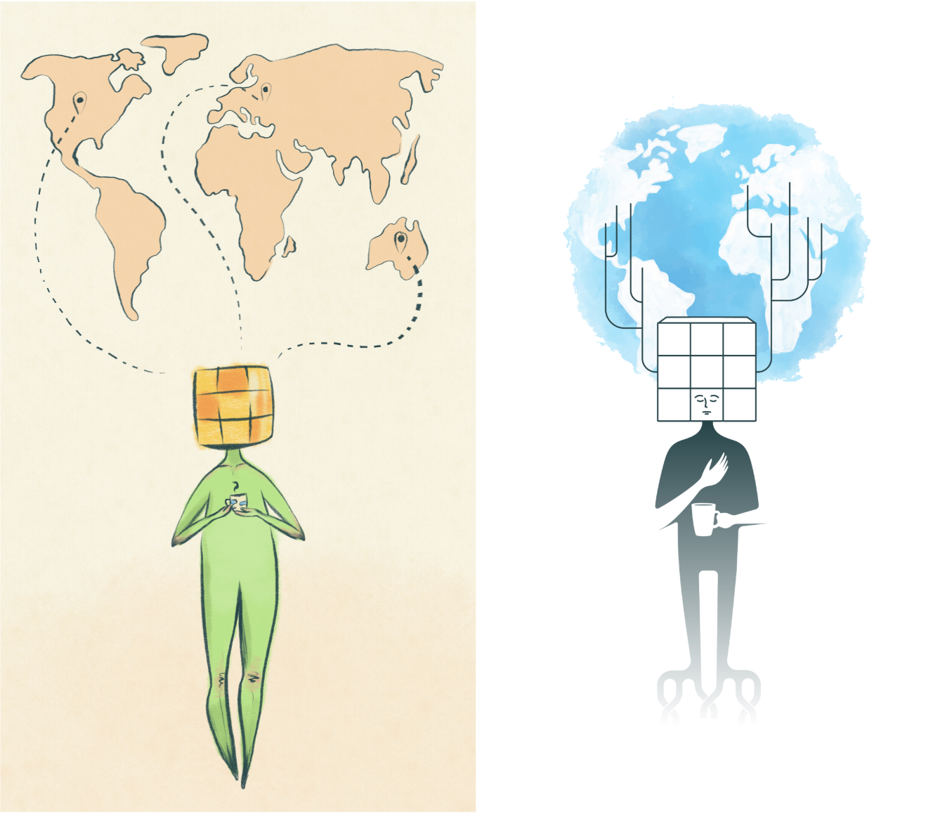
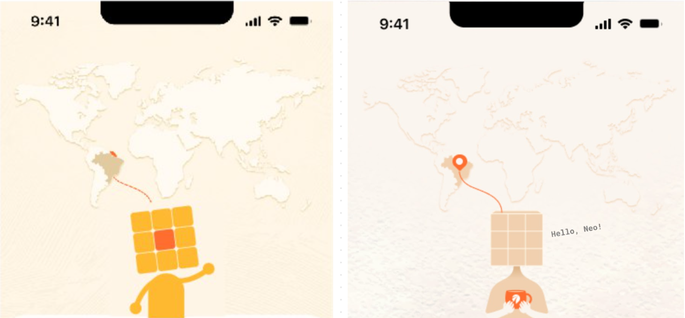
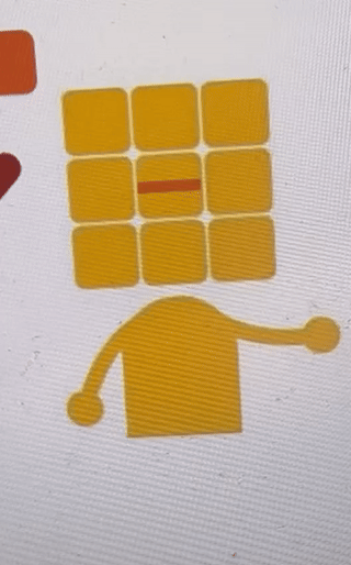
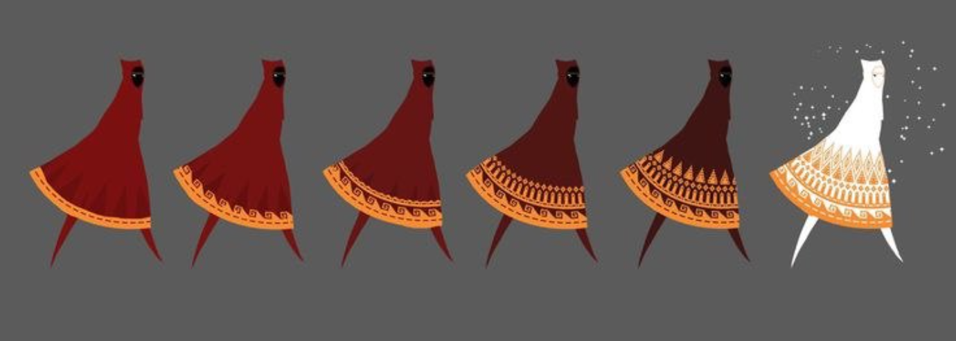
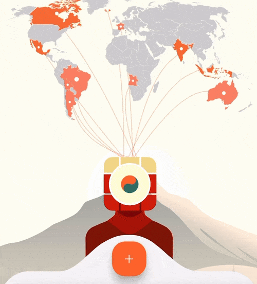
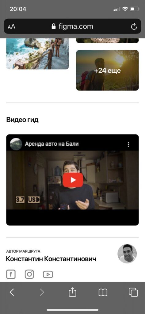
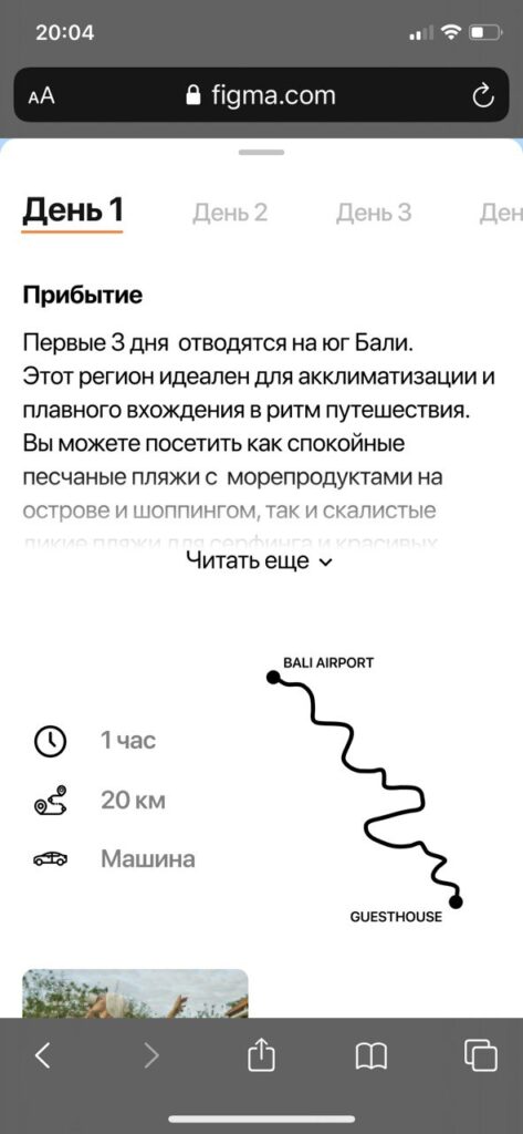
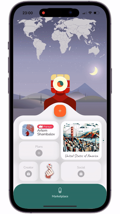
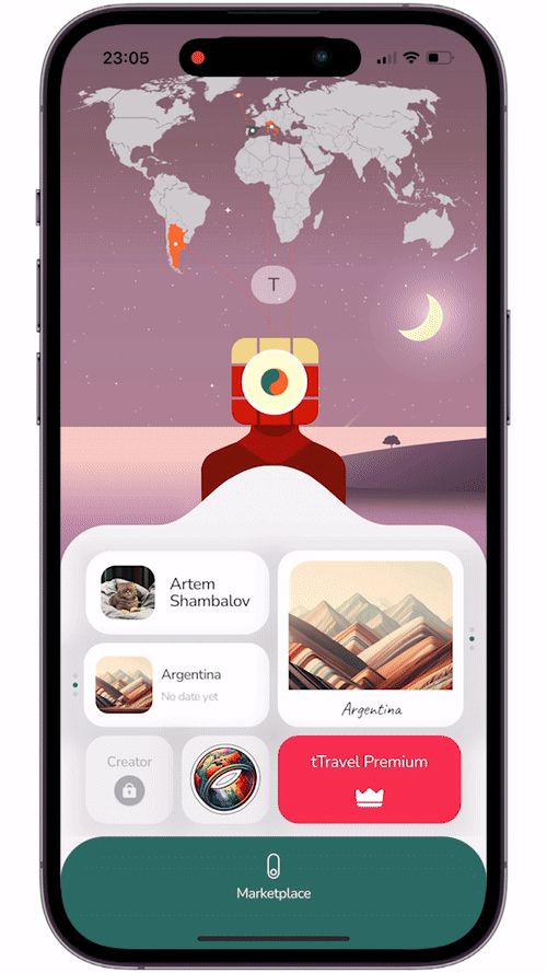
To encourage subscriptions, we’ve introduced a series of dopamine-driven micro-rewards— I call them “dopamine baby steps.” These are small, easily achievable actions that provide users with a sense of progress and excitement. So now, when users complete simple actions, they unlock a two-layered scratch map with interactive threads and receive stickers with lots of Easter Eggs, which adds an element of playfulness and personalization.
Each such achievement delivers a burst of dopamine. Thus, we aim to enhance the user’s connection with the app and create a positive feedback loop.
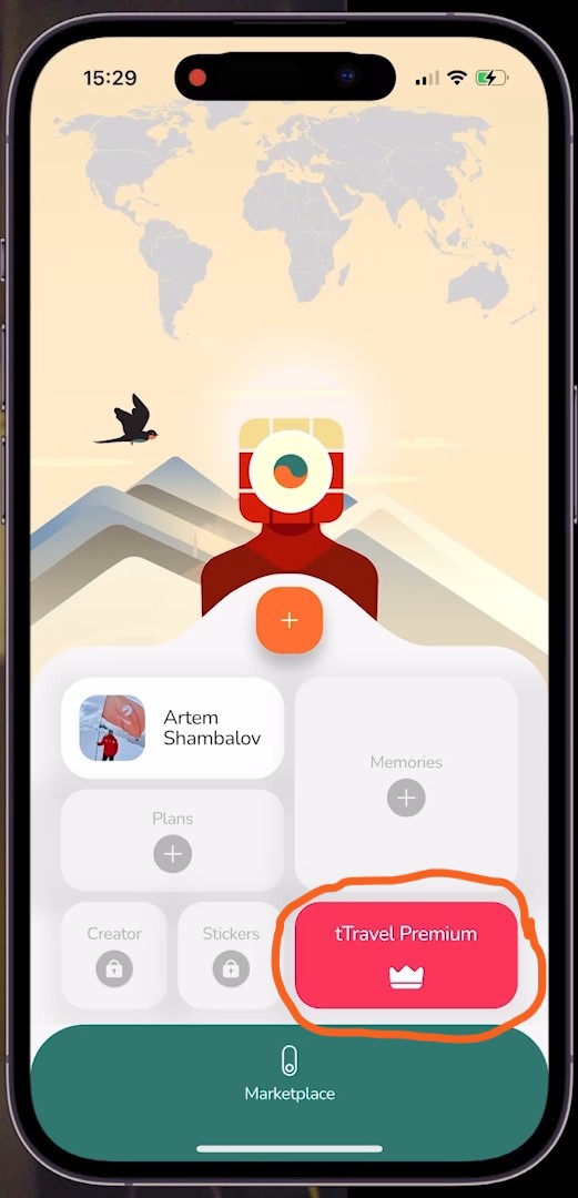
Subscription-Driving Dopamine
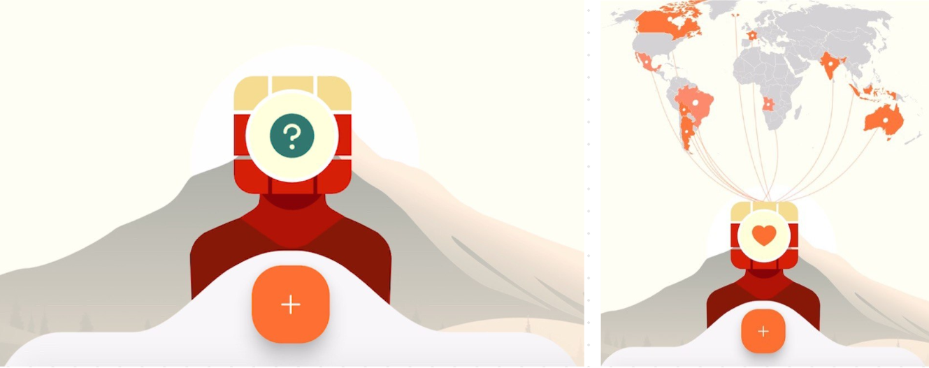
The map and stickers widget are partially available for free, but their full potential unlocks after the subscription is purchased. At first we tried a subscription offering right off the bat, at the moment users first interact with any premium feature, but this approach was a total disaster. Up to 99% of users didn’t subscribe and many were confused by the flow.
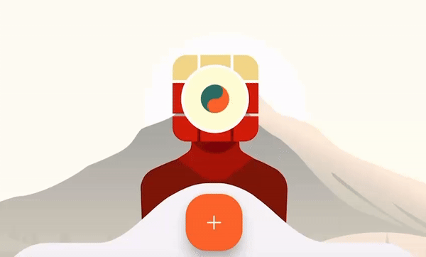
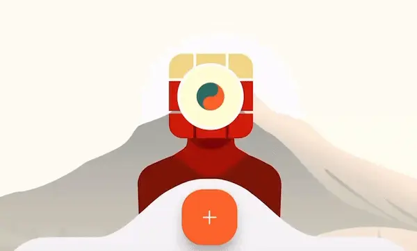
To make the transition to subscription seamless, we stopped showing the subscription offering screen without the user’s consent to see it. Instead, we use Me, our mascot, to explain the limitations when the user runs out of free functionality. If the user wants to lift those limitations, they can tap Me and proceed to the subscription screen. If not, Me’s dialogue disappears in a few seconds, so the user won’t even have to make extra taps to proceed with the app.
So now, users can check out the benefits of all premium features without immediate commitment and annoying subscription offerings. But the dopamine-driven elements serve as a consistent nudge toward upgrading.
Building Toward Complex Actions
Our hypothesis is that the small doses of dopamine not only drive subscriptions but also prepare users for the app’s more advanced features, like the Itinerary Constructor, which is also a partially free premium feature and basically the core one.
By creating a sense of progression and accomplishment through simple actions, we are trying to make users more inclined to explore and understand the more complex and valuable aspects of the app. Hence, this is another change that hopefully will indirectly increase the % of users checking out the constructor.
tTravel isn’t just a trip planner app — it’s also a space where product design and psychology come together to create a more engaging user journey.
I hope this article was useful to you. Download tTravel on iOS or Android if you haven’t done so yet. And stay tuned for the next articles. Until next time.
By: Artem Shambalov